
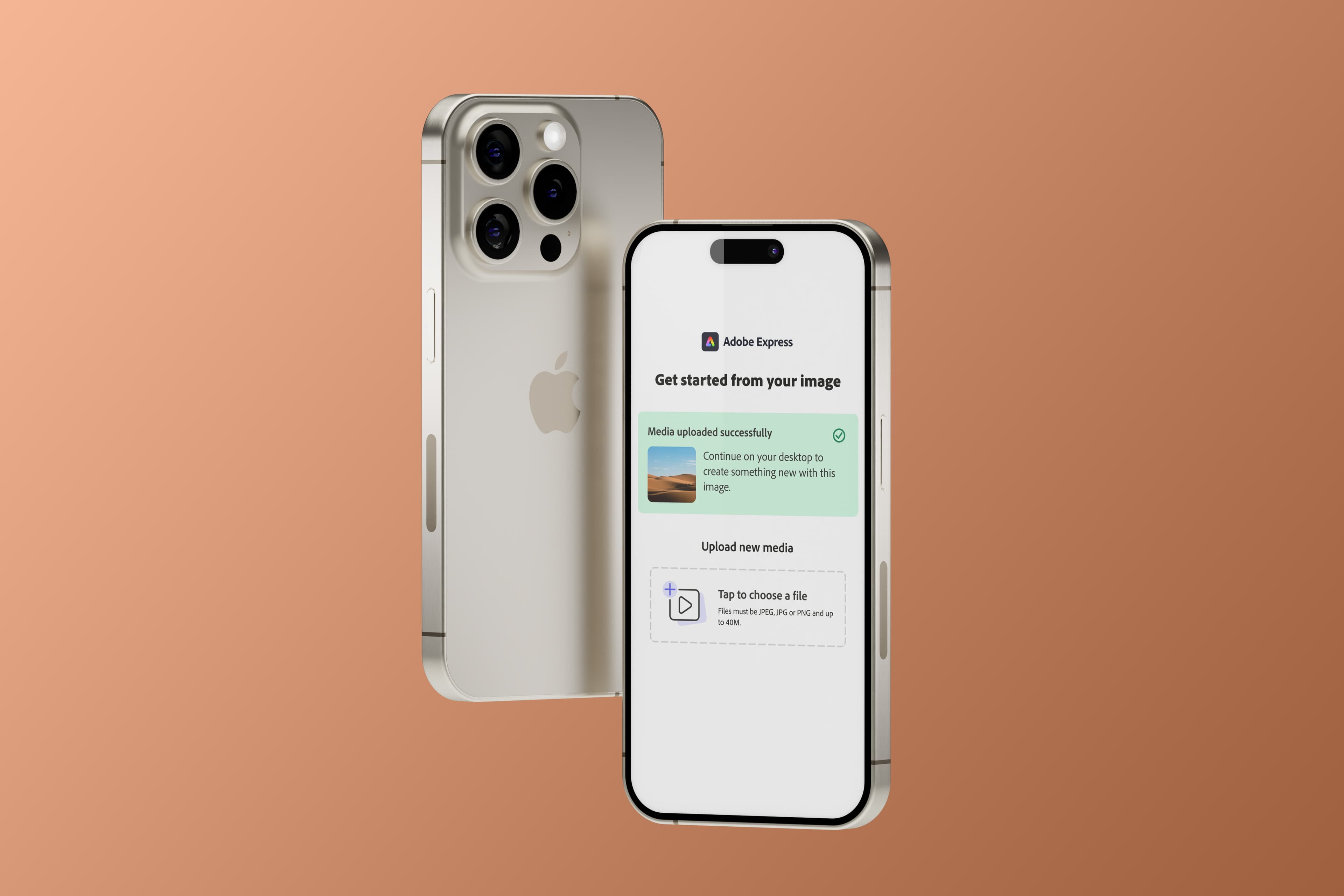
Easy Upload: Strong signal, narrow audience — and a concept the next team can build on
- Status
- Shipped · Paused
- Timeframe
- Jan 2026
- Role
- Design Lead
- Company
- Adobe
Context
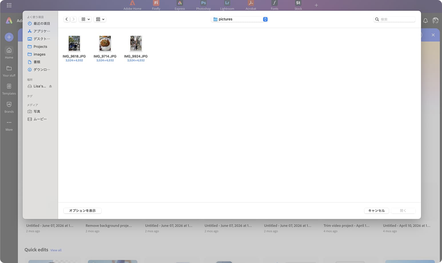
Getting files into Adobe Express on desktop is harder than it should be. Users whose assets live in Google Drive, Dropbox, or on their phone face the same workaround every time: download to device first, then upload to Express. That detour causes over 40% drop-off at the upload step.
The existing upload modal offered one path: local file picker. The hypothesis was straightforward — surface cloud storage and mobile upload options directly in the modal, and more users would complete the upload and go on to export.
What we learned was more interesting than the hypothesis.
Problem
The easy assumption: if users have assets on their phone, just use Express mobile to edit. The research said otherwise.
Desktop return rates run nearly 42% higher than mobile — Day 2–7 return of 24% on desktop vs 14% on mobile. Internal usability research (Mobile Usability Issues POV, 2026) found consistent friction across mobile editing: too many screen transitions, poor touch precision for layer manipulation, performance issues in every user interview, and meaningful difficulty with Gen AI refinement on smaller screens.
At the same time, mobile is where assets live. Users capture on mobile and move to desktop for editing. The two devices play different roles in the same workflow — and Express wasn't bridging that handoff.
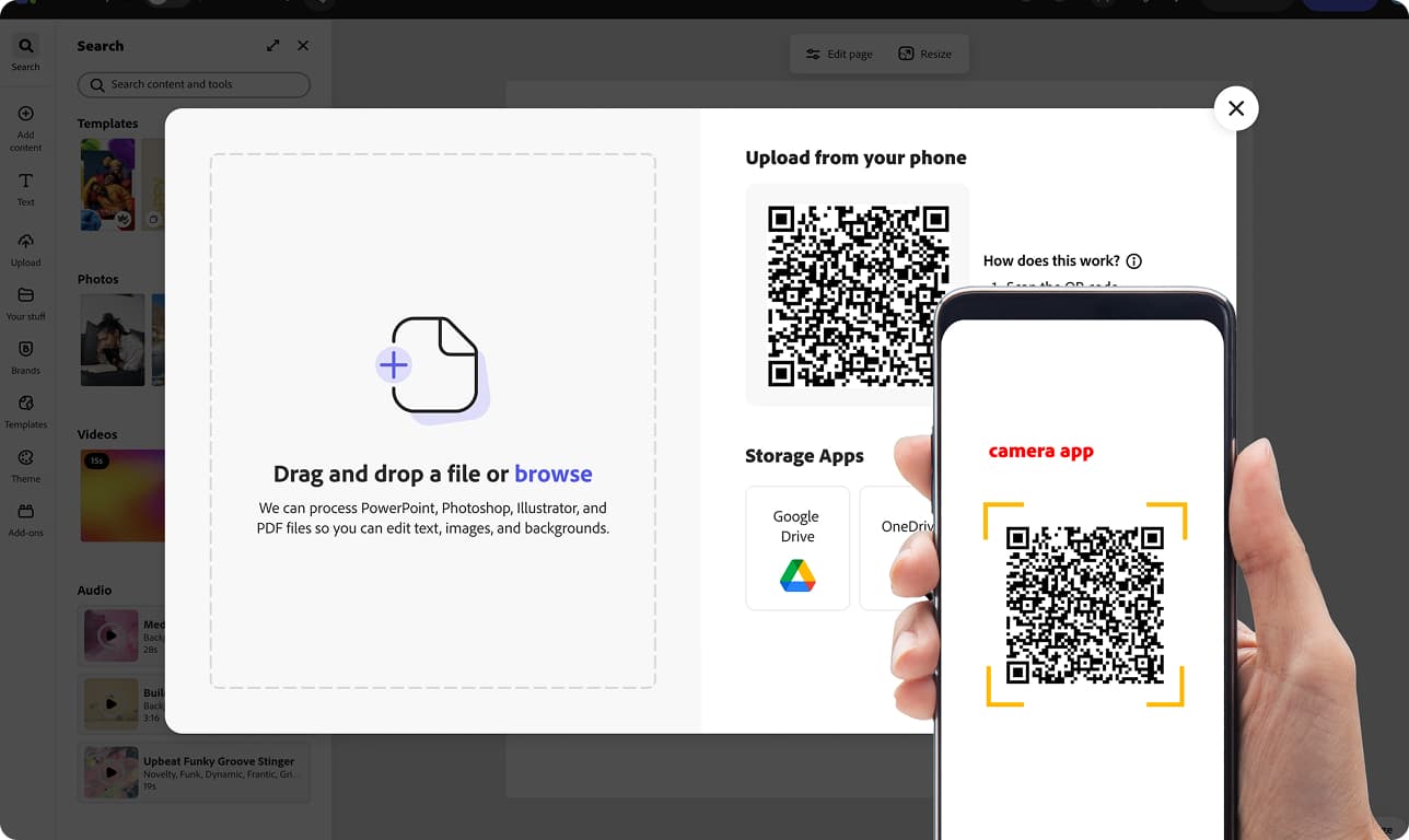
Easy Upload was designed for that reality. The QR path wasn't asking users to edit on mobile. It was asking mobile to do what it already does well: be a camera and a file source. The editing stays on desktop.
The Decisions
1. One hub, three paths
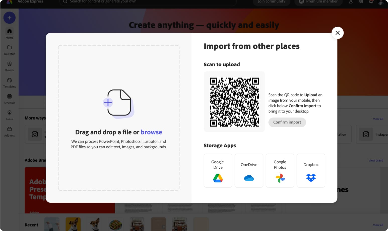
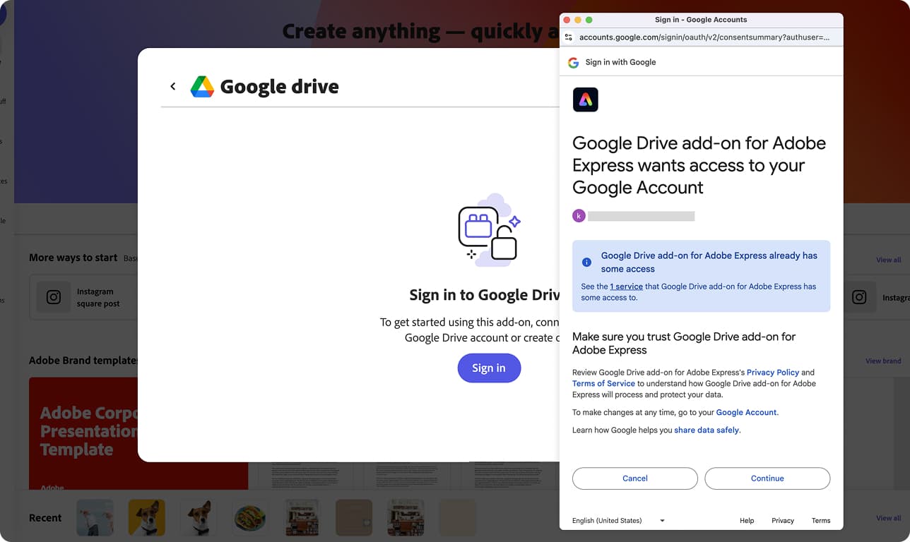
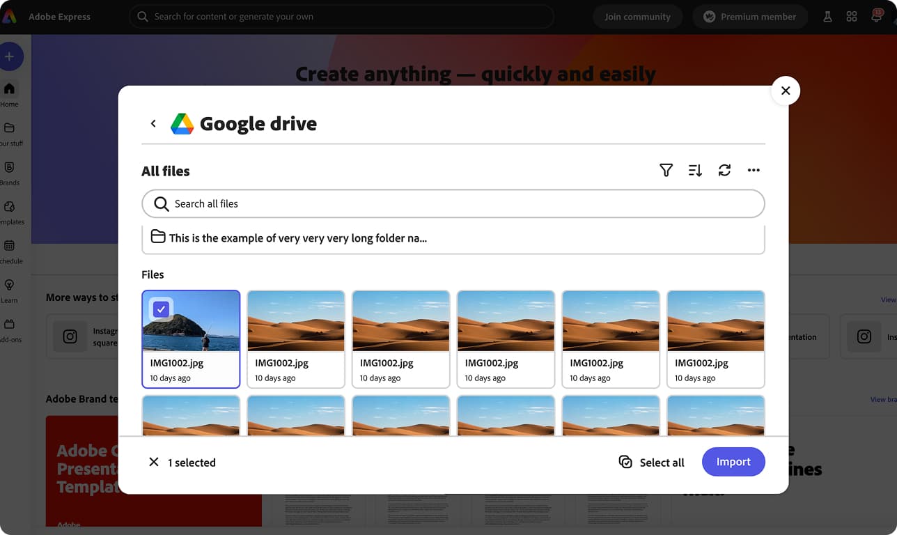
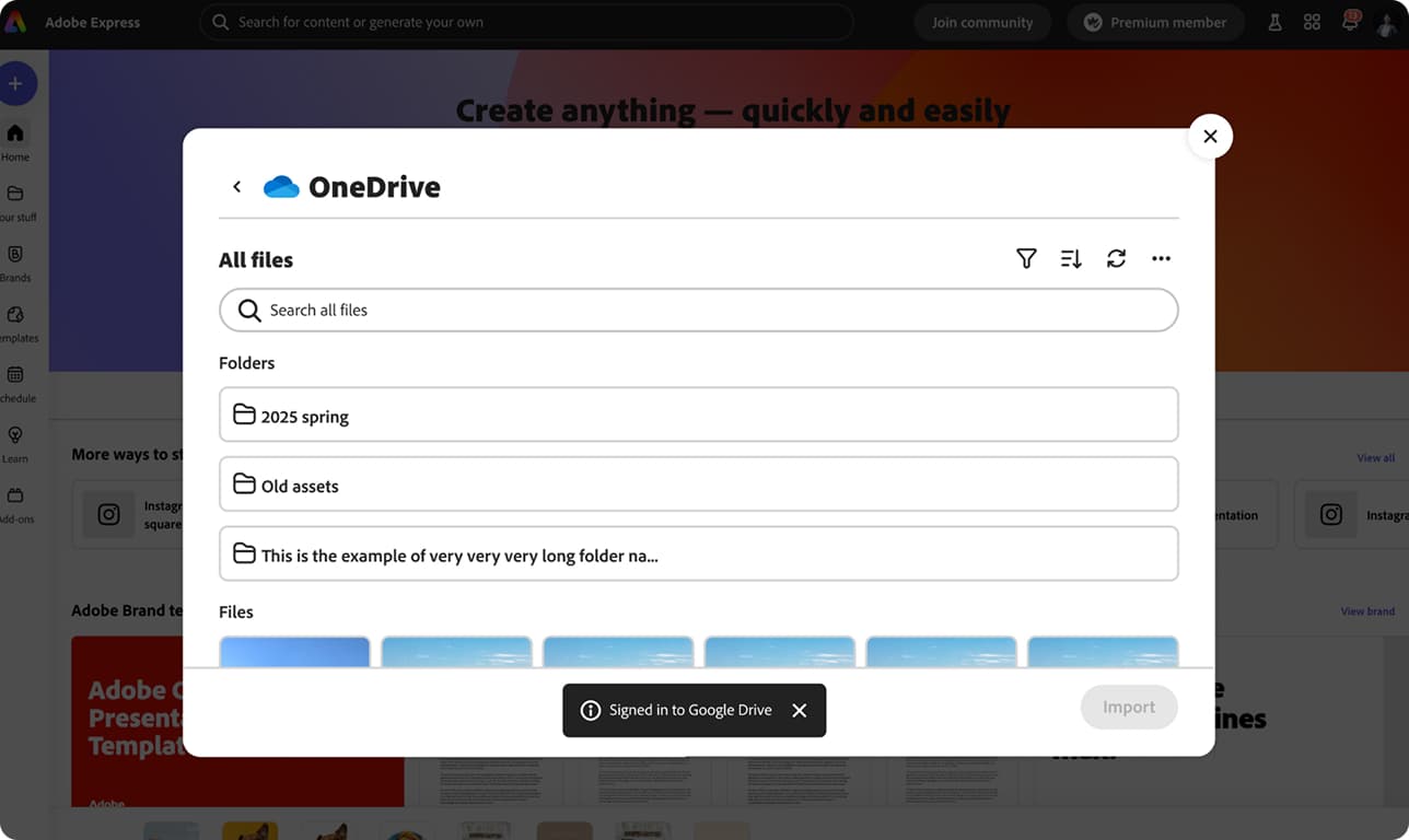
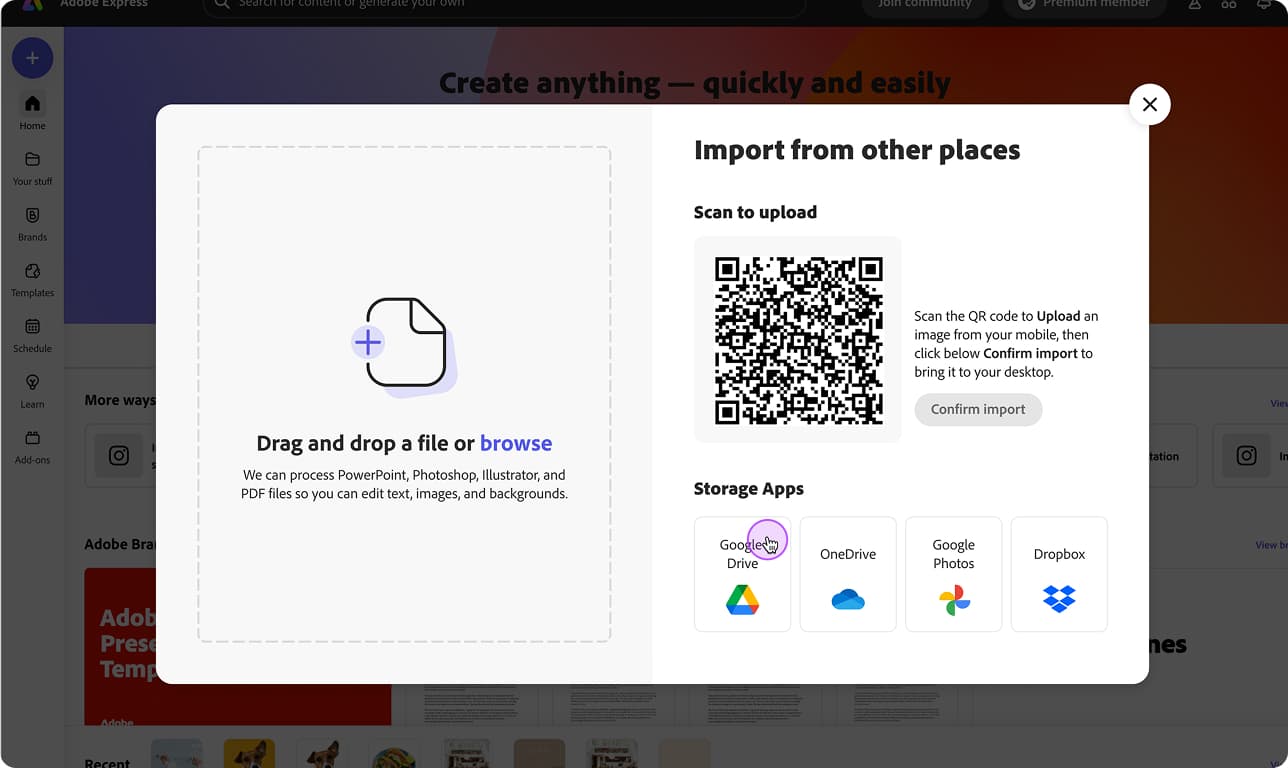
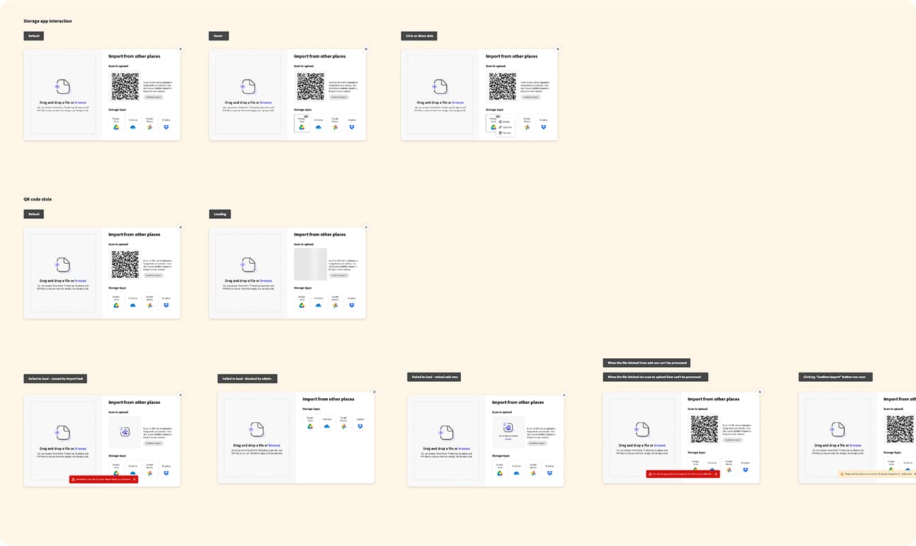
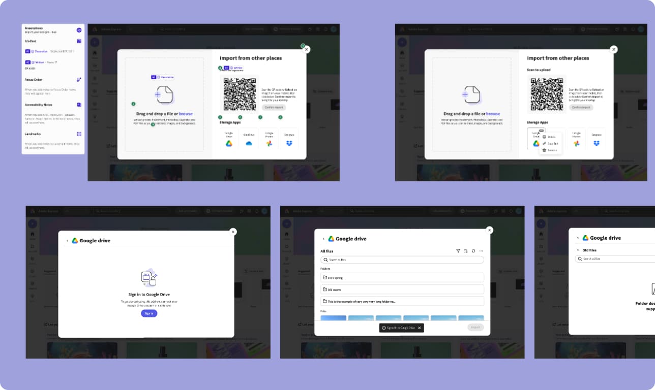
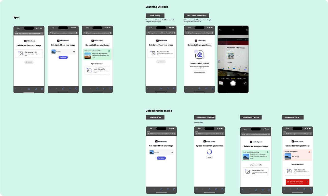
I conceived the end-to-end design for Easy Upload — an expanded import hub inside the Editor's upload modal offering local drag-and-drop, cloud storage add-ons (Google Drive, Google Photos, OneDrive, Dropbox), and a QR code scan-to-upload from mobile. The cloud path required close collaboration with the Extensibility team on add-on panel behavior; the Content team shaped the visual treatment of the add-on panel state, since first impressions matter when users hit an unfamiliar pattern.
2. A component built to travel
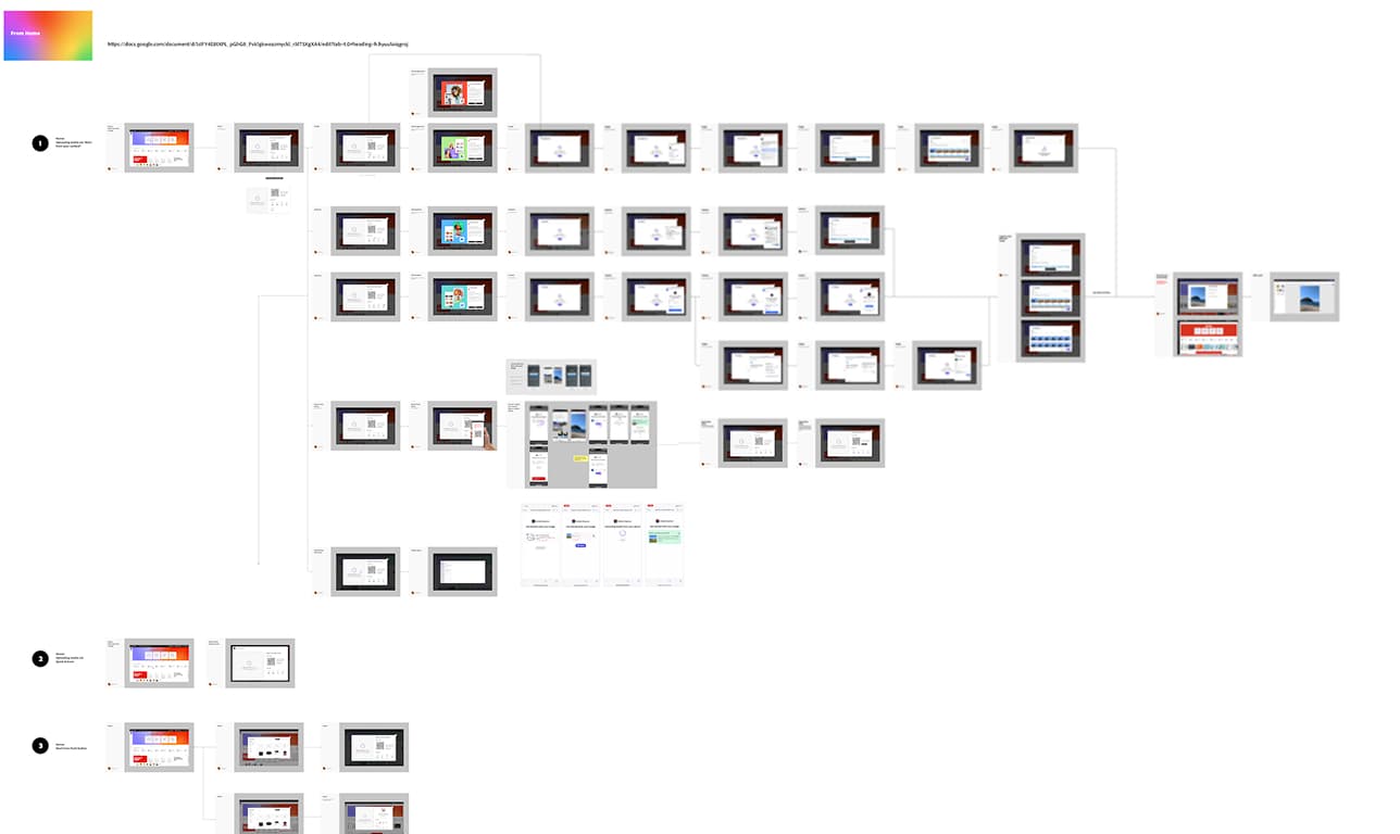
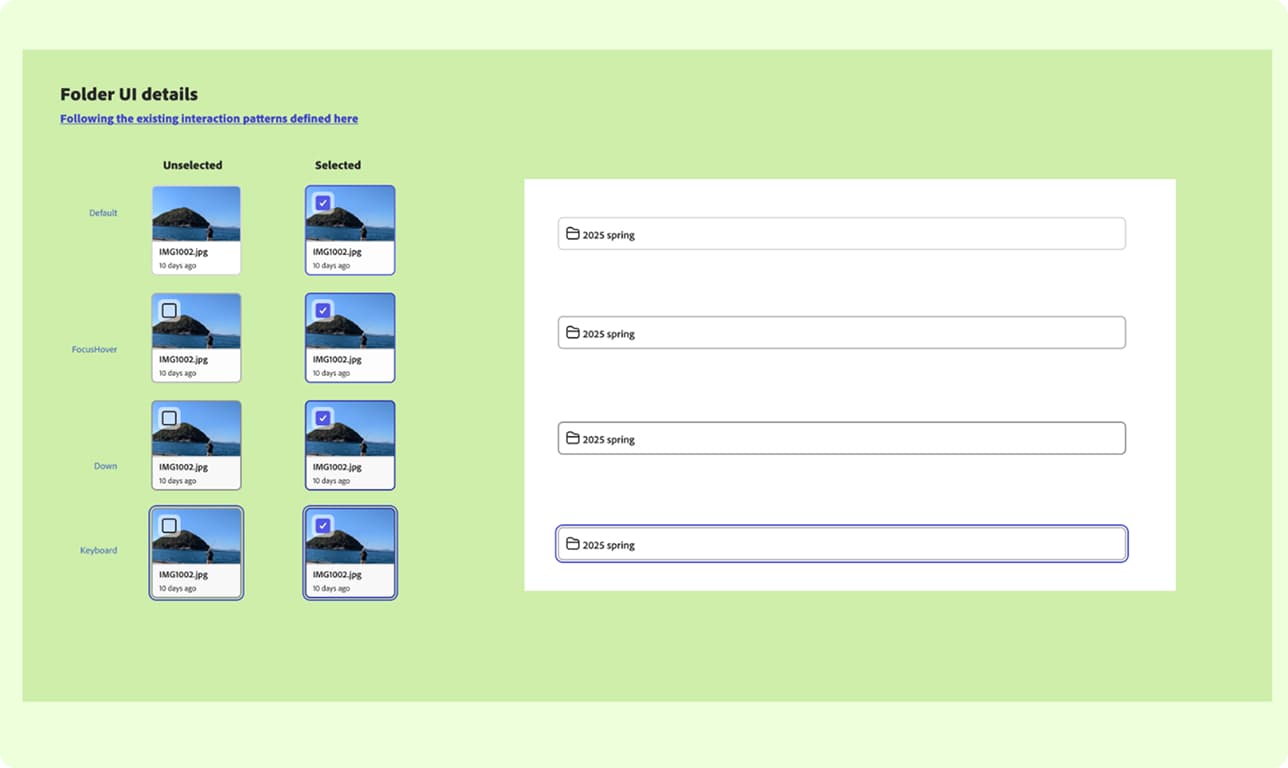
The import hub required a new add-on dialog component — a pattern that didn't exist in the Express design system. I designed it, reviewed it with the Foundation team, and got it approved as a system-level component. The a.com team subsequently adopted the same component to expand the upload experience to non-authenticated users — a different surface, a different audience, same pattern. One component, two teams, no redesign required.
3. Diagnosing the friction point, not the concept
Within one week of the Home version launching, QR interaction data came back critically low. I didn't wait for the test window to close. The question was: concept failure or execution problem? Cross-device handoffs are behaviorally familiar — AirDrop, WhatsApp, Google Photos.
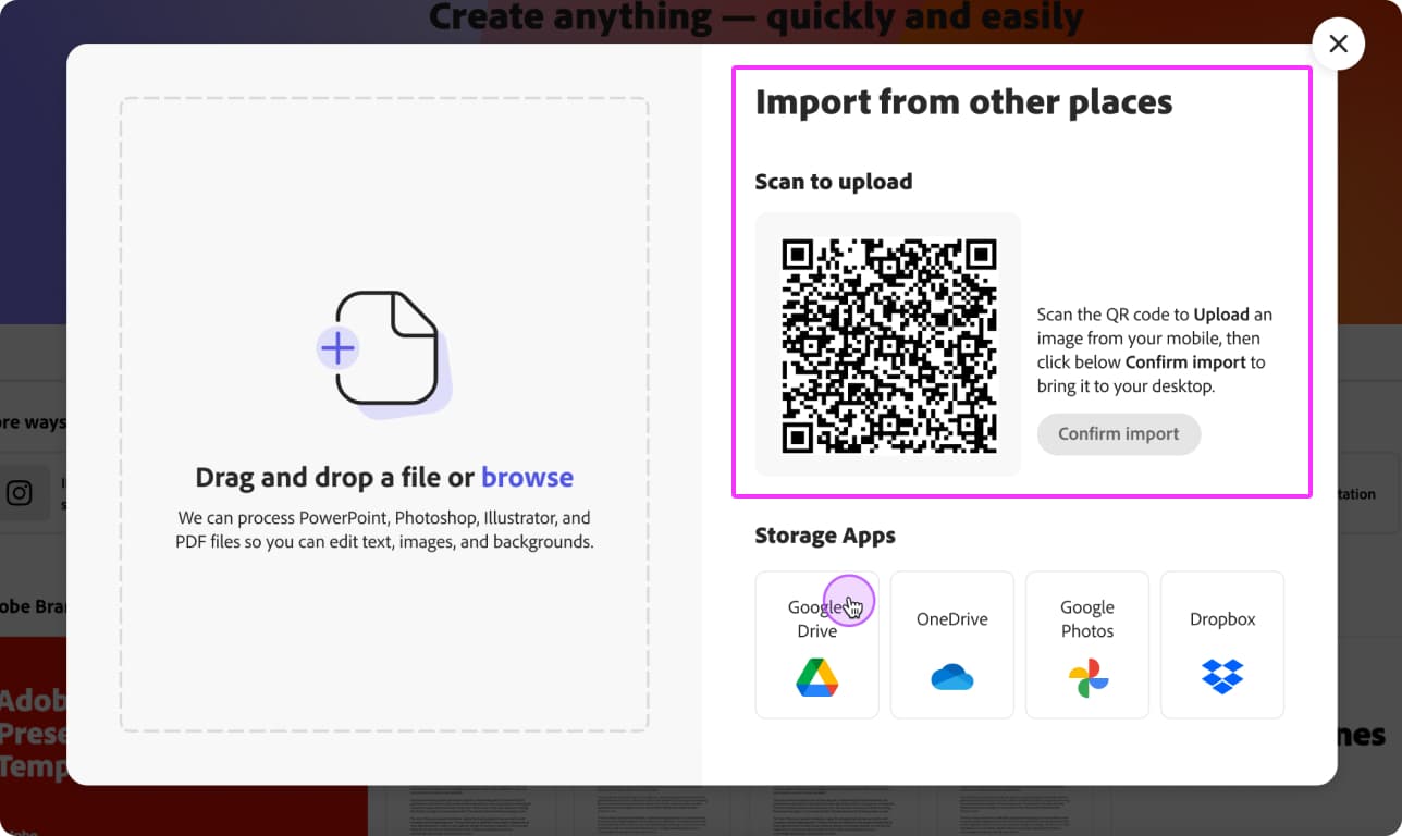
The friction wasn't in the idea. It was one moment: after uploading from mobile, users had to return to desktop and click "Confirm Import." 93% never clicked it.
That's not concept rejection — that's a user who completed their half of the interaction and expected the system to handle the rest.
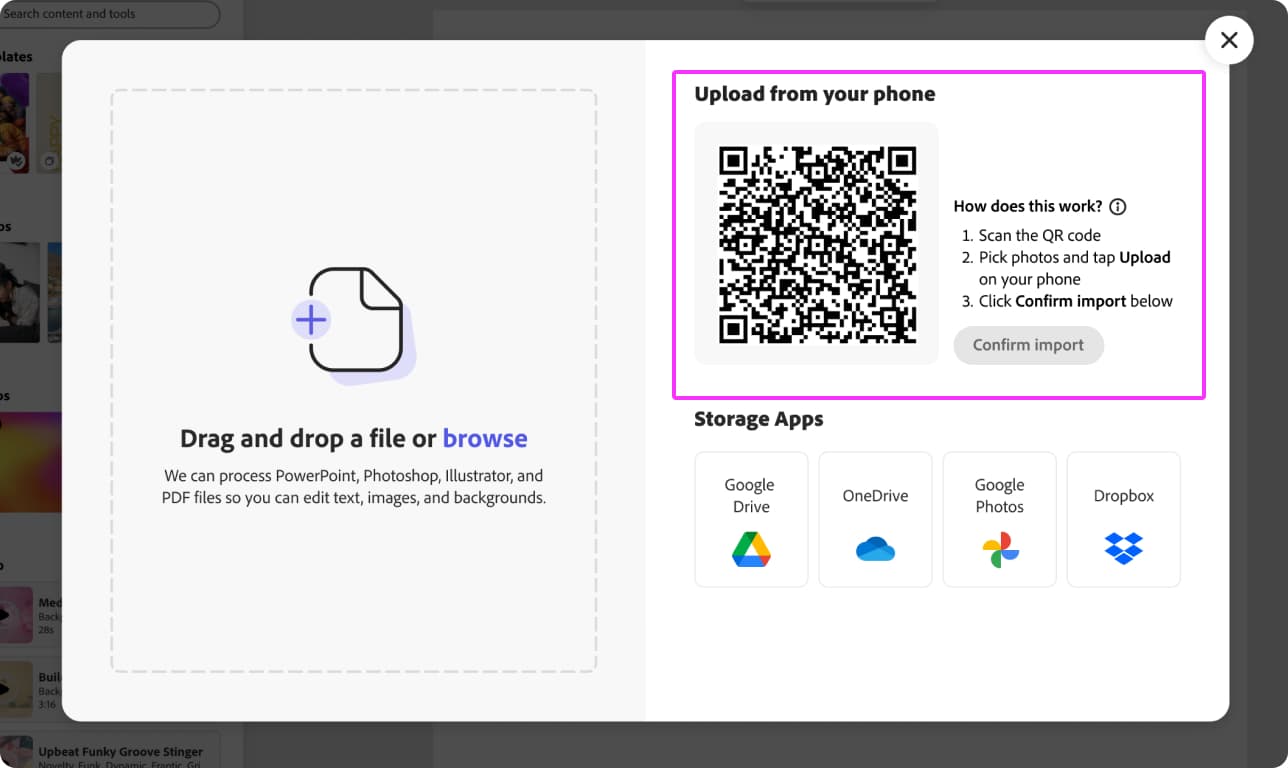
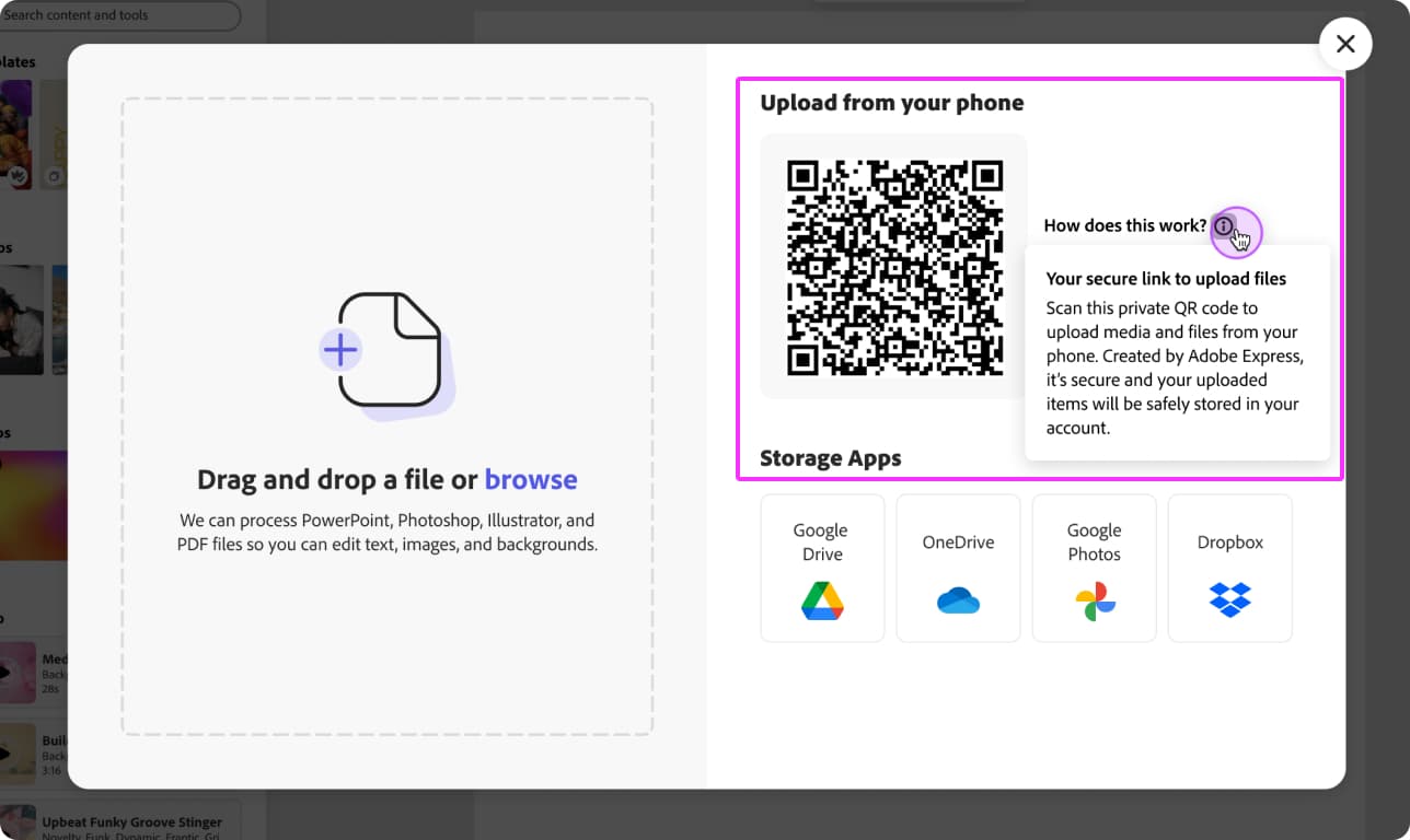
I redesigned the QR section when we run the same test in Editor, with clearer instructions and relaunched by November 25; the Editor version went live December 16 with the update. The relaunch confirmed the diagnosis: the confirmation CTA, not the concept, was the friction point.
Results
This content is protected
Outcomes, metric tables, and what this unlocked beyond the test are behind the password — contact Lisa if you'd like access.
Up Next:
Looked, liked, loved it?
Let's talk.