
Institutional website redesign
UC San Diego Main Website Redesign
Overview
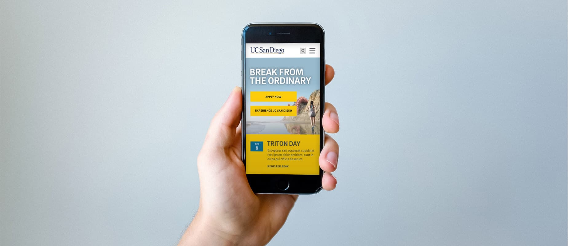
We partnered with UC San Diego to redesign the campus website with a user-centric approach. Prospective students treat the institutional site as a primary information source — getting them to the right content quickly was the brief.
A campus website is a wayfinding problem at institutional scale. The redesign was not visual polish for its own sake; it had to help people find the page they came for, and stay long enough to use it.
Design
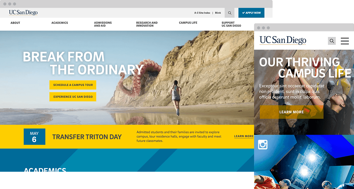
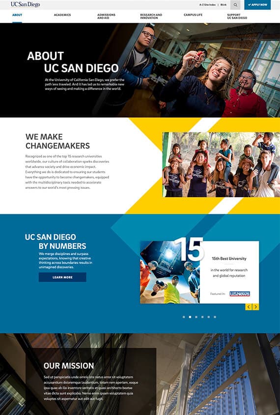
Collaborating with the brand team, we established the new look and tone. The trident shape became an iconic figure, and authentic lifestyle photography carried the student story — letting campus life do the heavy lifting instead of stock polish.
Landing pages & templates
Handoff
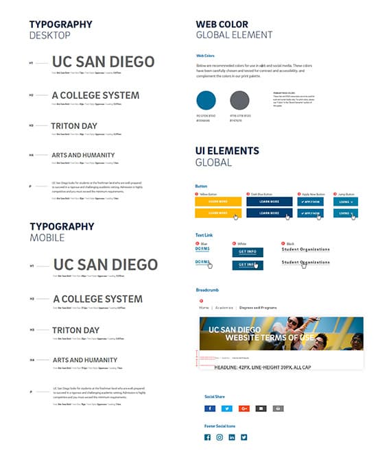
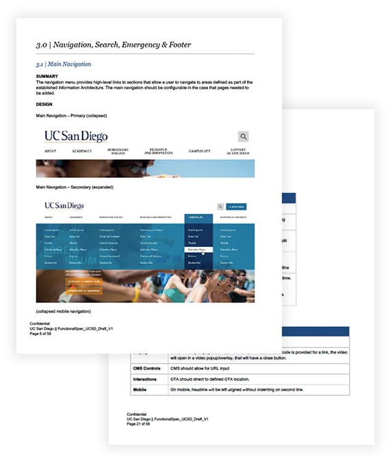
Handing designs to UC San Diego IT was a core part of the project. Our strategist, lead developer, and I worked closely with IT so front-end handoff and back-end implementation stayed aligned — through a detailed style guide, functional specifications, and multiple prototypes.
Style guide
Functional specification
Results
After launch, people found information more easily and moved into deeper content. Two outcomes we can stand behind from the project record:
+150%
Page views
−61%
Bounce rate
A third legacy graphic mixed “time on site” and “exit rate” labels — left out here until we confirm the real number in QA.
Supporting work: Break Things Better
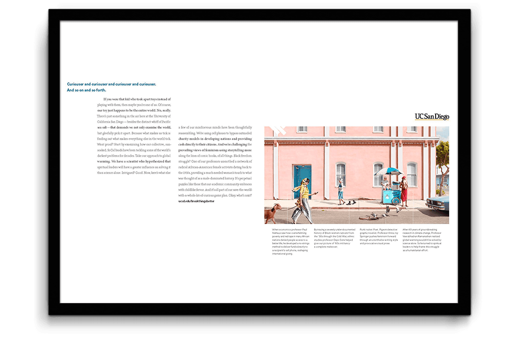
Alongside the main site, we built the Break Things Better campaign hub — a paid-media destination meant to inspire top-caliber students to make UC San Diego their #1 pick. The university’s identity as a community of breakers and makers needed an engaging, educational story experience, not a static landing page.
Role: Art Direction, Design, UX, Front-end Direction (2016).
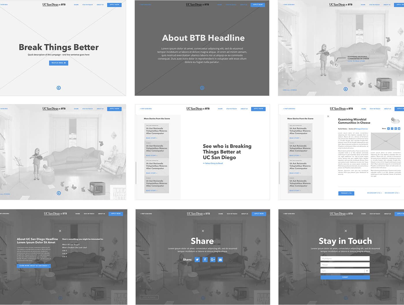
UX / UI approach
Traditional media used an Easter-egg hunt feel. The digital hub kept that spirit while making the landing experience more dynamic and conversion-minded — seasonal CTAs (Apply Now, Check Status, Explore Your Future), first-visit instruction modals, hotspot stories, and cross-links into schools and programs.
Up Next:
Looked, liked, loved it?
Let's talk.