
Logged Out Editor A/B test: Give Them a Reason to Sign In
- Status
- Win → Infrastructure Gap
- Timeframe
- Feb 2025
- Role
- Design Lead
- Company
- Adobe
Context
Adobe Express grouped Japan, Germany, France, and the UK together as Tier 1 markets — the highest-priority international segment. The logic was market size. But market size doesn't tell you how people learn, trust, or decide to adopt a new product.
This test started as a conversion optimization experiment. It ended as an argument for rethinking how Adobe Express approaches international growth entirely.
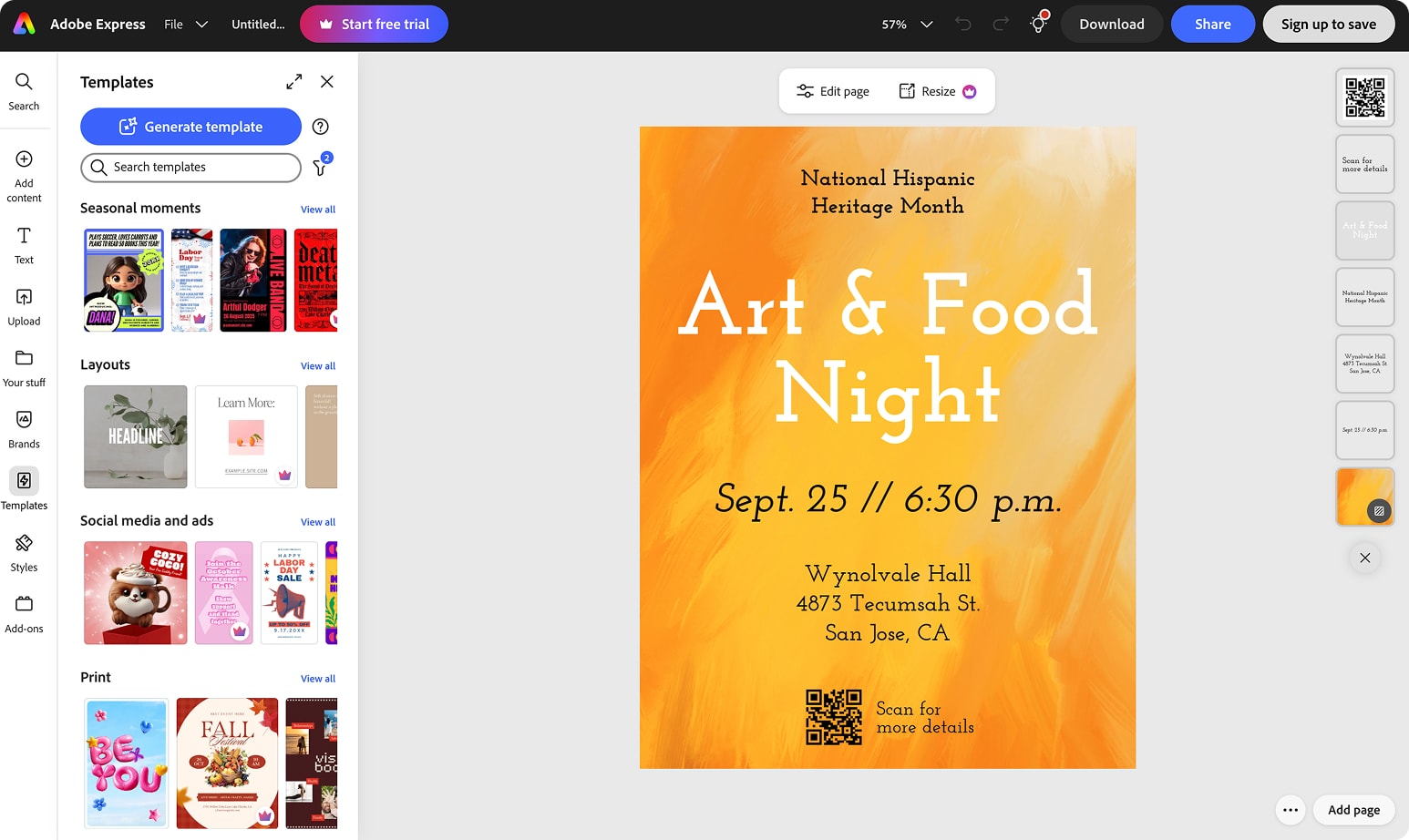
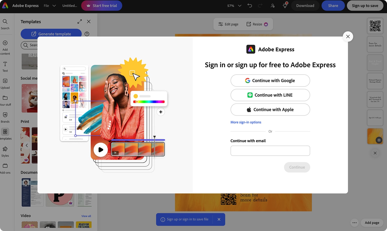
The test centered on SUSI (Sign Up, Sign In), the nudge that pushed Adobe Express's Logged Out Editor (LOE) users — especially net-new users without an Adobe account — to sign up, by teasing the features they'd unlock once they signed up or logged back in, through our optimized version of Express's LOE.
The test ran across the same markets — Japan, Germany, France, and WW English, excluding US and UK — but tested two different hypotheses about what would actually move the needle. International PLG's variant (V1) bet that culturalized, localized experiences would lift conversion. The US PLG team's variant (V2) bet that reducing friction — fewer sign-up blockers, a simpler path — was the bigger lever. Two teams converging on the same conversion problem from different philosophies.
Problem
JP, DE, and FR shared a common problem: First Time Authentication rates sitting at 13–15%, compared to 21–42% in markets like the UK, Brazil, and India. Users were exploring Express in the logged-out editor but not converting to sign-up.
The hypothesis: if we showed users what they'd get after signing up — while they were already experiencing the product's value — they'd feel more confident taking that step. Rather than interrupting with a sign-up prompt at the moment of export, we'd surface the value of signing in throughout the exploration itself.
The decisions
V1 — International PLG: culturalize and tease
I led design execution on this variant, working closely with our PM. Alongside our researcher, I pushed to place the SUSI nudge during active feature exploration — not at the Share or Download moment — because that's where users were already discovering what Express could do for them.
Rather than hiding what wasn't available to logged-out users, our bet was to tease it: show users specifically what they'd unlock once they signed up, while they were already in the middle of exploring — and localize that experience for JP, DE, and FR to test whether culturalization itself could move conversion.
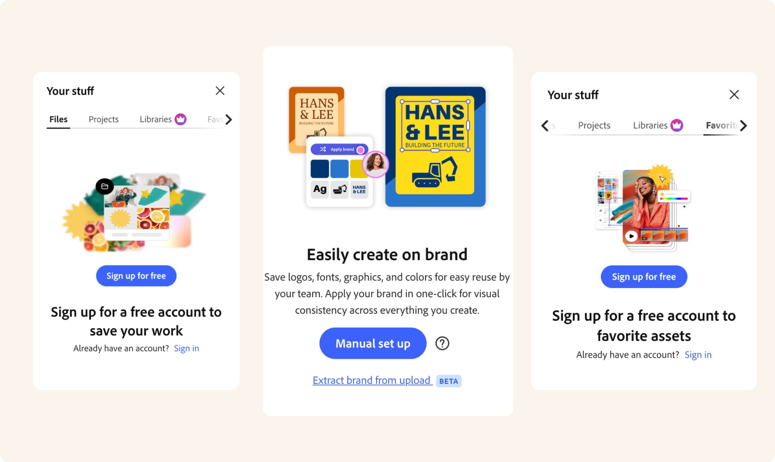
In the control experience, following features existed behind the sign-up wall entirely invisible — users saw a generic callout and graphic prompting sign-up, with no way to learn what they'd actually get. We designed three "demo" panels that showed the real feature in action, so users could weigh the specific value before deciding to sign up.
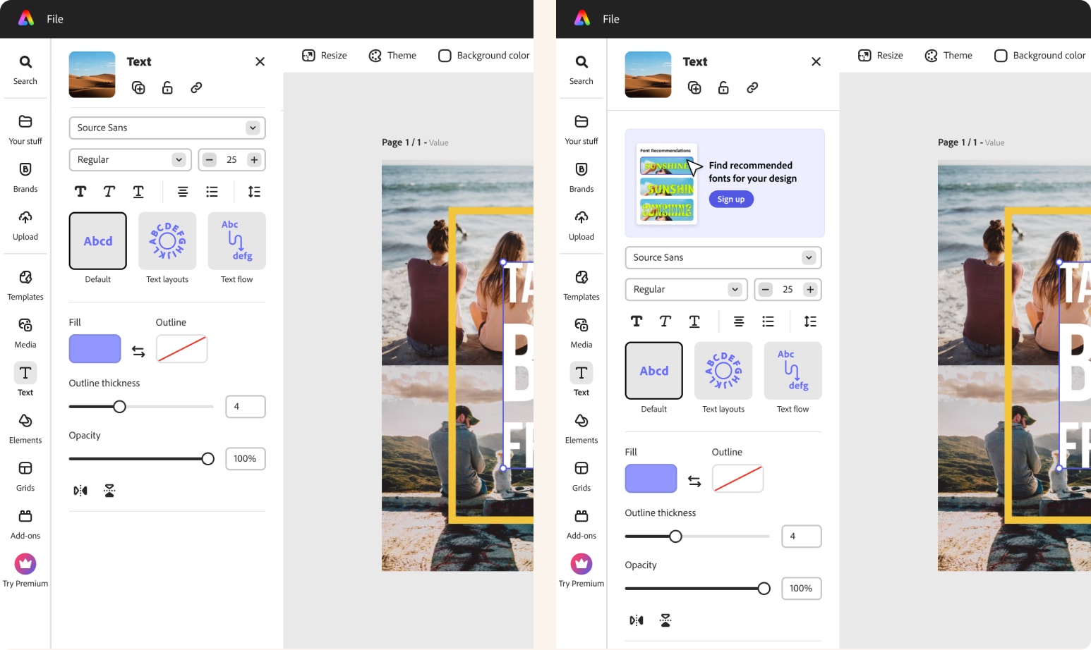
1. Font recommendation panel
Editing text is one of the most interacted-with features in the app. We surfaced a demo of Express's font recommendation feature — which reads the context of a design and suggests fonts based on language and layout, a genuinely useful capability for non-designers — to nudge sign-up around a feature users would immediately recognize as valuable.
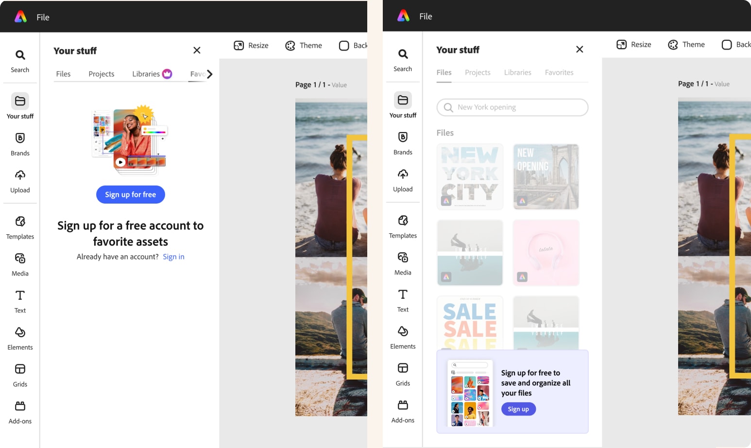
2. Your Stuff panel
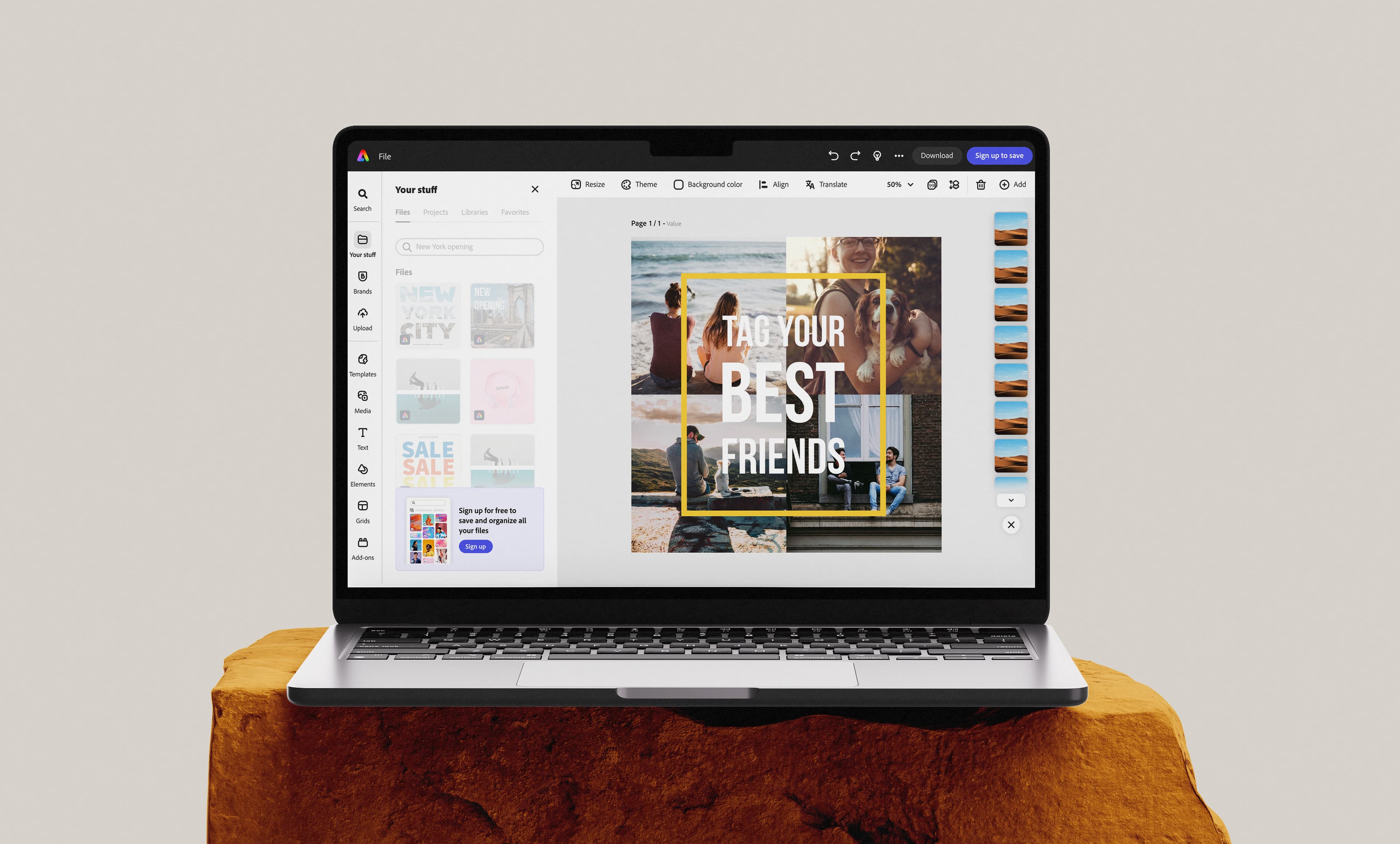
In control, this was just a callout and graphic saying "Sign up for a free account to save your work" — no context for what that experience actually looked like. We replaced it with a demo visual of the real Your Stuff panel post-login, so users could see what saving and returning to their work would actually feel like.
3. Brand panel
Control showed a callout and graphic saying "Easily create on brand," again without showing what that meant in practice. We designed a demo visual showing logo, font, color, and branded graphics living together in one panel — making the abstract promise of "on brand" concrete enough to nudge sign-up.
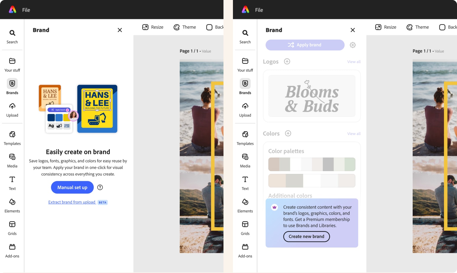
All three panels were rendered as a grayed-out state to signal availability without enabling interaction. When engineering flagged that building true UI states would be too resource-intensive, we solved it together: a grayed-out JPEG in place of live UI, indistinguishable in feel from the real thing.
I also designed and culturalized translated versions of each panel for DE and FR — making sure the unavailable state felt locally real, not like a placeholder.
V2 — US PLG: reduce friction
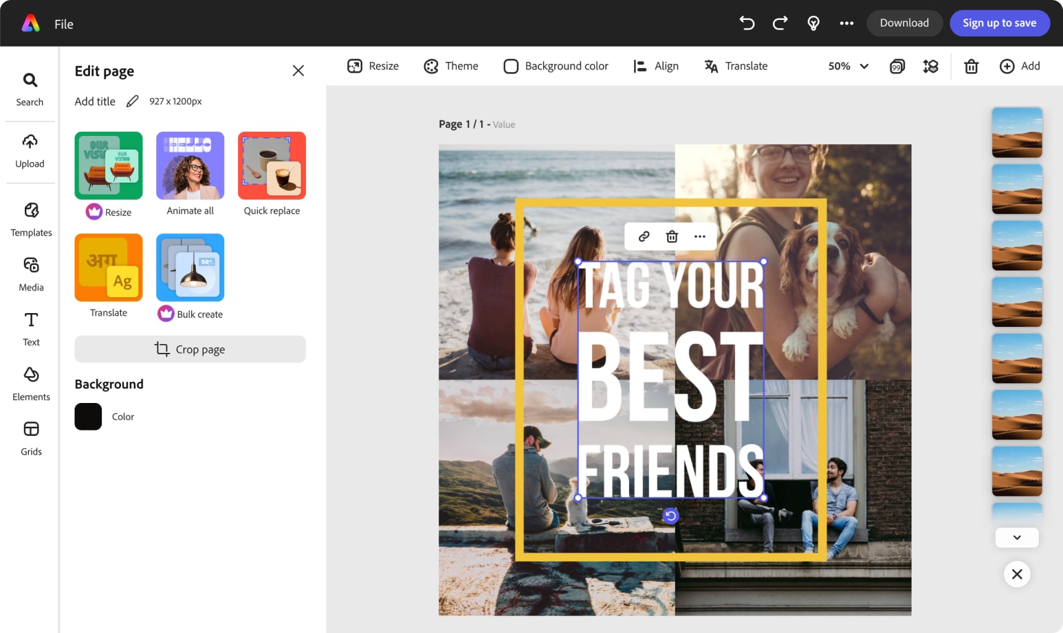
Running in parallel, the US PLG team bet that the bigger lever wasn't showing more value — it was removing friction. If certain features weren't available to LOE users yet, why show them at all?
V2 simplified the left navigation, hiding Your Stuff, Brand, and Addons entirely rather than teasing them. It also simplified the top navigation down to two CTAs — Download and Sign Up to Save — since sharing required signing in anyway.
Results
This content is protected
Outcomes, metric tables, and what this unlocked beyond the test are behind the password — contact Lisa if you'd like access.
Up Next:
Looked, liked, loved it?
Let's talk.