
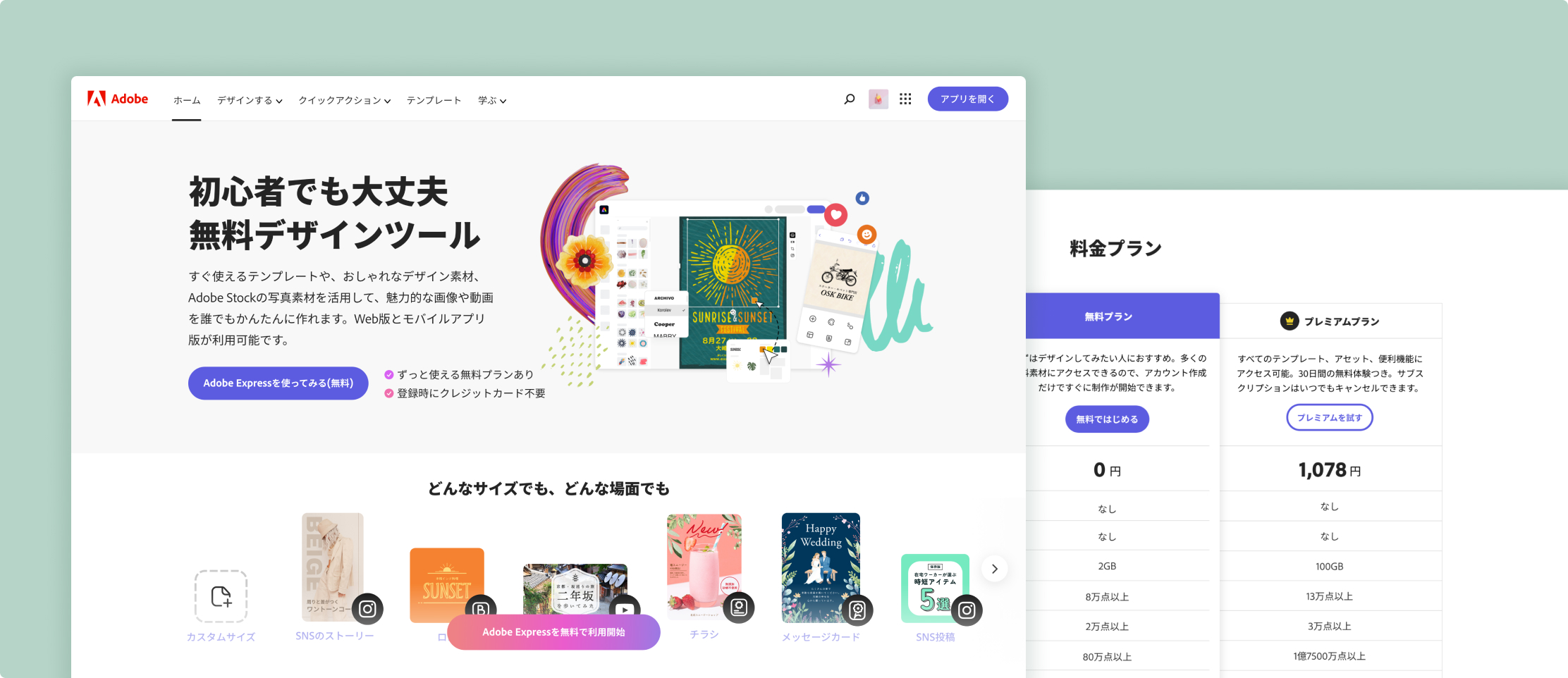
Japan Homepage Redesign
Not a translation, a rebuild for how Japanese users decide
Adobe Express's Japan homepage was simply a translation of the US page, and it ranked lowest of six markets on landing-page click-through and new registrations. I led the redesign around one finding from user research: Japanese visitors want proof before they try something, even when it's free. Through the redesign and the A/B test, we wanted to show HQ the bigger picture: if we commit to culturalizing key markets' homepages, we can really move the needle.
Overview
- Role
- Design Lead
- Scope
- UX strategy
UI/UX design
Japanese copywriting - Team
- International PLG team
- Test Details
- June to August 2023 (6w A/B test)
Desktop and Mobile web
adobe.com/jp/express
50/50 split
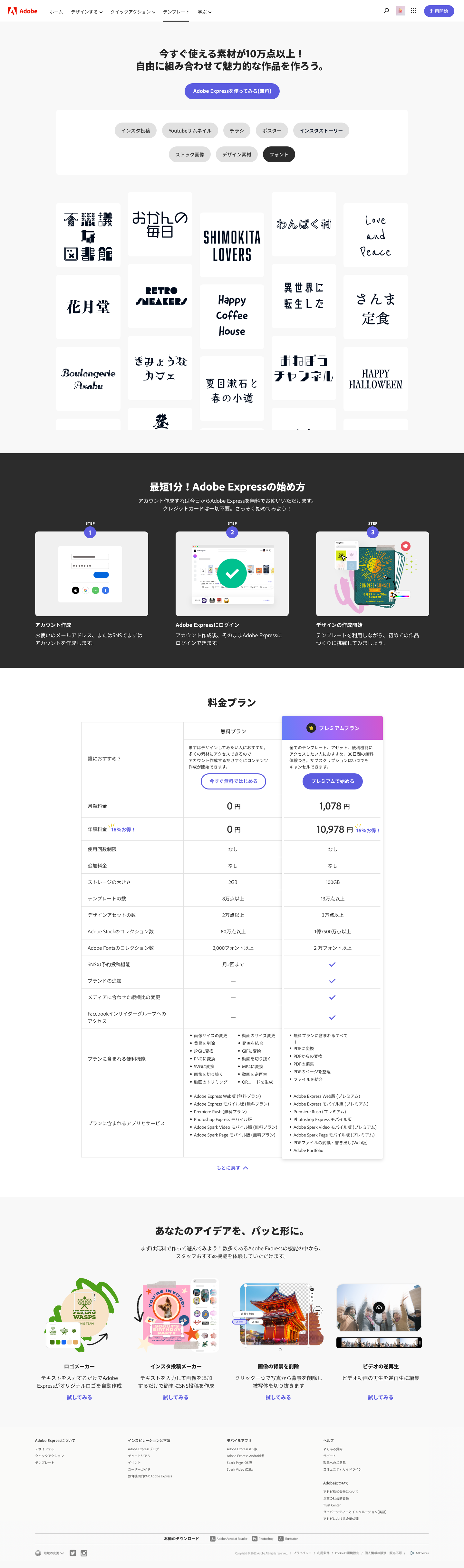
Redesigned homepage — full-page scroll
The Challenge
Benchmarked on desktop web against five other markets, the localized Japan page ranked last on both landing-page CTR and new registrations. Japan's registration rate was roughly half the US rate. Japan didn't need a shorter homepage, it needed a more convincing one.
| Market | Landing page CTR | New registration % of NUV |
|---|---|---|
| Japan | 56% | 15.1% |
| US | 63% | 27.9% |
| UK | 73% | 20.8% |
| Germany | 65% | 17.3% |
| France | 60% | 20.0% |
| India | 67% | 26.8% |
Impact
In a 6-week A/B test against the control, more visitors tried the product and stayed longer. Our redesign performed much better.
+10.4%
Free MAU
+15.3%
NUV to MAU
+17%
Overall page CTR
Note: Registrations dipped 5.3%. That was the tradeoff, and the Outcome section explains it.
Discovery
The data showed Japanese visitors weren't converting. Our researchers' interviews showed why.
Free still feels like a commitment
Japanese visitors want to fully understand an offering before signing up, even a free one
The pages didn't give enough to judge
Many also assumed Express was a tool for creative pros
“No credit card required” backfired
It suggested a card would be needed eventually
Fonts, tutorials, longer pages
Japanese users lean on type features, seek out tutorials (textbooks included) and don't bail on a longer page if the content is useful.
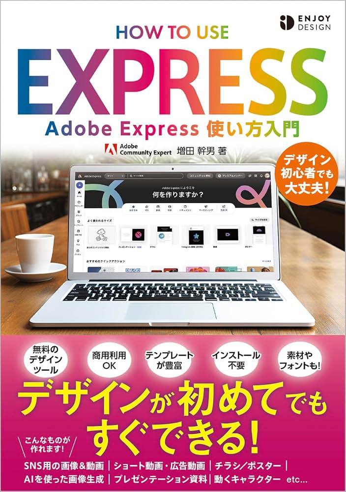
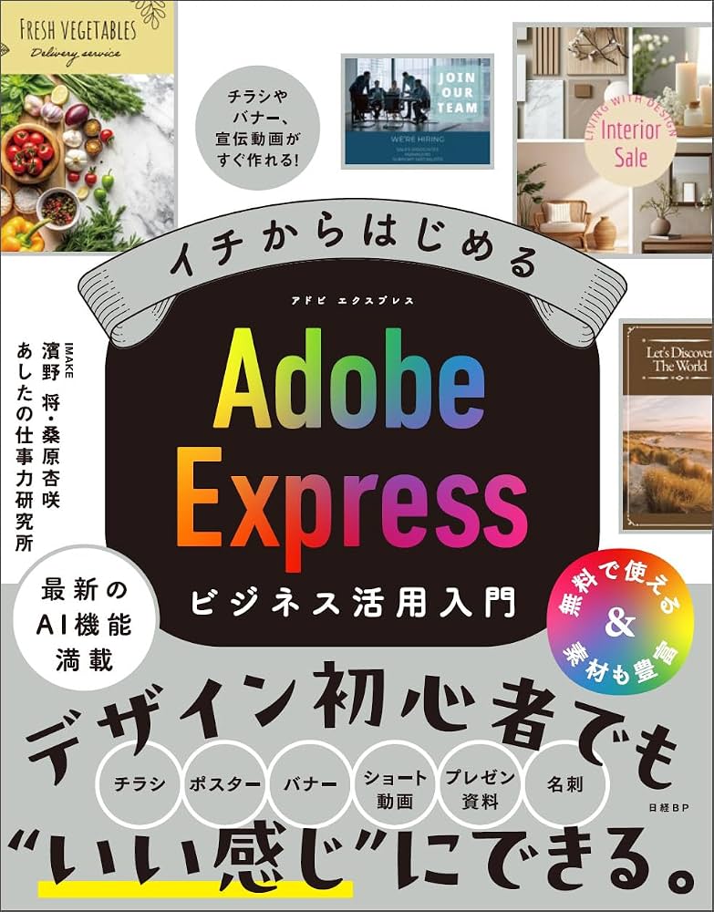
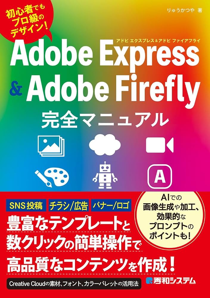
Examples of Adobe Express textbooks
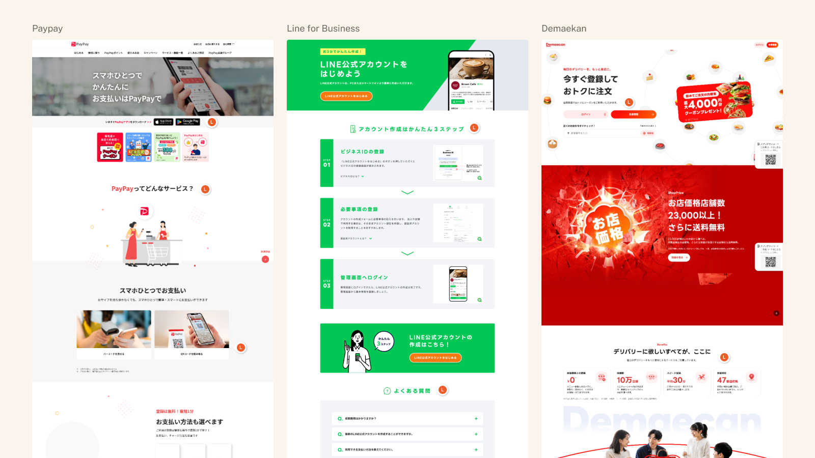
I also studied how domestic companies such as PayPay, LINE Official Account and Demaecan introduce new services, which shaped the page's structure.
Every visitor should leave able to answer three questions:
- What is Adobe Express?
- What's in it for me?
- What's the difference between Free and Premium?
The US page already answered them, but not clearly enough for Japanese visitors.
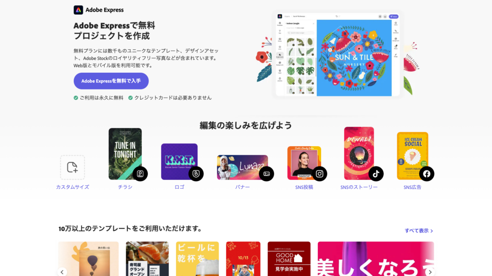
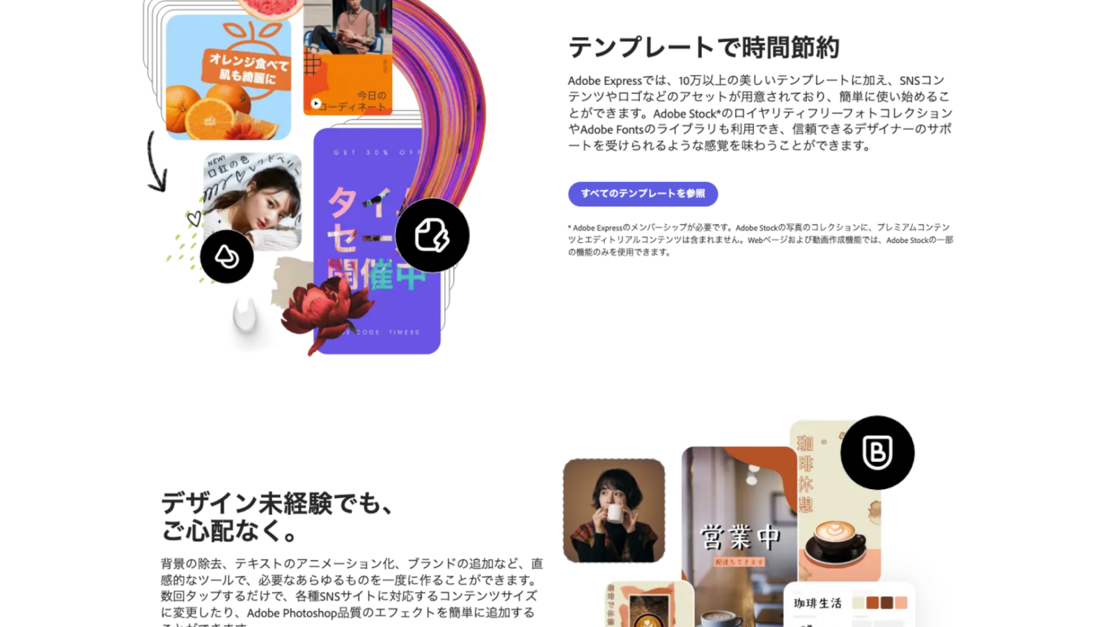
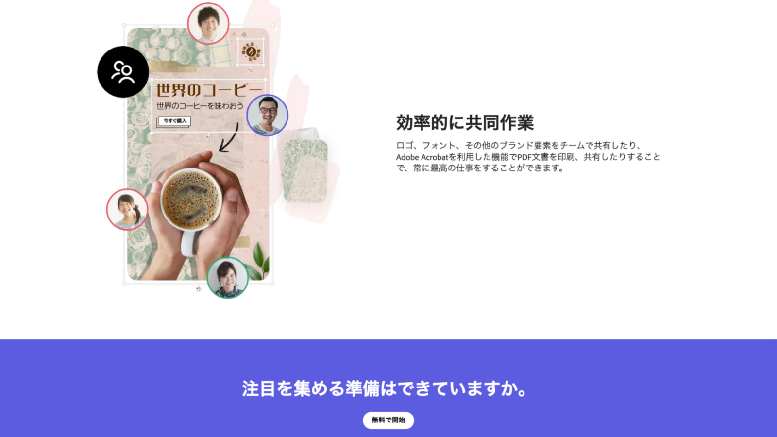
Auditing the control experience
Working with a researcher, Japan's PMM, we audited the existing experience, marking what is not working with Japanese audiences.
Design approach
We made two bets.
Japanese visitors don't need faster persuasion. They need enough proof to trust the offer.
As the Acquisition team, we wanted visitors to hit an aha moment first by trying a Quick Action, betting it would lead them to register later. Free MAU became our leading indicator, even when visitors didn't register.
We tested the bigger idea first, then used what we learned to finalize the version we shipped.
Iteration #1: a “rich assets” concept, tested qualitatively (Feb 2023)
A home that showcased available templates, design assets and fonts, with linked example pages. It was too heavy to code and added too many variables to read cleanly in a live test, so we ran it as a qualitative community study with our research team.
Research methodology
- Pop-up community research
- 127 participants (49%M, 51%F)
- All Japanese native residents
- Run for 7 days
- Unmoderated
- Age group (18-55)

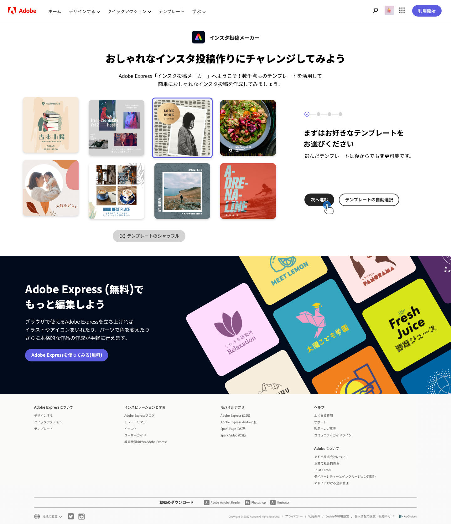
Results
75% out of 127 participants agreed what they learned about Adobe Express motivated them to sign up to use it
A feature comparison table between free and premium offers was a big win
The tagline on the marquee resonated with users and users also understood that they are not going to be charged.
The “rich assets” feature area and the linked pages showing asset examples played a role in communicating the product value
Participants were intrigued by the Quick Actions & Mini Editors. Background removal was a star attraction.
FAQ and Mobile App areas delighted users to understand Express support multi-surface and no need to install.
Users felt the amount of text was too much
Need stronger benefits of the app to be shown in order to perk their interests
Iteration #2: finalized from those findings and tested live
Working within the Acquisition team's component constraints, I redesigned the whole homepage experience as a longer, proof-first page that answers the visitor's questions in order: the product, the sign-up steps, the plan comparison and the FAQ. It was the version we could ship and measure cleanly.

Key decisions
1. Say what it is, not what it isn't
“No credit card required” made visitors feel a card would be needed later, so I removed it. The hero now says ずっと使える無料プラン (“a free plan you can use forever”) and makes it clear from the start that this is for non-designers (初心者でも大丈夫, “beginners welcome”).
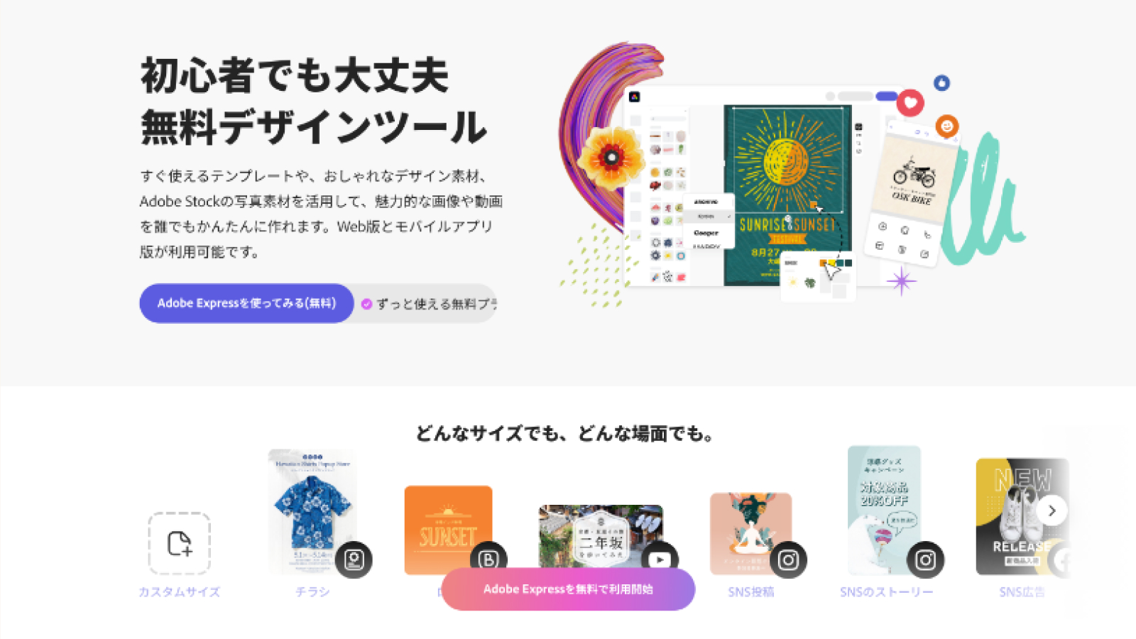
2. Write in Japanese, don't translate
I wrote the copy natively so it reads naturally, and used Japan-specific culturalized content for every template graphic.
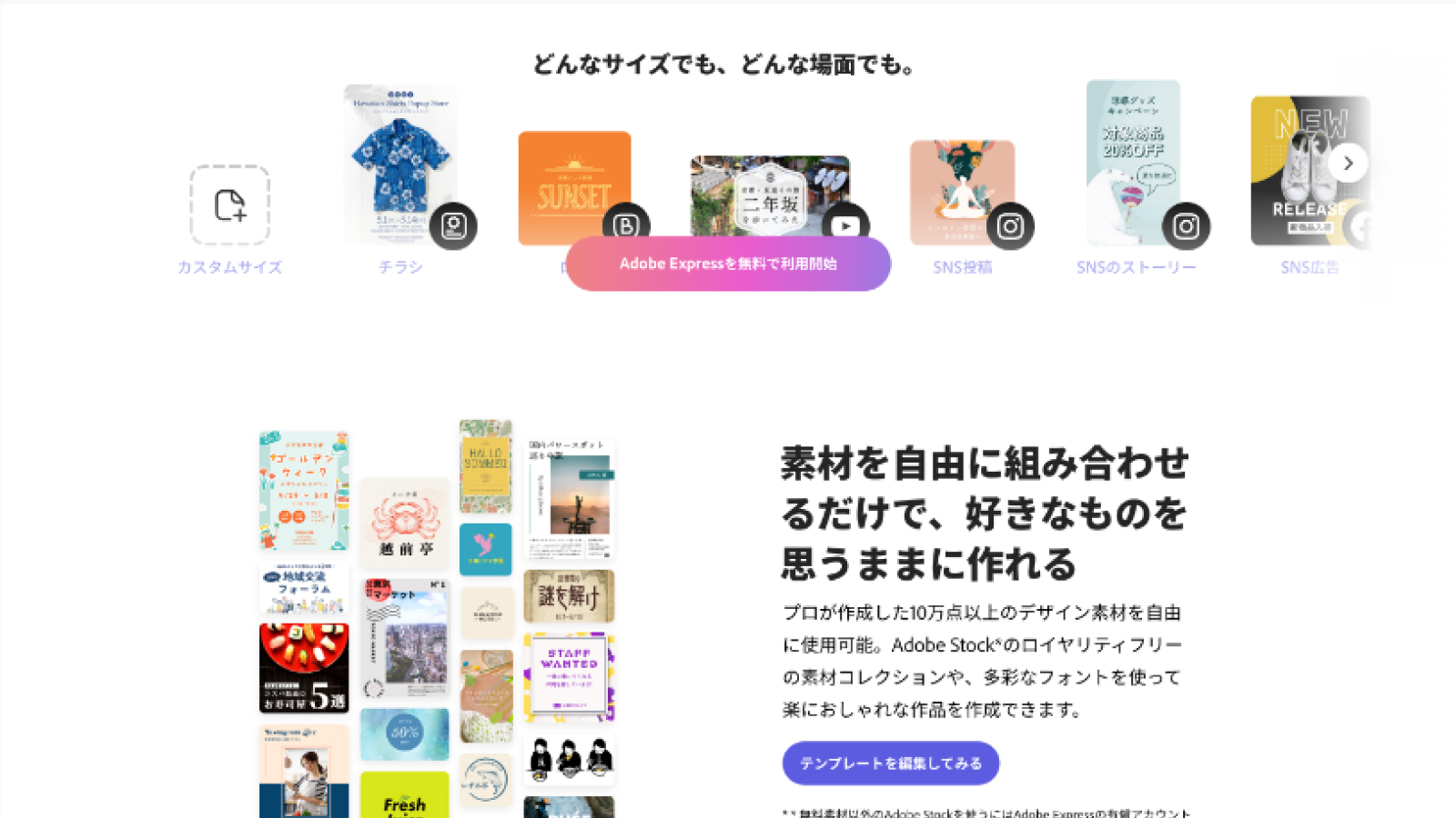
3. Make the free tools impossible to miss
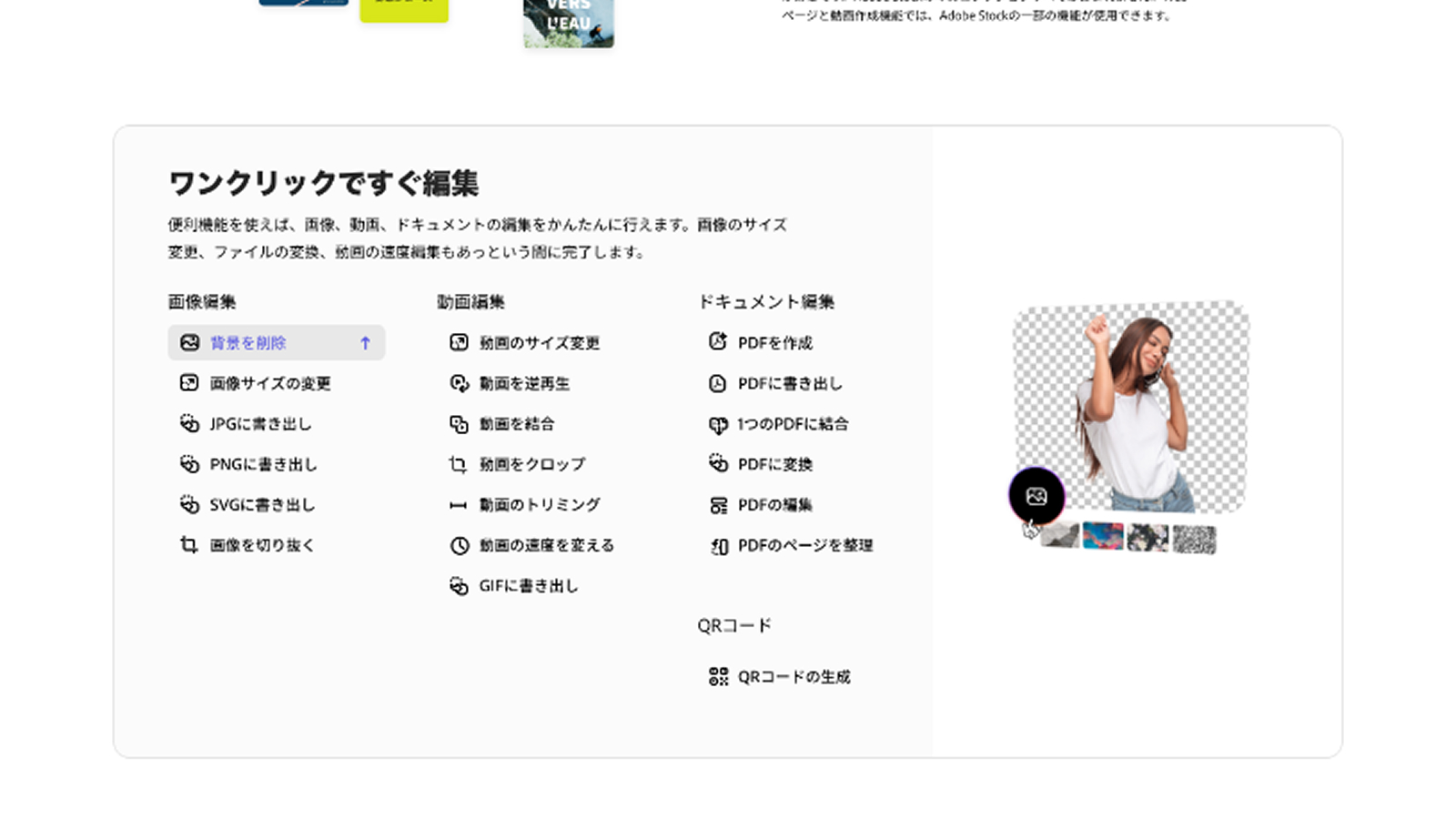
The ワンクリックですぐ編集 (“edit in one click”) module surfaced Quick Actions, which were already open without an account, so visitors could try real value before registering. The test readout credits the first half of the page, including the quick action panel, for the +17% rise in overall CTR.
4. Show how easy it is in different ways
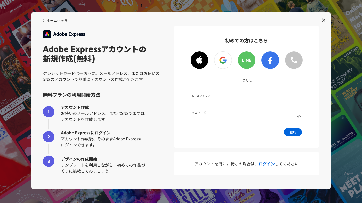
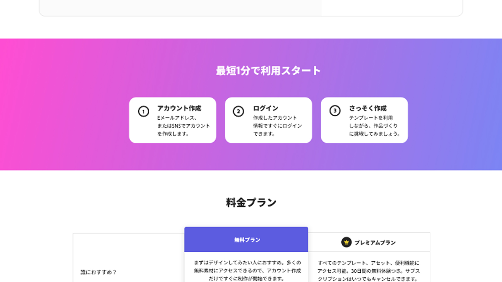
Ease of use and ease of getting started appear in many places and ways, such as the hero, the one-click editing section and the three-step sign-up section right below it.
5. Answer the questions before they're asked
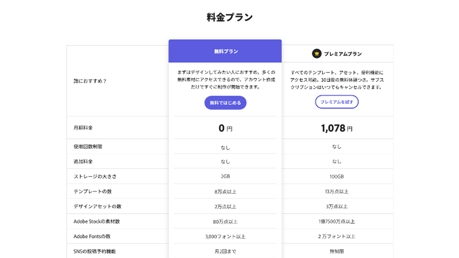
A side-by-side Free vs. Premium table and an FAQ. The table sat low on the page, yet its engagement was comparable to the marquee.
6. Give learners a door
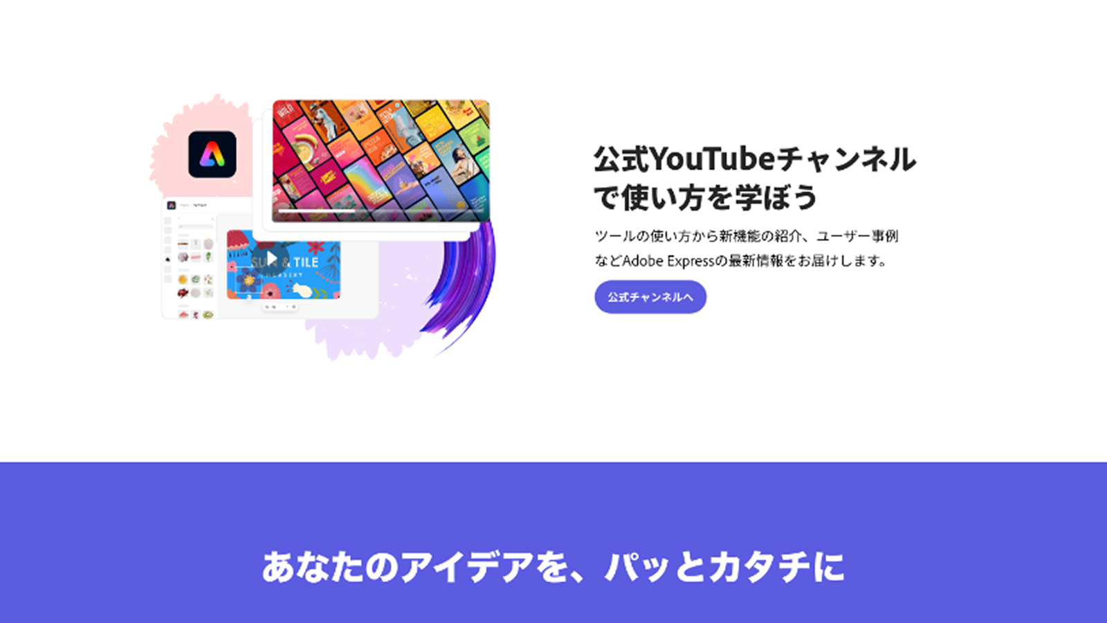
A clear jump point to the official YouTube channel serves the tutorial-seeking behavior the research surfaced.
Outcome
More people entered the product, and the new-user conversion lifted most. The cost was fewer registrations.
| Metric | Control | Variant | Lift |
|---|---|---|---|
| Free MAU | 41.6% | 45.9% | +10.4% |
| NUV to MAU | 29.5% | 34.0% | +15.3% |
| New user growth rate | 46.6% | 48.5% | +4.1% |
| Time spent on page | 1m 59s | 2m 21s | +18.2% |
| Overall page CTR | — | — | +17% |
| Registration rate | 19.7% | 18.6% | -5.3% |
| Sign up / sign in rate | 42.1% | 41.9% | -0.5% |
| Bounce rate | 39.3% | 39.3% | 0% |
Lifts are relative. NUV to MAU is the share of new unique visitors who became monthly active users.
Free MAU rose because more visitors used free tools, not because more of them registered. That was the bet: someone who tries a Quick Action (free quick editing tools) is a stronger signal than someone who leaves.
The cost showed up in registrations. With more content in the body of the page, traffic spread away from the top-of-page Sign Up/Sign in and global nav paths that drove registration in the original, and visitors could get value without an account. The test didn't measure whether Quick Actions users registered later.
Beyond the page: the price comparison table style was later adopted by Adobe's worldwide sites.
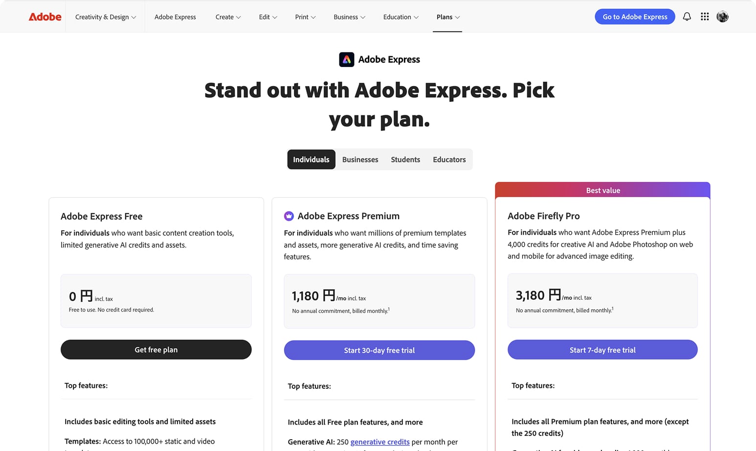
The price comparison table style was later adapted by the full site
Reflection
Data tells you what. Research tells you why.
The numbers showed Japanese visitors weren't converting. Only the research explained why, and that is what shaped the redesign. Foundational qualitative research is what makes culturalization possible.
Every design trades something
The richer page won on the metric we set (Free MAU) but pulled attention from the sign-up paths. The open question is whether Quick Actions users convert later. That is the second half of the bet.
Customization moves the needle
This project gave the International PLG team evidence that deep, per-market customization is necessary for growth in markets like Japan.
The open problem is operational
If we customize in depth per region, how do we keep every country consistent with the US on brand, product message and promotions? The content architecture has to flex per market without fragmenting the product story. We still need to figure out how to operate that.
Up Next:
Looked, liked, loved it?
Let's talk.