
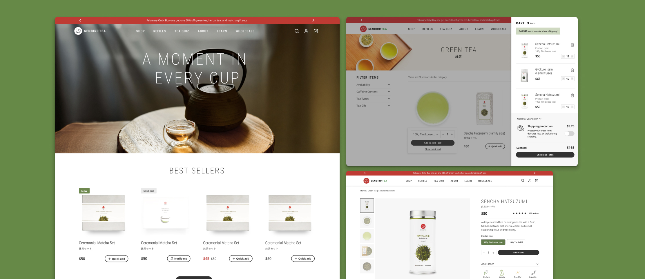
Refreshing Senbird Tea by rebuilding the UI as a token-driven system
- Client
- Senbird Tea
- Timeframe
- 2025
- Role
- Art Director / Product Designer
- Tools
- Figma (variables)
Context
I originally designed and built the Senbird Tea ecommerce experience years ago in Adobe XD. The live site still reflects that earlier foundation. When the client asked for a visual refresh, the brief could have been a page-by-page restyle.
Instead, I treated the refresh as a systems problem. I moved the work into Figma and started from scratch with variables for color, type, spacing, and radius, then rebuilt reusable components on top of those tokens. The goal was a new look that could scale across Home, PLP, PDP, and cart without redesigning each surface in isolation.
That tooling shift matters: Adobe XD shipped the original storefront; Figma variables became the token layer for a maintainable redesign direction.
Foundations
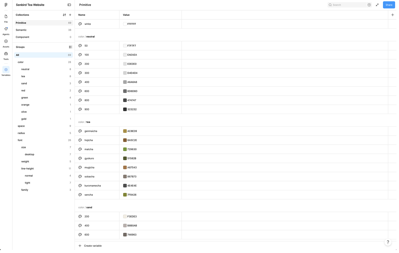
Tokens came first. Color, typography, spacing, and radius define the system before any component is drawn. Primitive values feed semantic roles so UI never hard-codes one-off decisions.
Figma variables
The shift from the earlier Adobe XD file was structural: rebuild the foundation in Figma as variables, named values components reference instead of one-off numbers on each frame. Color, type, spacing, and radius live there first; components inherit from that layer.
Color
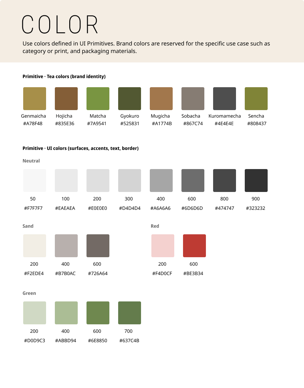
The palette splits primitives from semantic roles: text, surfaces, sale, feature, and status backgrounds. Contrast was checked against WCAG so critical text and key UI states stay readable on their intended surfaces, not just visually distinct.
Typography
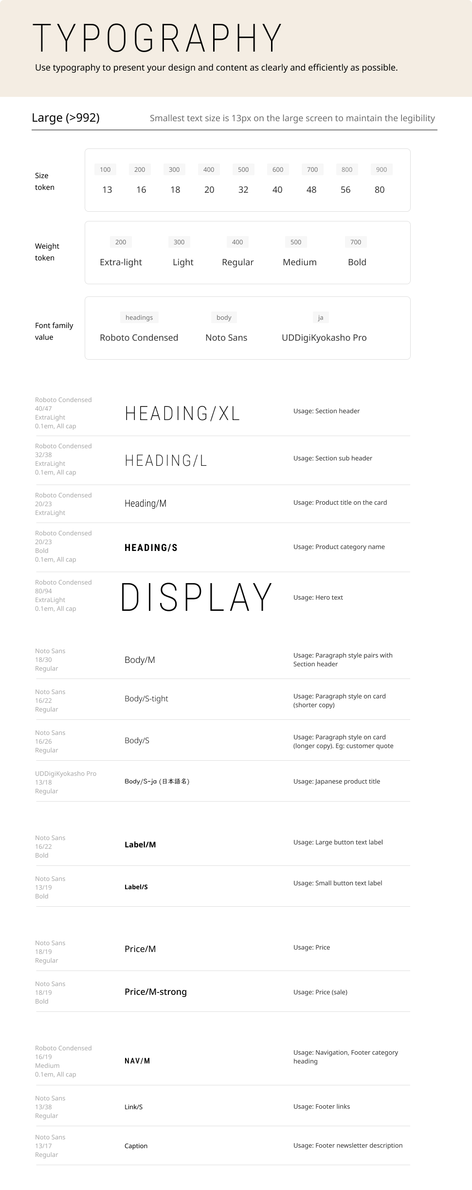
Two typefaces, two jobs. Roboto Condensed is the brand voice for heroes, section titles, and nav. Noto Sans is the UI typeface for product cards, cart, forms, labels, and dense panel copy. Styles are named by role (Display, Heading, Body, UI/Label, Price, Nav) so reading text and compact interface text stay distinct without inventing a new size for every surface.
Spacing
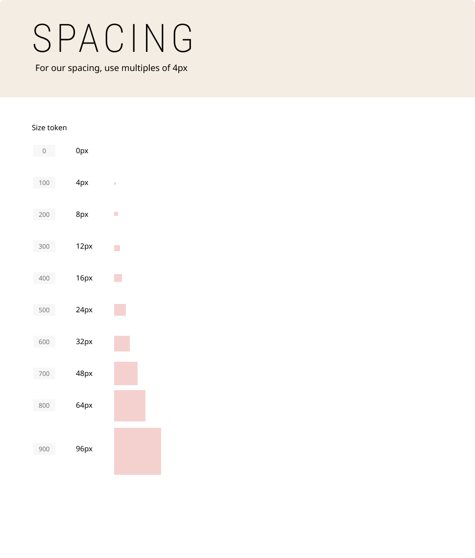
Spacing follows a consistent scale (multiples of 4) for padding, gaps, and section rhythm, so cards, drawers, and page layouts share the same breathing room instead of eyeballed margins.
Radius
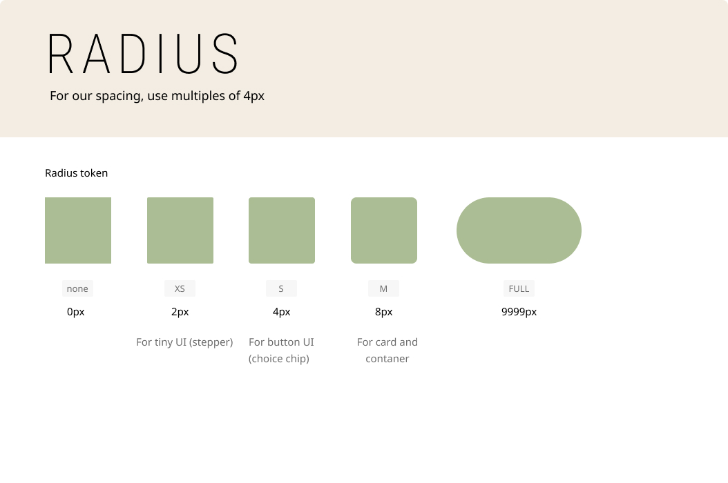
Corner radius is tokenized too, from sharp to full pill, so buttons, inputs, badges, and cards stay on one curve language.
Interaction primitives
With tokens defined, I built the smallest interactive pieces next. Buttons alone are table stakes. Filters and commerce controls mean PLP and cart share one language instead of one-off widgets.
Buttons
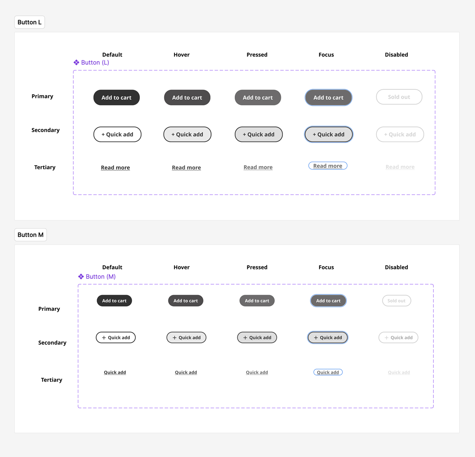
Primary, secondary, and tertiary across large and medium sizes, with default, hover, pressed, focus, and disabled, including focus treatment for accessibility.
Filters
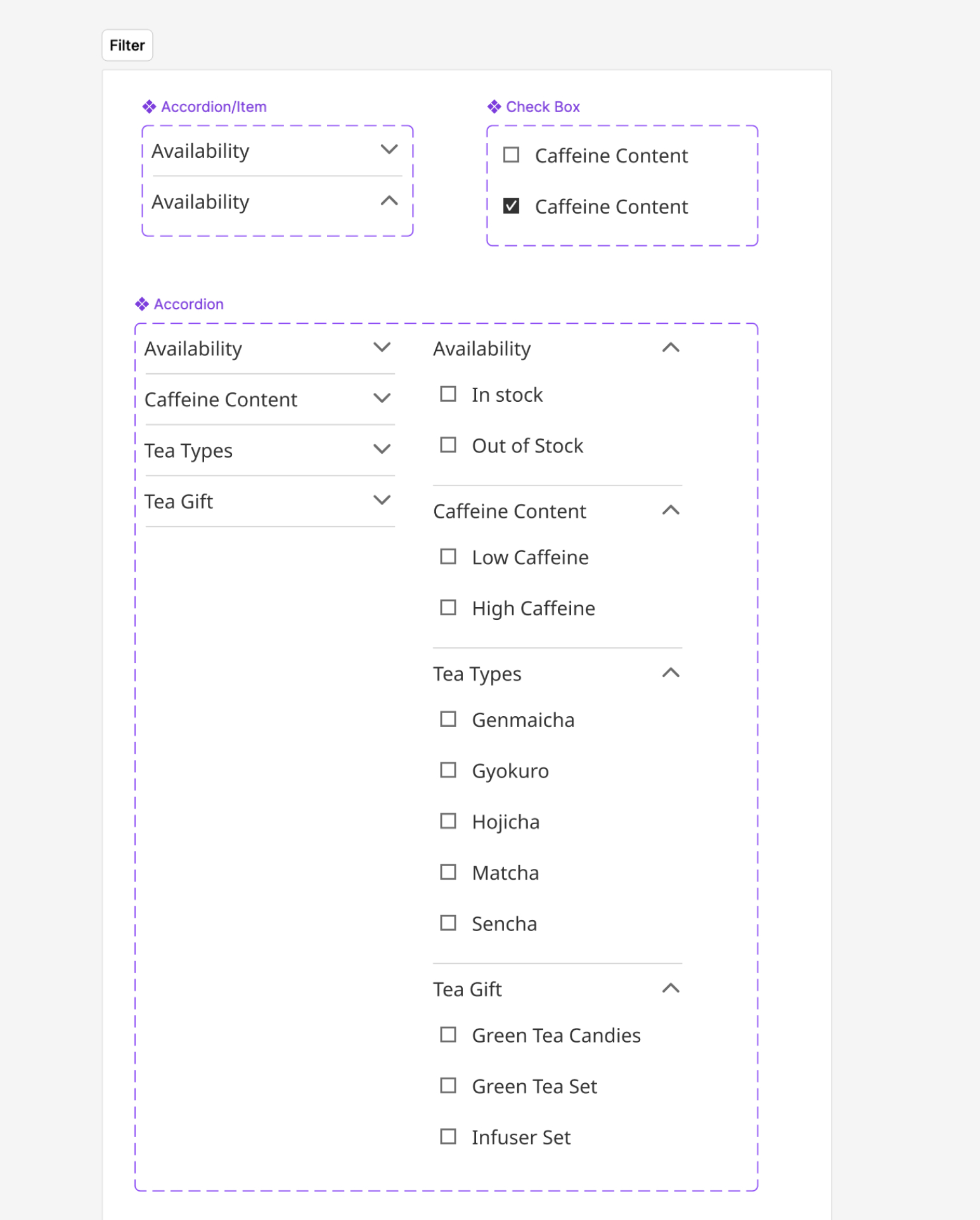
Accordion items and checkboxes compose the PLP filter sidebar as atoms with open/closed and checked/unchecked states, not a custom panel per category page.
Icons and badges
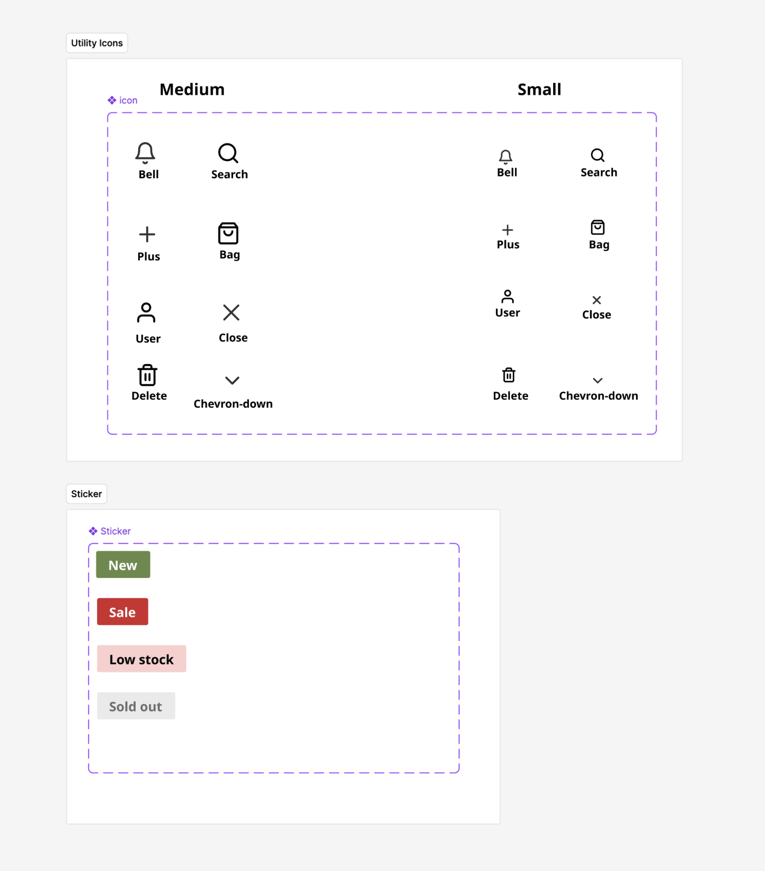
Utility icons and status stickers (new, sale, low stock, sold out) keep chrome and merchandising signals consistent across cards and panels.
Quantity stepper
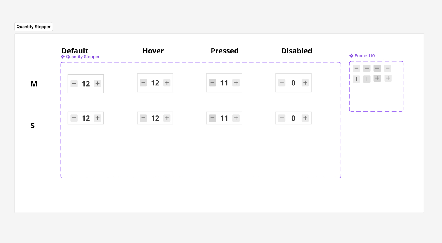
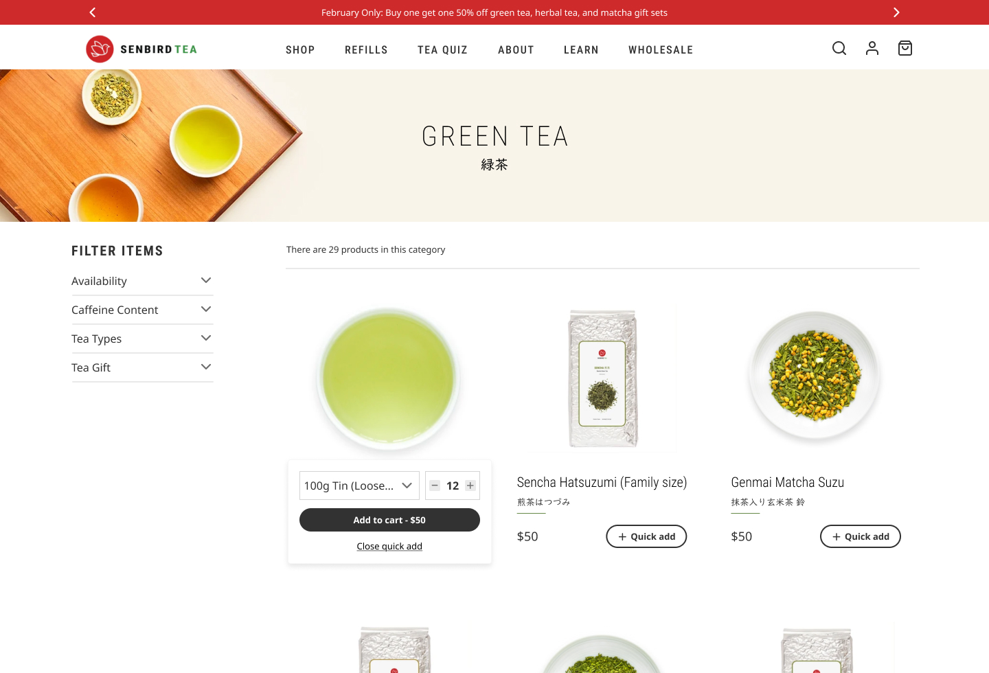
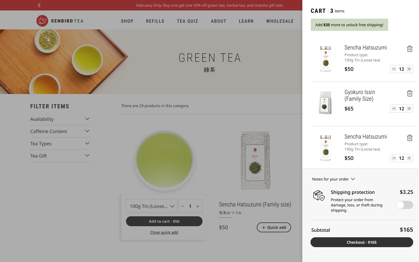
Quantity steppers cover medium and small sizes across default, hover, pressed, and disabled, and are reused in quick add, PDP, and cart. Choice chips and switches appear in the full designs below.
Components
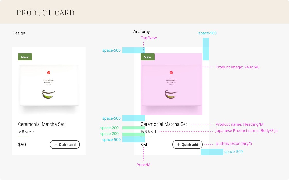
Primitives then compose into larger ecommerce molecules. The product card is the clearest example: named parts, spacing rhythm, and variants that absorb merchandising and inventory conditions without a new artboard for every SKU state.
Product card anatomy
Image, badge, title styles, price, and secondary action are assembled from the token and primitive layer, not drawn as a flat mockup.
State and status
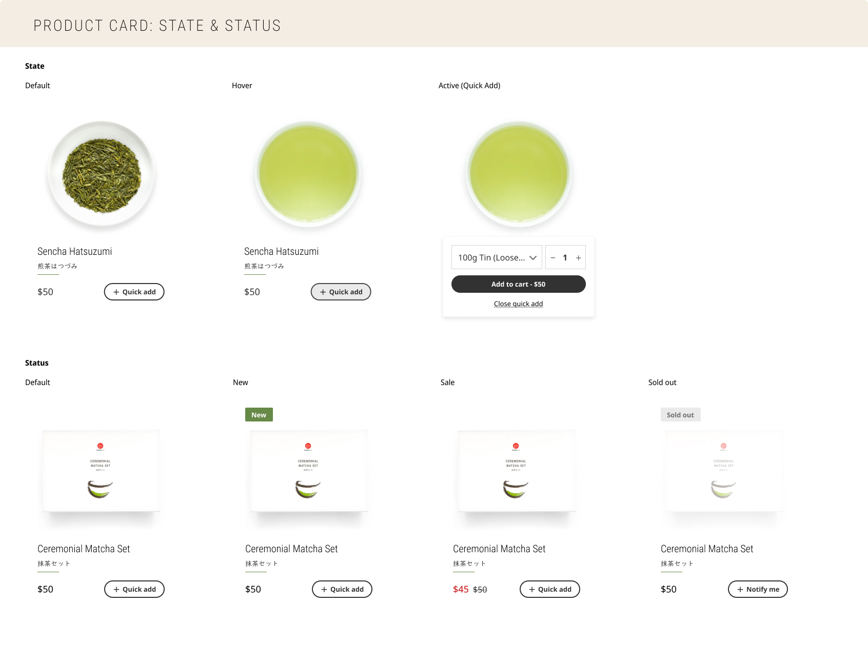
Interaction states and business statuses stay separate. Default, hover, and quick-add cover how shoppers engage. New, sold out, sale, and default cover how inventory and promotions change the same component.
Full designs
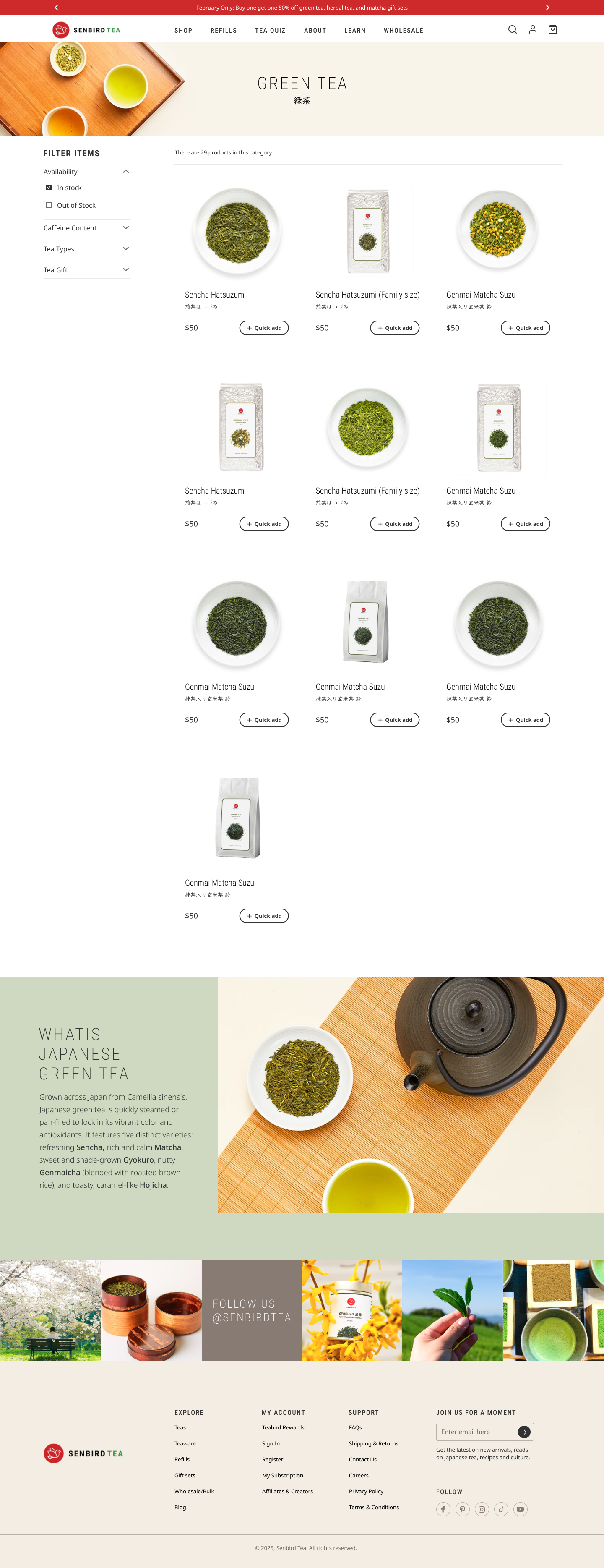
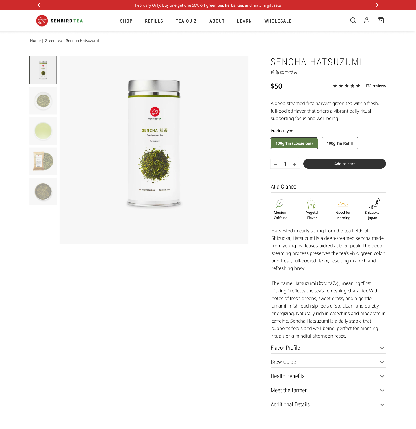
Tokens and components only matter when they hold up at page scale. These are the redesign surfaces, from Home through cart, built from the system above.
Home

Product listing
Product detail
Cart
Outcome
The refresh direction is no longer a set of disconnected screens. It is a token-driven foundation with reusable commerce components, ready to extend to new collections, promotions, and surfaces without reinventing the visual language each time.
For Senbird, that means consistency across the shopping journey. For me, it was a chance to move from an earlier Adobe XD page-design approach into Figma variables and atomic system work, executing a brand refresh while building something scalable.
Up Next:
Looked, liked, loved it?
Let's talk.