
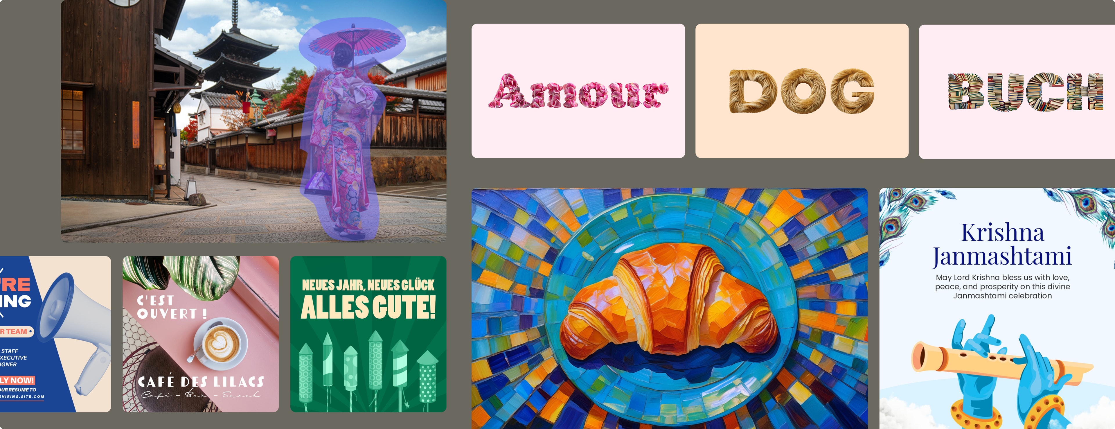
Culturalization is not localization:
four examples of how we made a product feel local
Culturalization vs Localization
Localization is mechanical. Swap the language, swap the currency, swap the stock photo of a white woman for a stock photo of a Japanese woman. Ship it.
Culturalization is something harder to define and much harder to get right. It's the difference between a product that reads in Japanese and a product that feels Japanese. Between a UI that has been translated and a UI that feels like it was made for you.
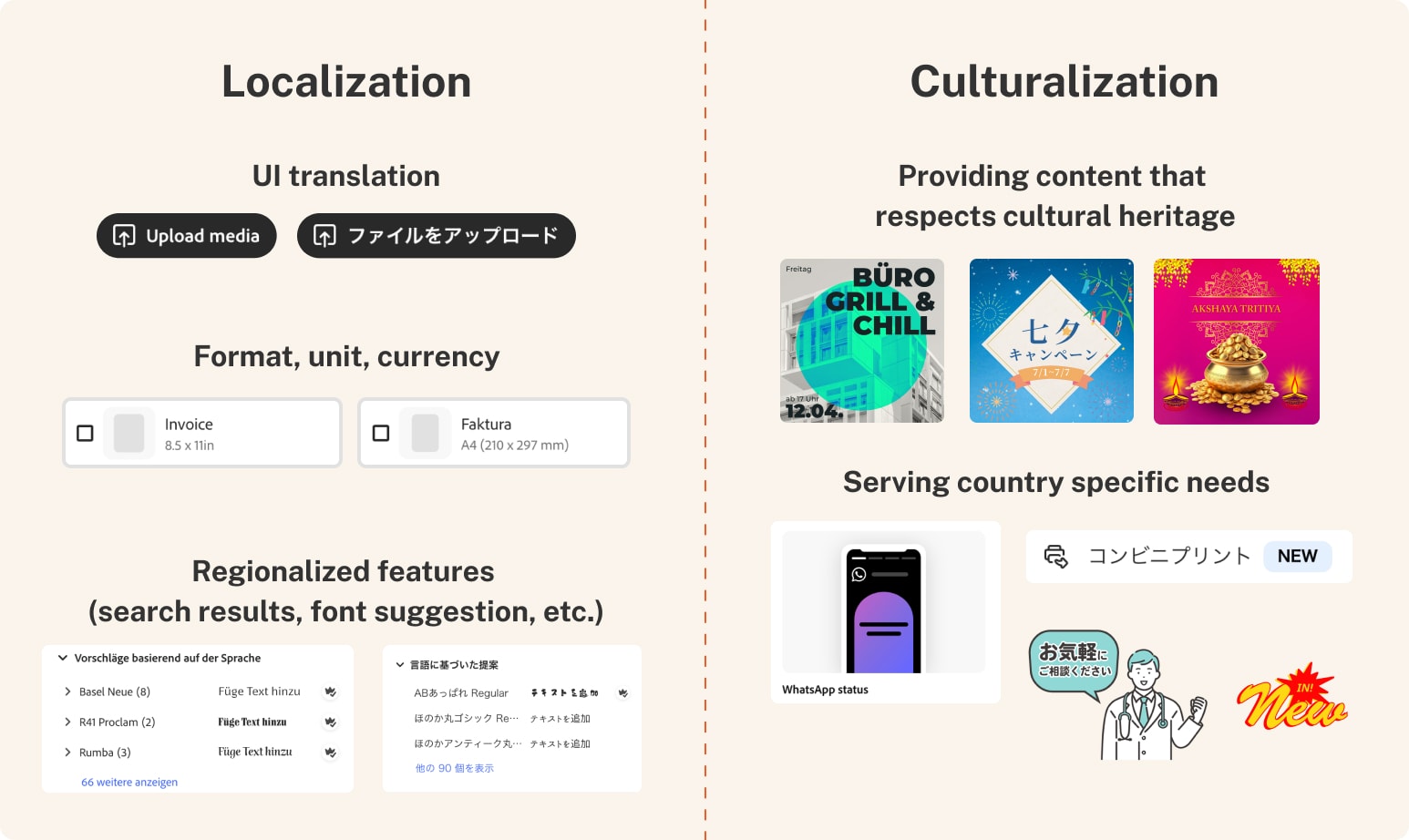
The gap between those two things is subtle. Most users can't name it. But they feel it — in the rhythm of the copy, in the images that don't quite match their life, in the tone that feels too loud, too aggressive, too American. These moments don't register as design failures. They register as something smaller and more corrosive: a subconscious sense that this product wasn't really made for us.
I notice this gap acutely because I've lived and worked in both countries. I spent years in the US design industry before returning to Japan — which means I know exactly how US product teams think about global markets, and I know what their decisions look and feel like from the other side.
My measure of success for any culturalization project is simple: did we make something that feels so natural to its audience that they don't think about where it came from? If a Japanese user can move through the product without registering it as an American product — if the foreignness becomes invisible — that's the work done right.
The projects below represent different layers of that problem. Strategy. Content. Art direction. Channel. None of them are complete on their own. Together, they're what a culturalization practice actually looks like.
Project 1: Japan Homepage Redesign
- Status
- A/B Test · Done
- Timeframe
- 2023
- Region
- Japan
- Role
- Design Lead
- Company
- Adobe
Japan's Adobe Express homepage had a conversion problem. Landing page CTR sat at 5.6% — compared to 63–73% for US and UK markets. The gap wasn't a traffic problem. It was a confidence problem.
Japanese users needed to understand what Express was, who it was for, and whether the free plan was genuinely useful — before they would consider signing up. The existing homepage, built for a US audience and localized rather than culturalized, answered none of those questions.
I redesigned the page from the ground up with a Japanese-first information architecture — rewriting everything natively rather than translating existing US copy, to match the rhythm and tone of how Japanese users actually read and process information online.
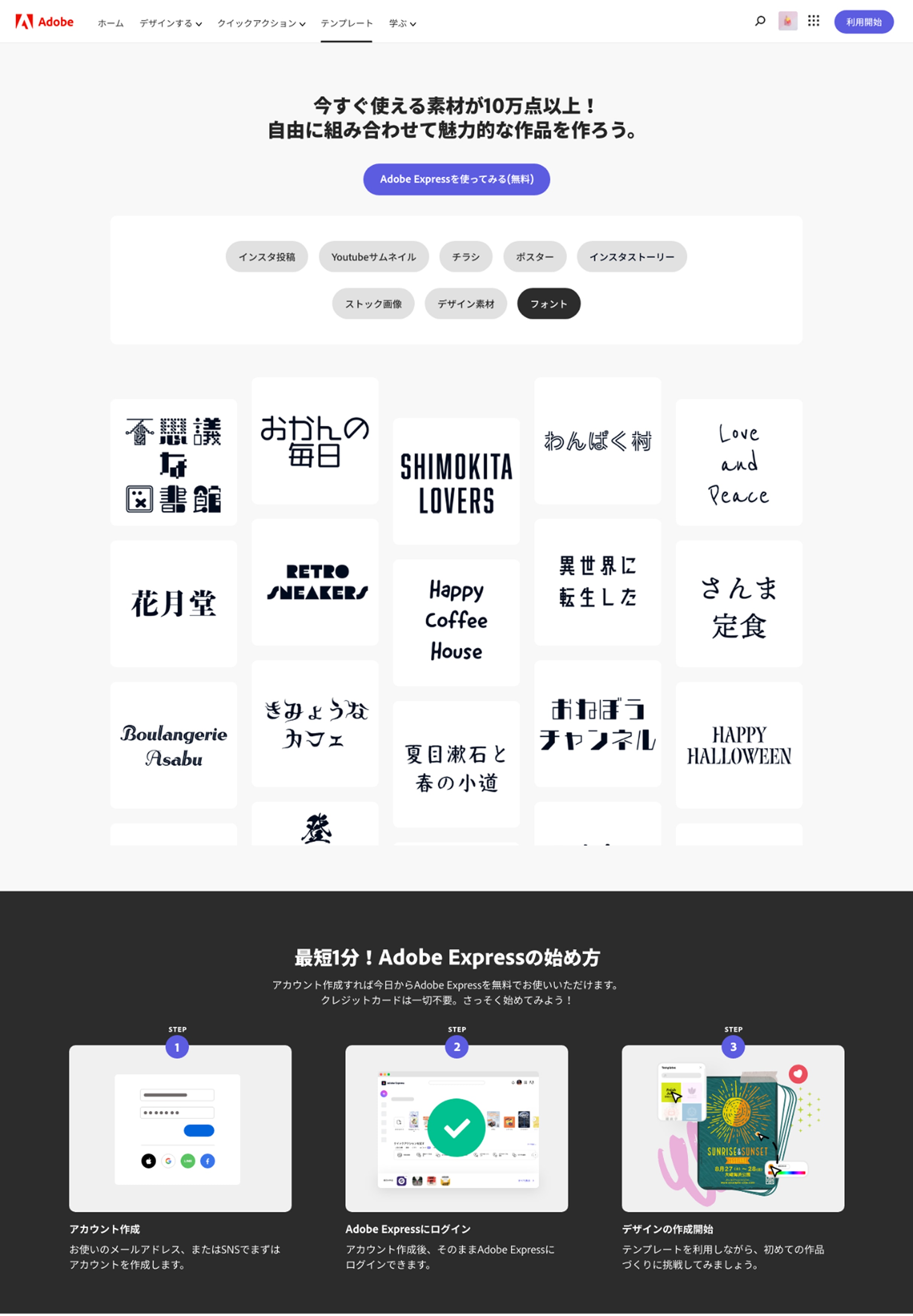
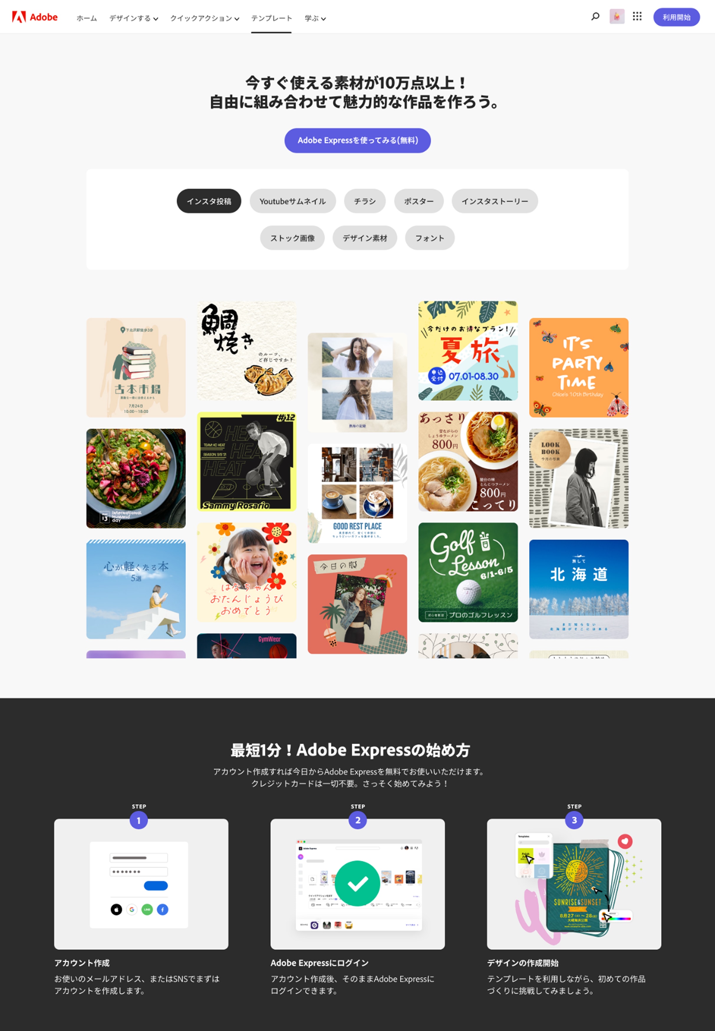
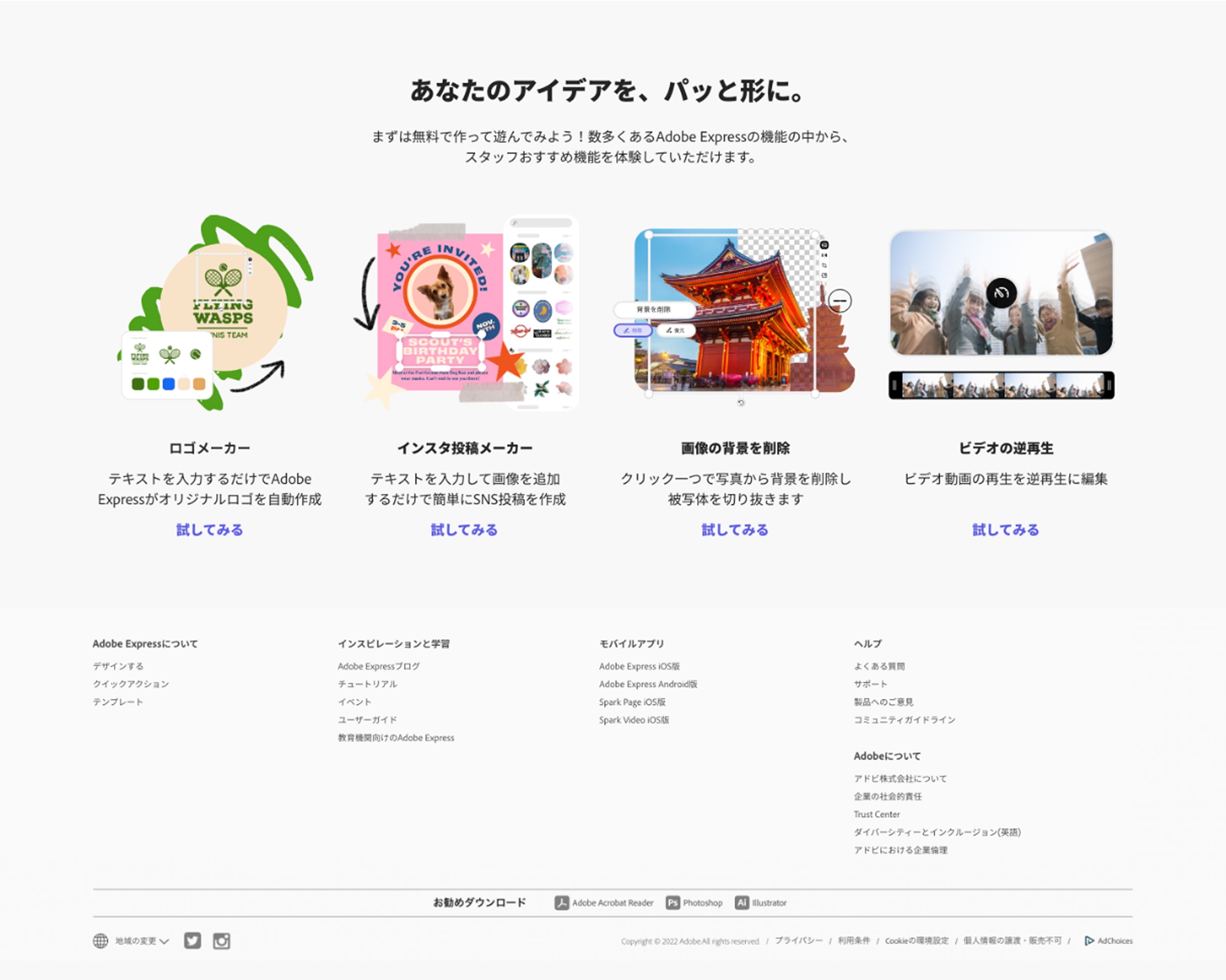
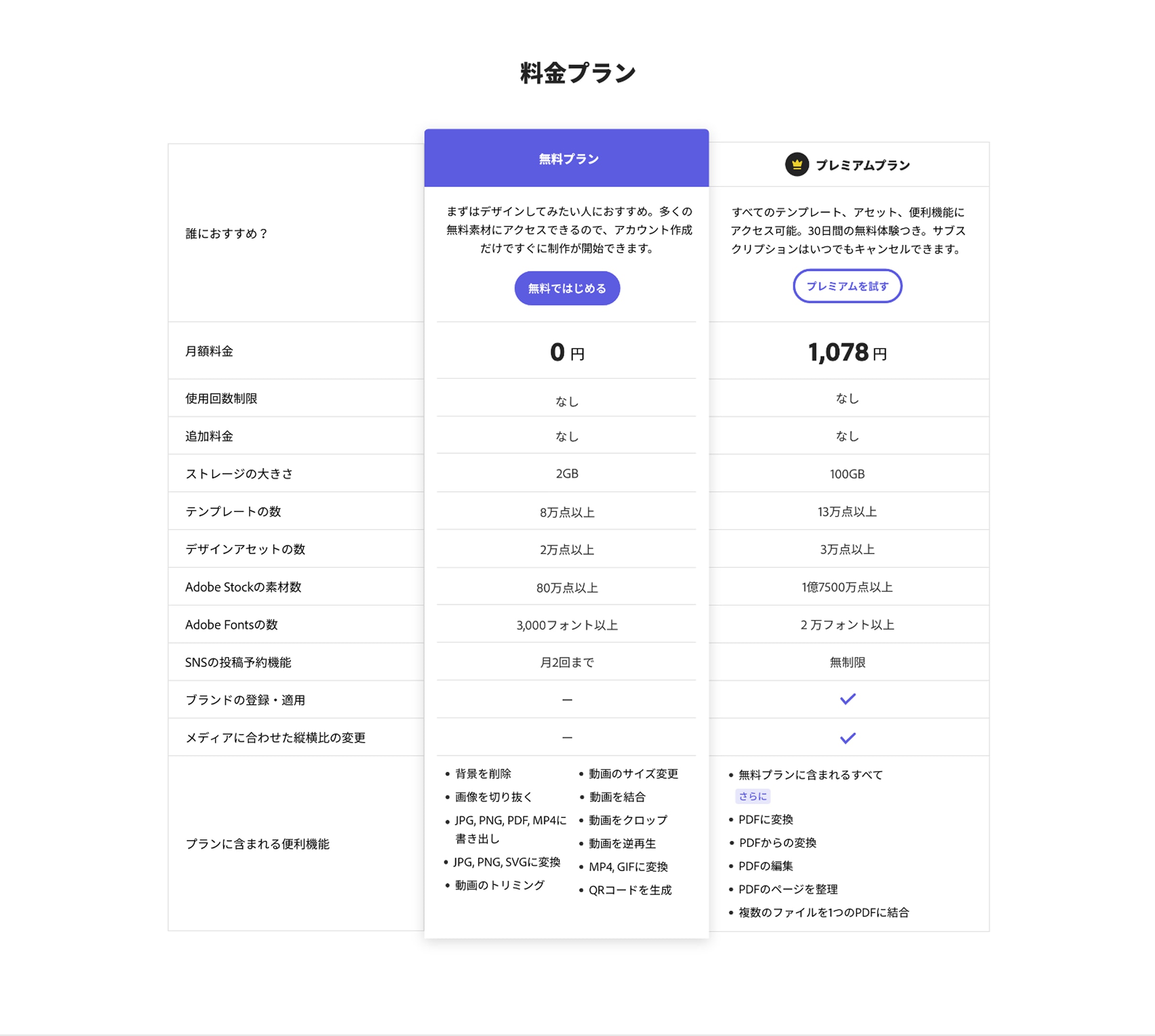
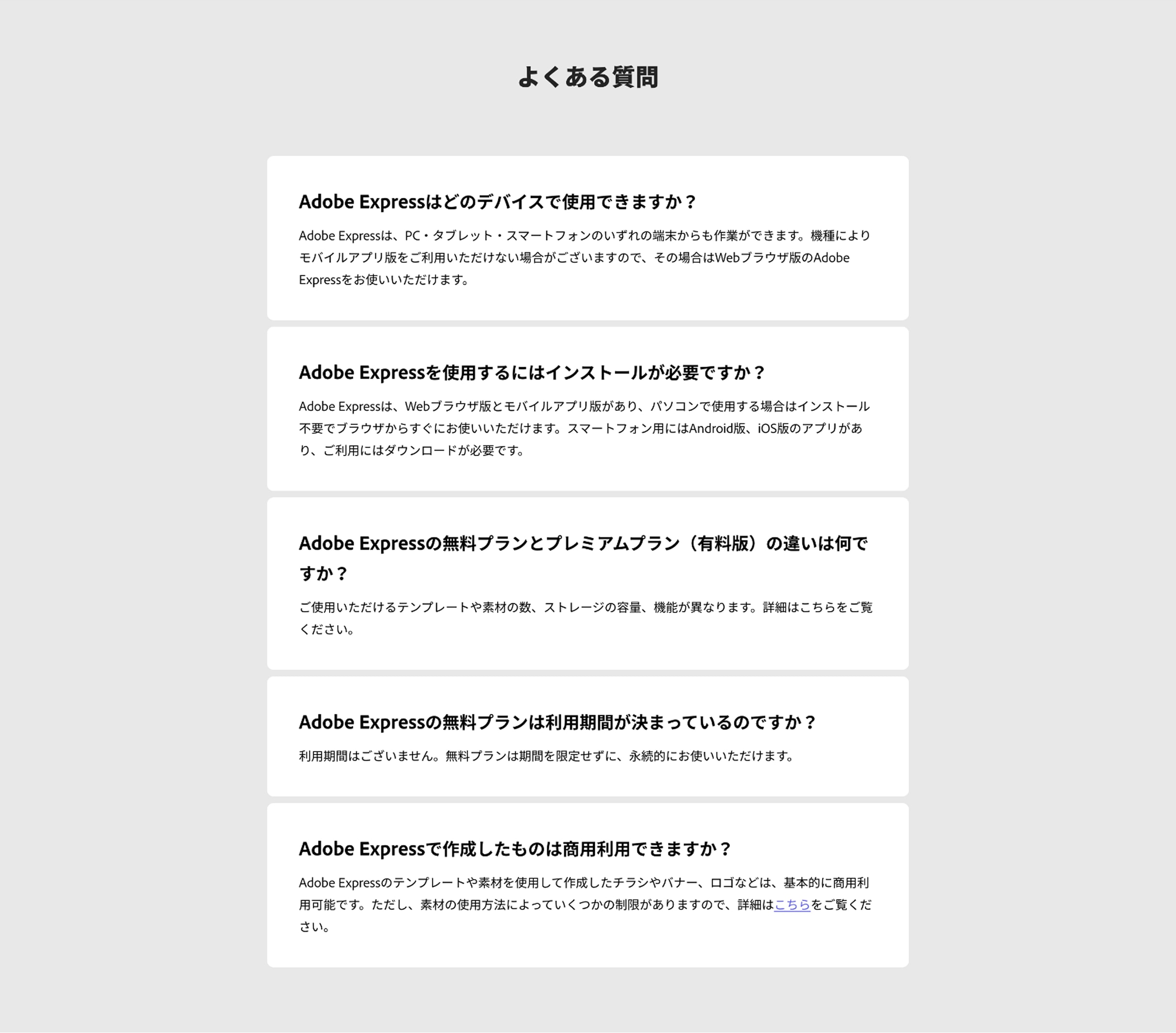
I introduced a free vs. premium comparison table designed around Japan's strong preference for side-by-side decision-making, and built out an expanded FAQ section targeting the specific hesitations Japanese users expressed in research: device compatibility, free plan limitations, commercial use rights.
The test ran for six weeks against a 50/50 split.
| Metric | Impact |
|---|---|
| Free MAU | +10.4% |
| NUV to MAU | +15.3% |
| NUG Rate (New User Growth, new visitors only) | +4.1% |
| Time Spent on Page | +18.2% |
Registration rate dipped slightly — an expected tradeoff, as richer page content drew users deeper into the experience rather than toward the top-nav sign-up button.
The variant did not proceed to full rollout — a Mobile GA launch required homepage alignment with the global experience.
Built for Japan. Adopted Everywhere.
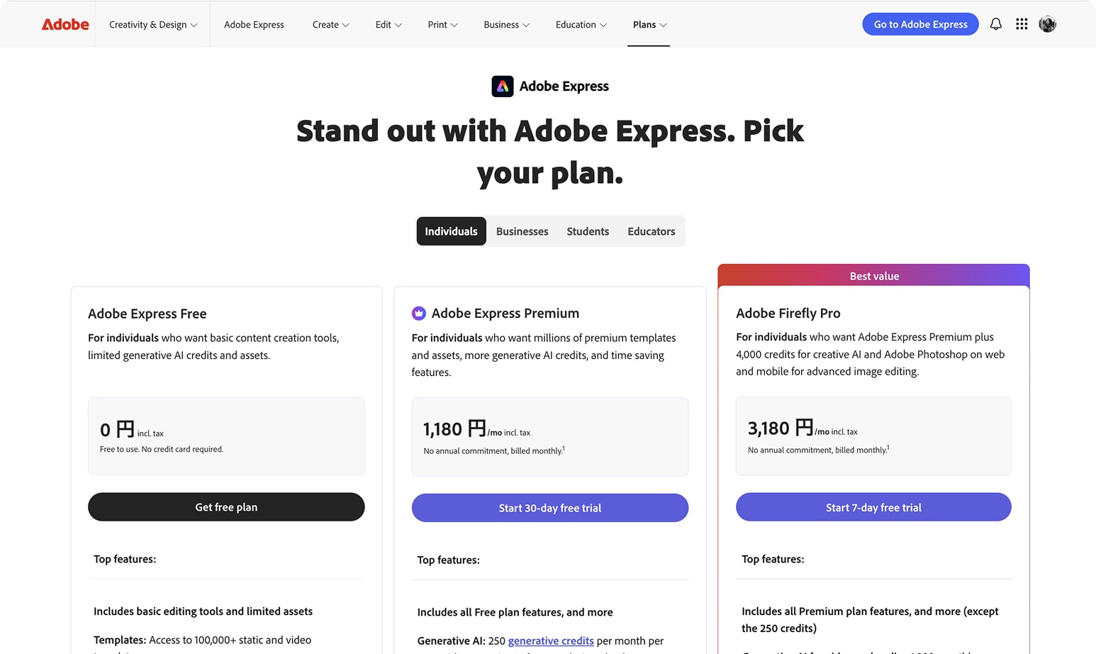
The pricing comparison table was later adopted by the global Adobe Express a.com team — a JP-specific design pattern that became a global standard.
Project 2: Japanese Text Lock-ups
- Status
- Shipped
- Timeframe
- 2024
- Region
- Japan
- Role
- Design Lead
- Company
- Adobe
The Text Inspire panel in Adobe Express offered one thing to Japanese users: blocks of English copy with no cultural relevance. Text lock-up usage in Japan sat at 3–5% of total editor views. The feature wasn't failing because users didn't want it — it was failing because it had never been designed for them.
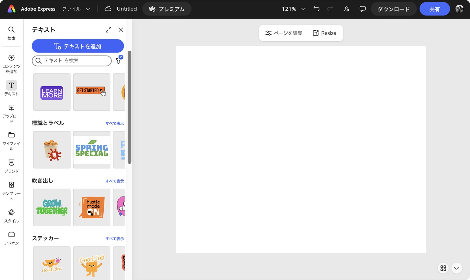
I partnered with the Content Strategy team to define what a Japanese text lock-up library should actually contain — specifying which categories to introduce, what content types to prioritize, and what culturally relevant use cases were missing entirely.
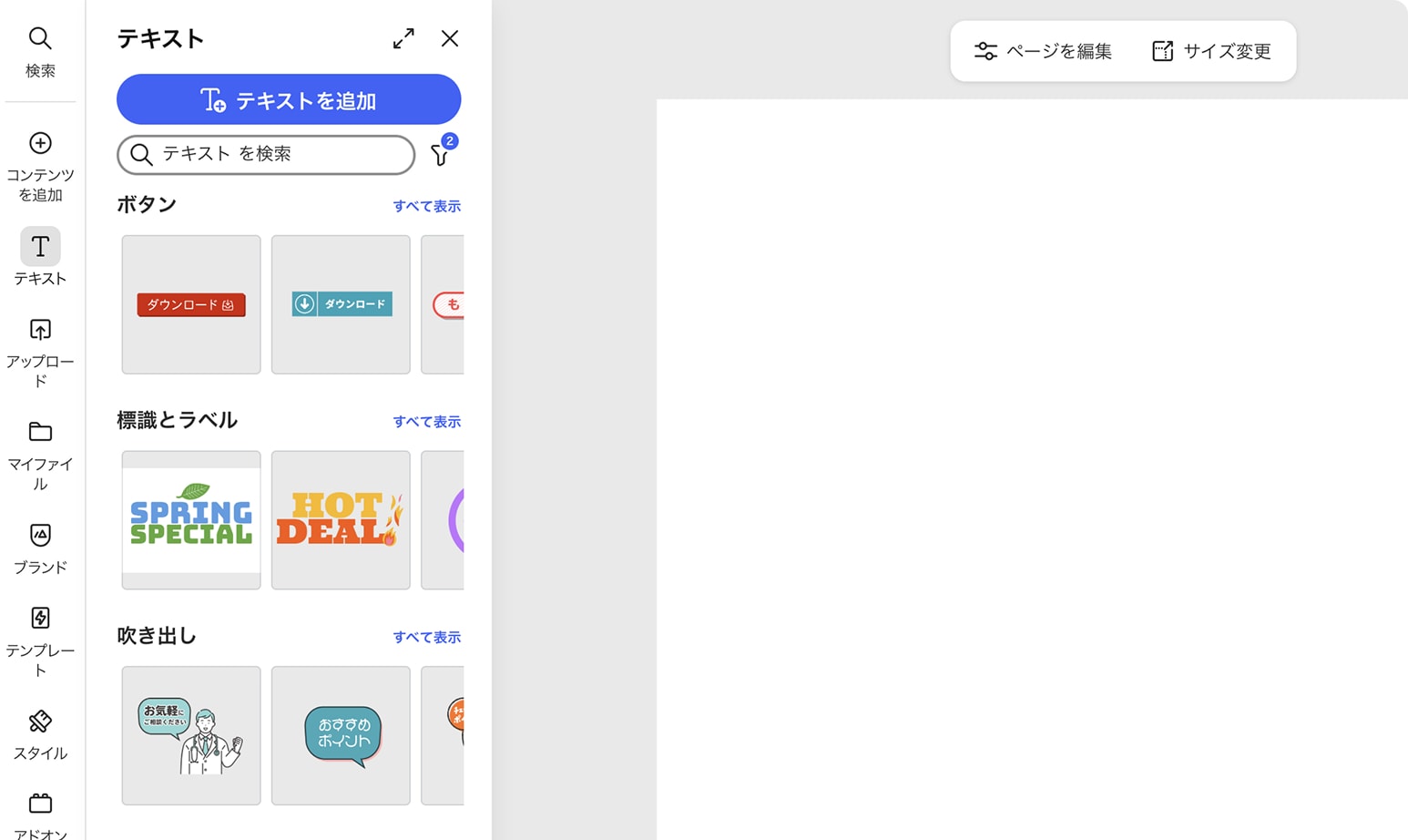
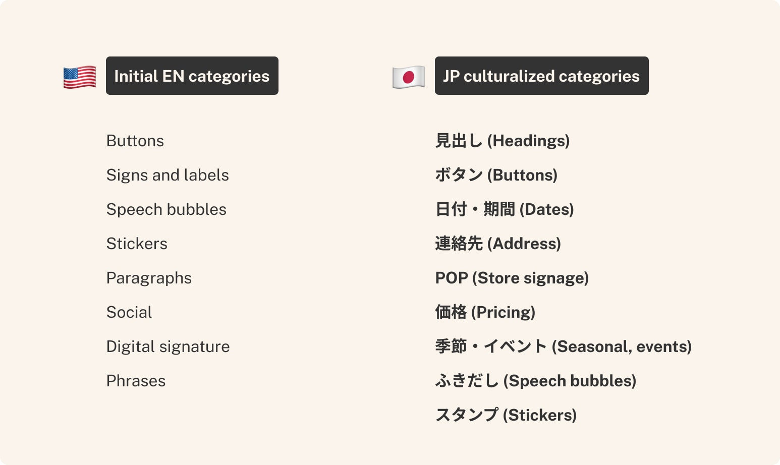
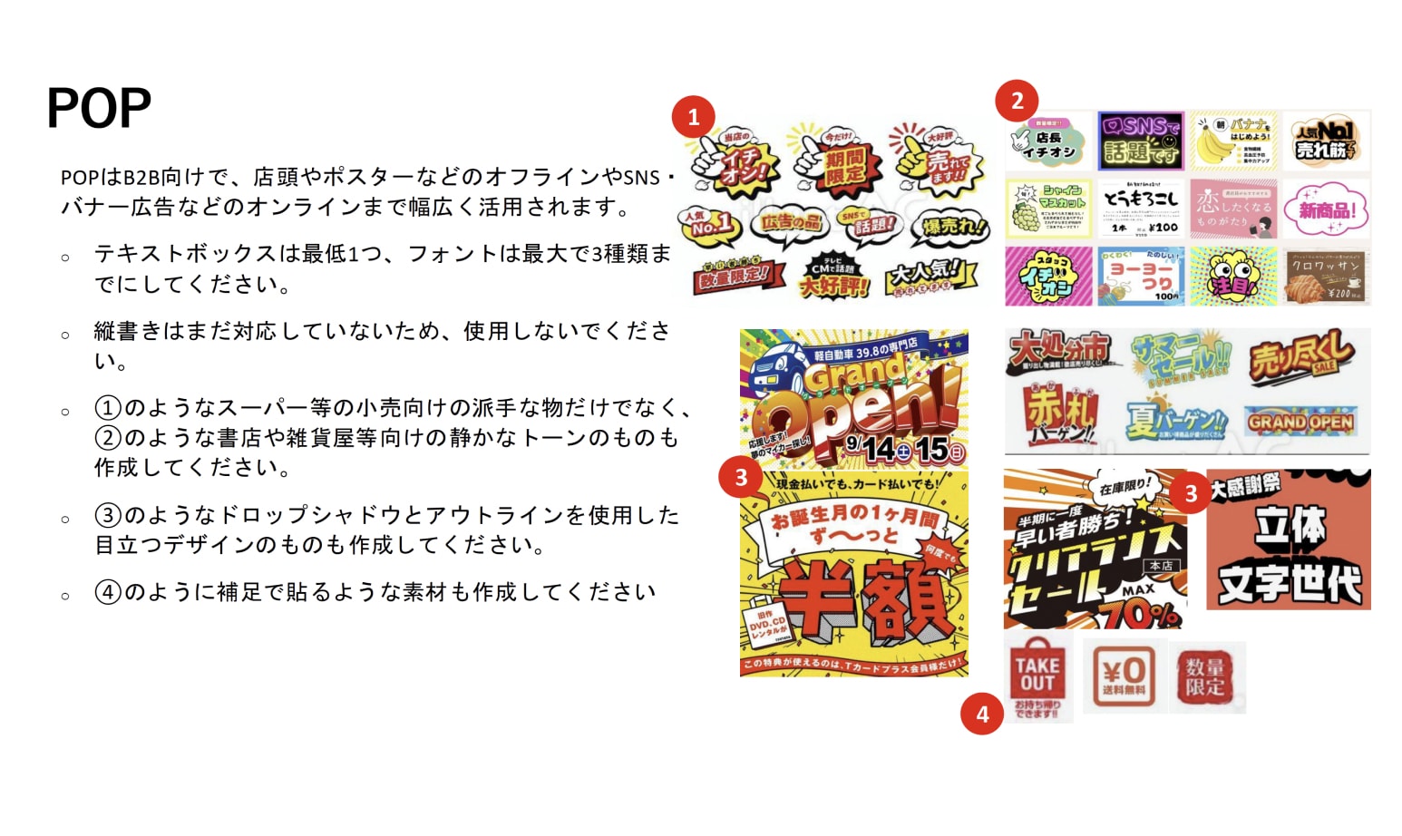
The existing eight English-centric categories expanded to fourteen JP-relevant categories, adding net-new content types absent from the original panel: Menus, Digital Signatures, Captions, Sales, Phrases, and Seasonal. I directed the regional agency through production, reviewing each asset for cultural fit, brand alignment, and whether the execution would actually help Japanese users understand what to do with it.
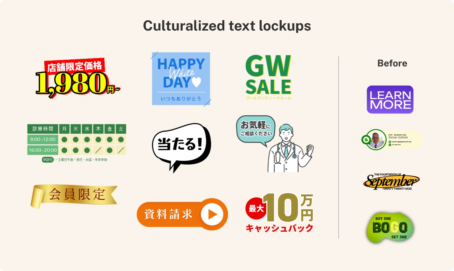
Beyond translation
Localizing text lock-ups isn't just a matter of swapping English for Japanese. It means understanding what Japanese people actually make — and what design assets they need to make it well.
Seasonal moments came first: Golden Week, White Day, cultural rhythms that simply don't exist in a US-centric template library.
ポップ — the bold, high-contrast price tag style found in every Japanese supermarket — was an obvious addition for anyone who has shopped at Aeon or Seiyu, and completely invisible to a designer who hasn't.
Operation hours stickers for medical clinics and salons addressed a format tied to ショップカード and 診察券, physical card types deeply embedded in Japanese service culture.
The 会員限定 ribbon treatment in gold rounded out the set — a graphic convention so common in Japanese retail and packaging that its absence would have felt like an oversight.
None of these came from a brief. They came from knowing the market.
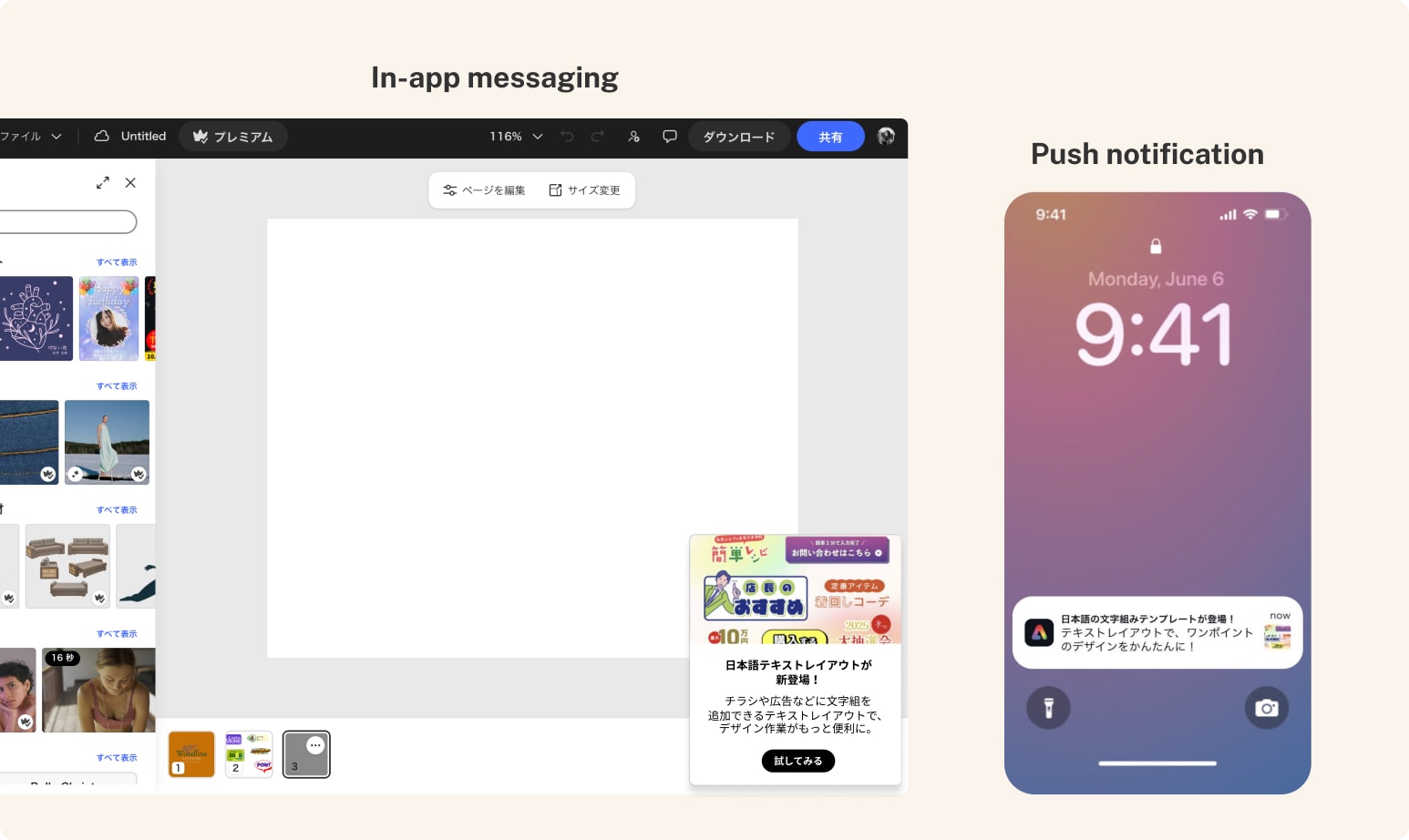
To drive discovery, I coordinated a dual-channel awareness campaign: in-app messaging and push notifications launched simultaneously at rollout.
The engagement gap told the clearest story: users who interacted with the JP Text Lock-ups exported at 73%, compared to 63% for those who didn't — a 10 percentage point difference that shows what happens when content is actually built for its audience.
| KPI | Lift |
|---|---|
| Overall Exporter % | +2.3% |
| D2–7 Return % | +4.8% |
| Trial Starts % | +4.1% |
Push notification outperformed in-app messaging significantly — driving 1,634 rMAU versus 116 from IAM. Results are based on pre/post analysis rather than a controlled test, but the directional signal is consistent across every KPI — a channel insight that now informs how the team approaches future JP feature launches.
Project 3: Gen AI Card Culturalization
- Status
- Delivered
- Timeframe
- 2024
- Region
- France, Germany, India, Japan, UK
- Role
- Art Direction, Content Strategy
- Company
- Adobe
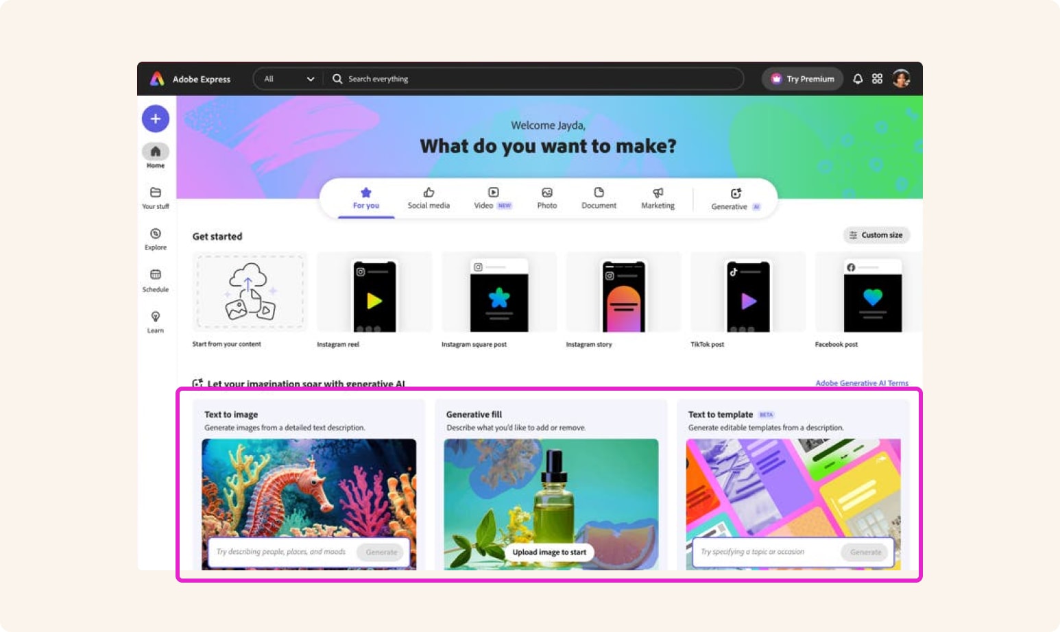
Generative Fill. Text to Image. These are the terms Adobe Express used to introduce its most powerful new features to the world. They're also terms that mean nothing to a non-designer in Osaka, Frankfurt, or Mumbai.
The brief was straightforward: help users across five markets understand what Gen AI can do for them. The real challenge was harder — how do you make a technical capability feel relevant and approachable to someone who doesn't speak the language of design tools, in a culture you may not share?
I art directed GIF animations for the Gen AI feature cards on Express Home across France, Germany, India, Japan, and the UK. Working with MediaMonks, I guided image selection for each region — evaluating every visual choice for cultural relevance, brand alignment, and whether it would actually communicate the capability to a non-creative audience. For markets I don't have native fluency in, I brought in international colleagues within Adobe to pressure-test the choices.
Alongside the visual work, I rewrote the UI copy for each Gen AI card — not just translating, but rethinking the language from the ground up. The goal was copy so clear and non-technical in English that its meaning would survive localization intact.
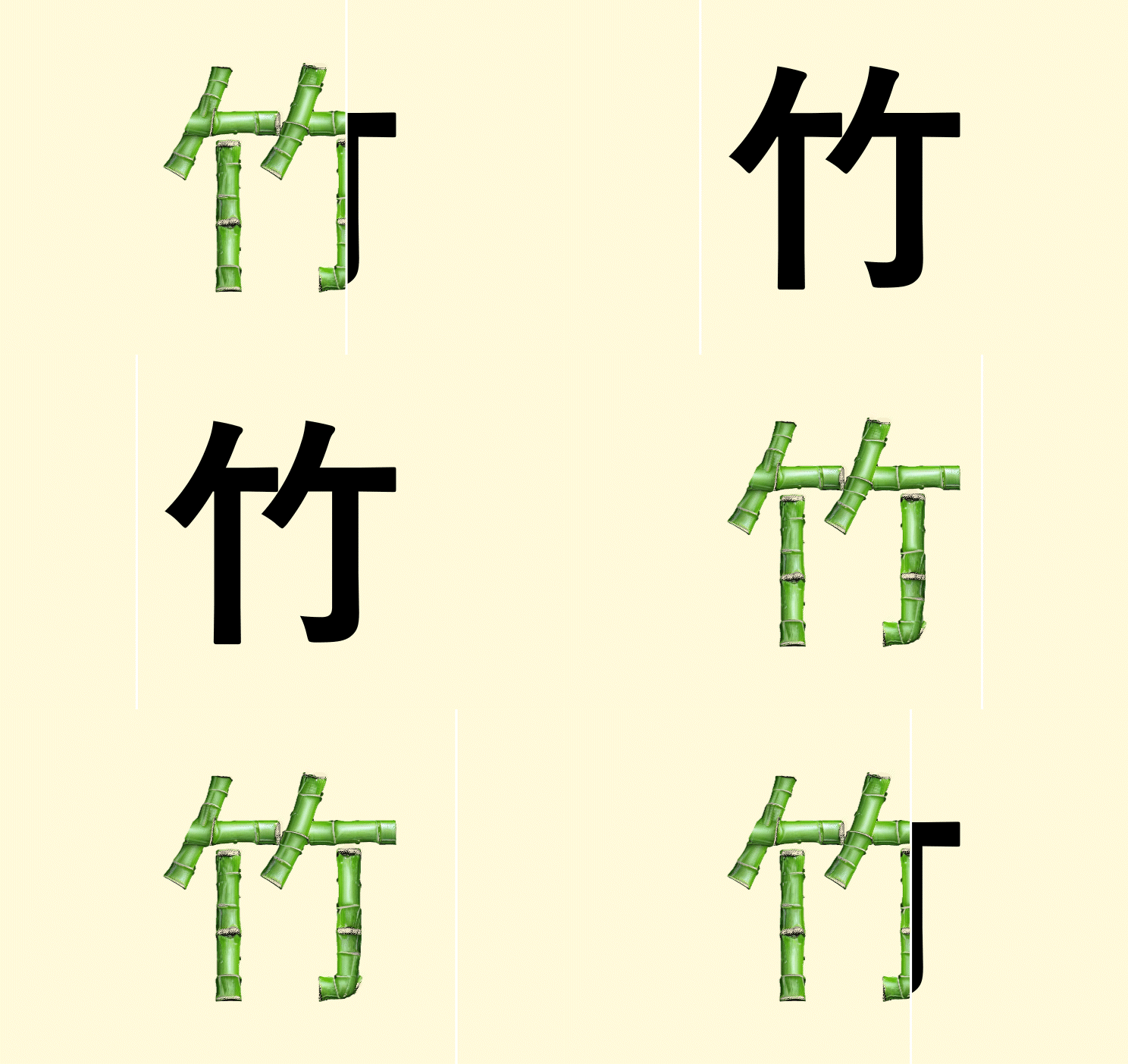
Before → After examples:



The underlying principle
If the base English copy is descriptive and free of design jargon, users anywhere can immediately understand what to do — and the localized version has a fighting chance of being just as clear.
Beyond the Product: Taking Culturalization Beyond Adobe Express platform
- Status
- Rolled Out
- Timeframe
- 2023
- Region
- Japan
- Role
- Art Direction
- Company
- Adobe
Not all culturalization happens inside the product. Sometimes it means meeting users where they already are — before they've decided whether your product is for them.
Project Seiza was a three-month content strategy initiative on Adobe Express's LINE Official Account. LINE is Japan's dominant messaging platform — and Adobe had an existing account with a large follower base that had been largely neglected, over-messaged with sales content, and tuned out. Our hypothesis was that non-designers in this audience could be a natural fit for Express. For that audience, a direct app download prompt was never going to work. They needed a lower-pressure on-ramp.
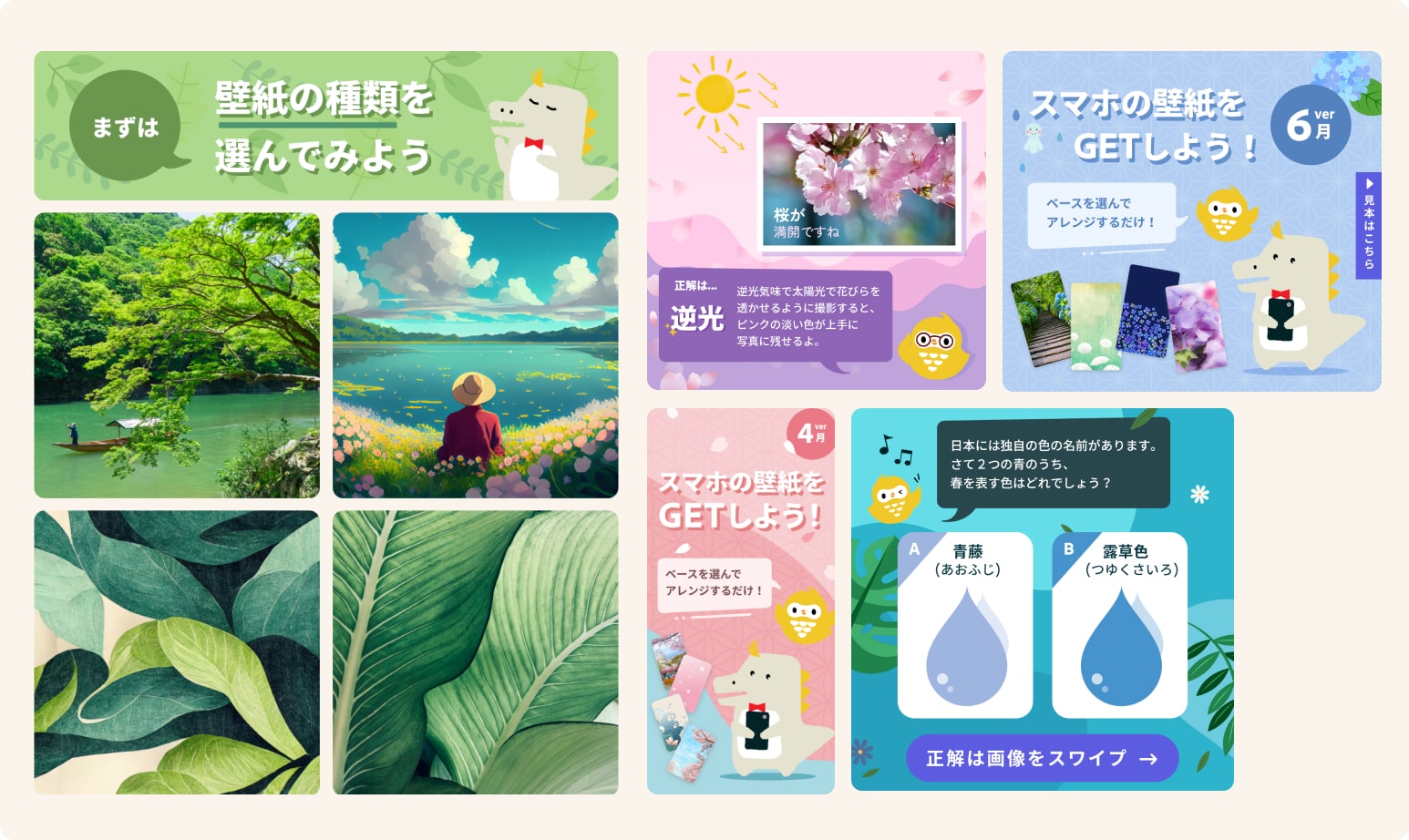
I directed MediaMonks on a content pipeline across four experience types, designed to let users feel creative confidence inside an app they already trusted — before ever opening Express.
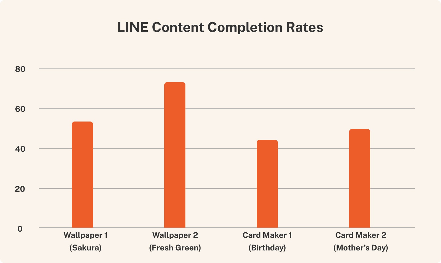
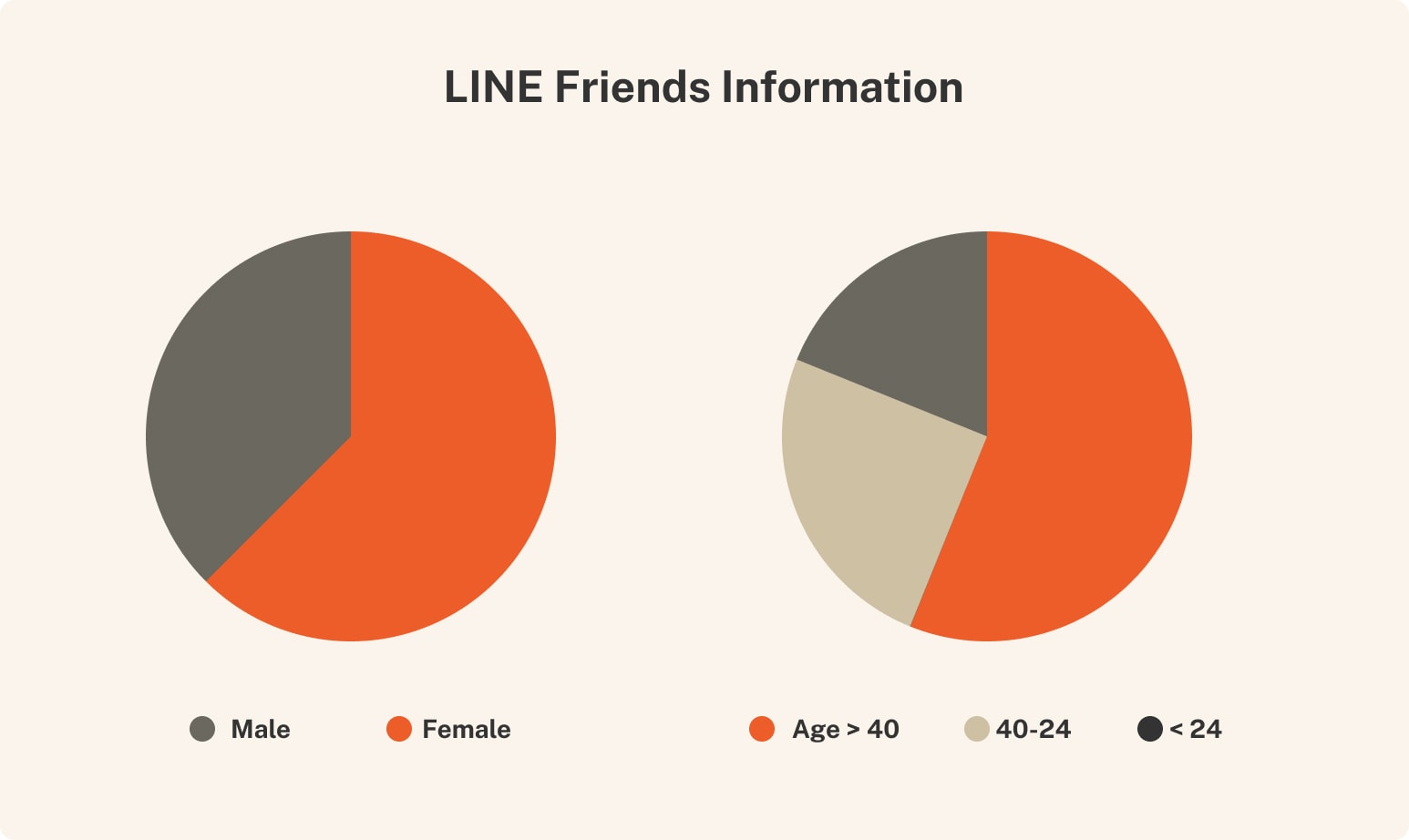
The results were instructive. Completion rates were reasonable, but the channel had a structural problem: years of neglect had left Adobe Japan's LINE account with a massive blocked-user ratio. The audience we thought we had wasn't reachable. We called it early.
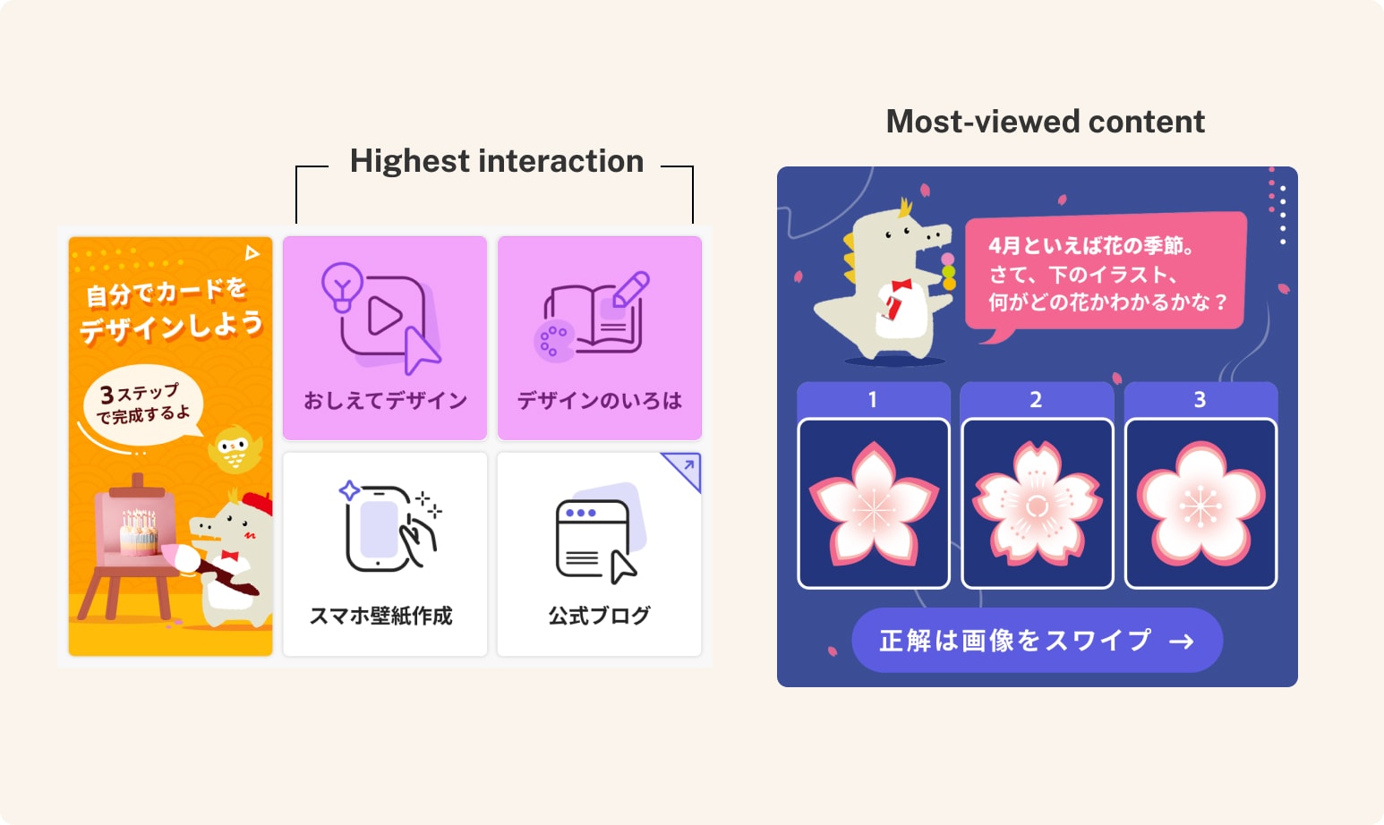
What the project clarified was more valuable than what it proved. LINE users aren't passively waiting for design education — they need a specific reason to care. We didn't get to test that direction. But knowing what the right question is — even after the wrong answer — is how channel strategy actually develops.
When the foreignness disappears
My measure of success stays the same: did we make something so natural to its audience that they never think about where it came from? If a Japanese user can move through the product without registering it as American — if the foreignness becomes invisible — the work is done right.
Up Next:
Looked, liked, loved it?
Let's talk.