
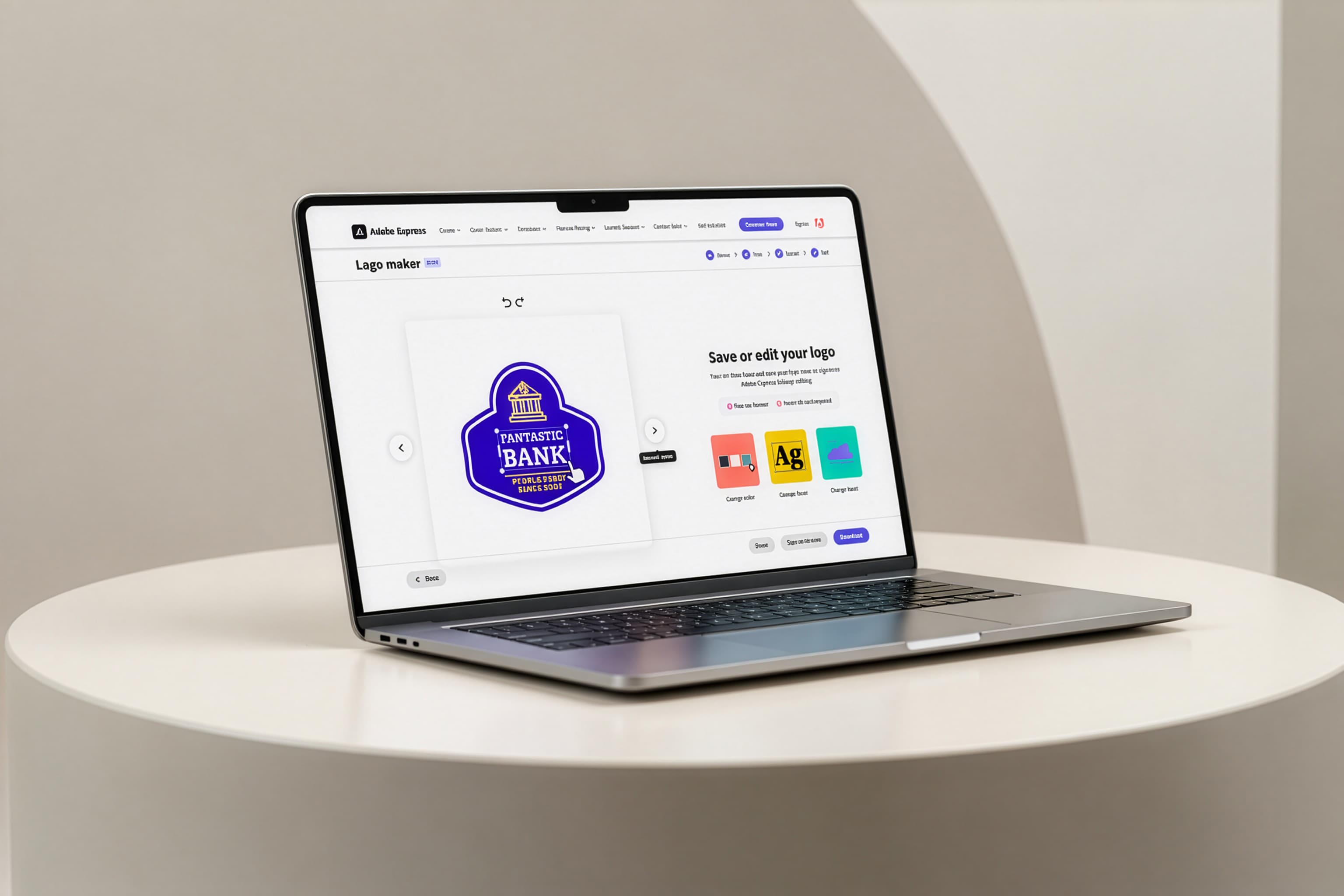
Logo Maker: Turning a 13% export rate into a funnel that works, not just a facelift
- Status
- Win → Rollout
- Timeframe
- Dec 2024
- Role
- Design Lead
- Company
- Adobe
The Opportunity
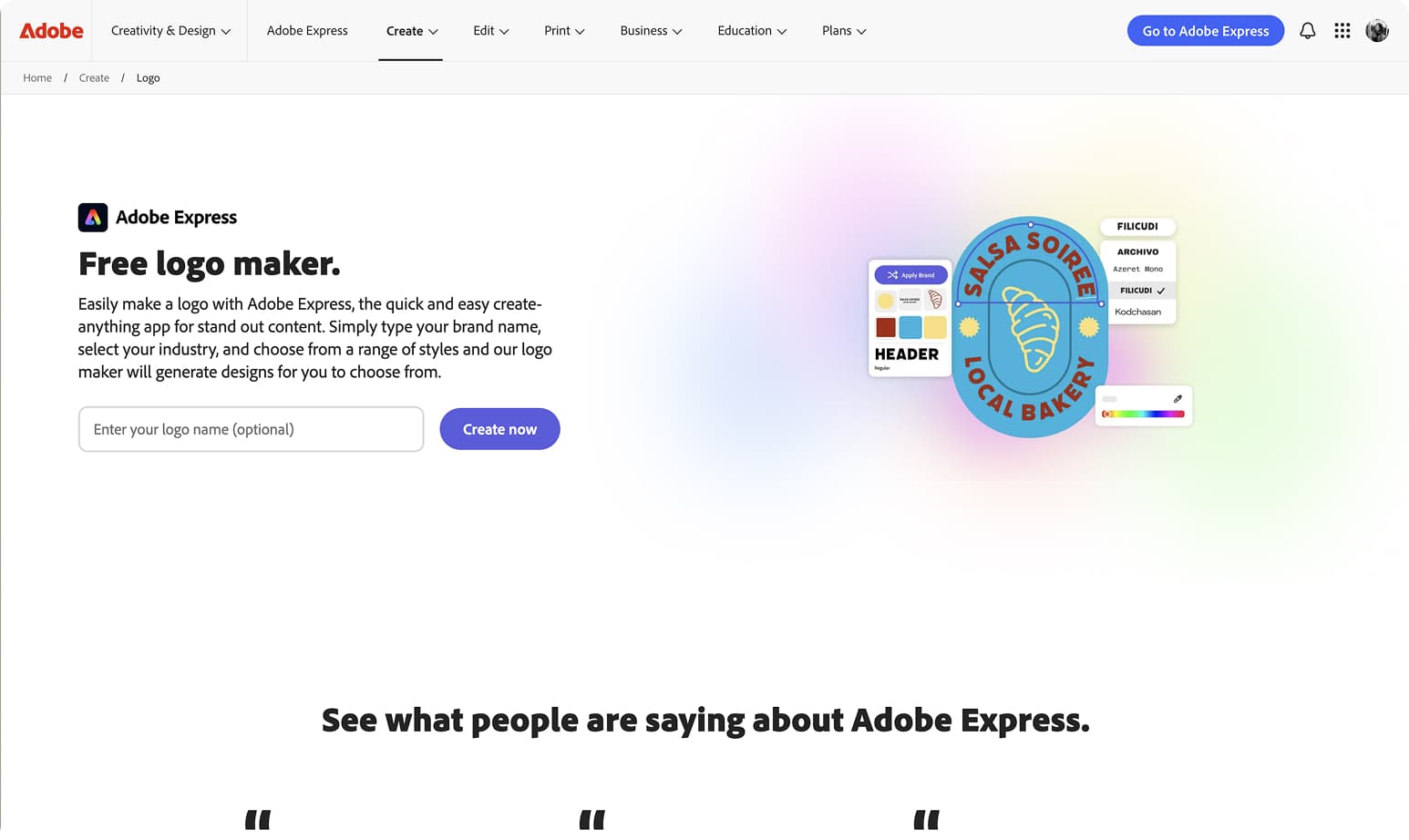
Logo Maker is a free, no-signup entry point into Adobe Express, built for people with zero design background — small business owners, side-hustlers, anyone who needs a logo fast. Most users arrive from search, not from Adobe directly, so this is often someone's first hands-on proof of what Express can do — and the bet is that experience turns an anonymous visitor into a registered user.
It's also Adobe Express's highest-traffic acquisition surface, drawing 3.5x more unique users than the next most popular Create page. But only 13% exported a logo, and the backend technology powering generation wasn't changing — no new AI, no rendering engine, no rebuild on the roadmap.
The question was: how much could design move the needle on a system that wasn't going to change?
What I Was Solving
Working with PM and data science partners, I mapped the full drop-off funnel to identify where design — not engineering — could make the biggest difference.
Three failure patterns emerged.
- Friction before value. The business name field was required before users could see a single logo. We were asking for commitment before we'd shown users anything worth committing to.
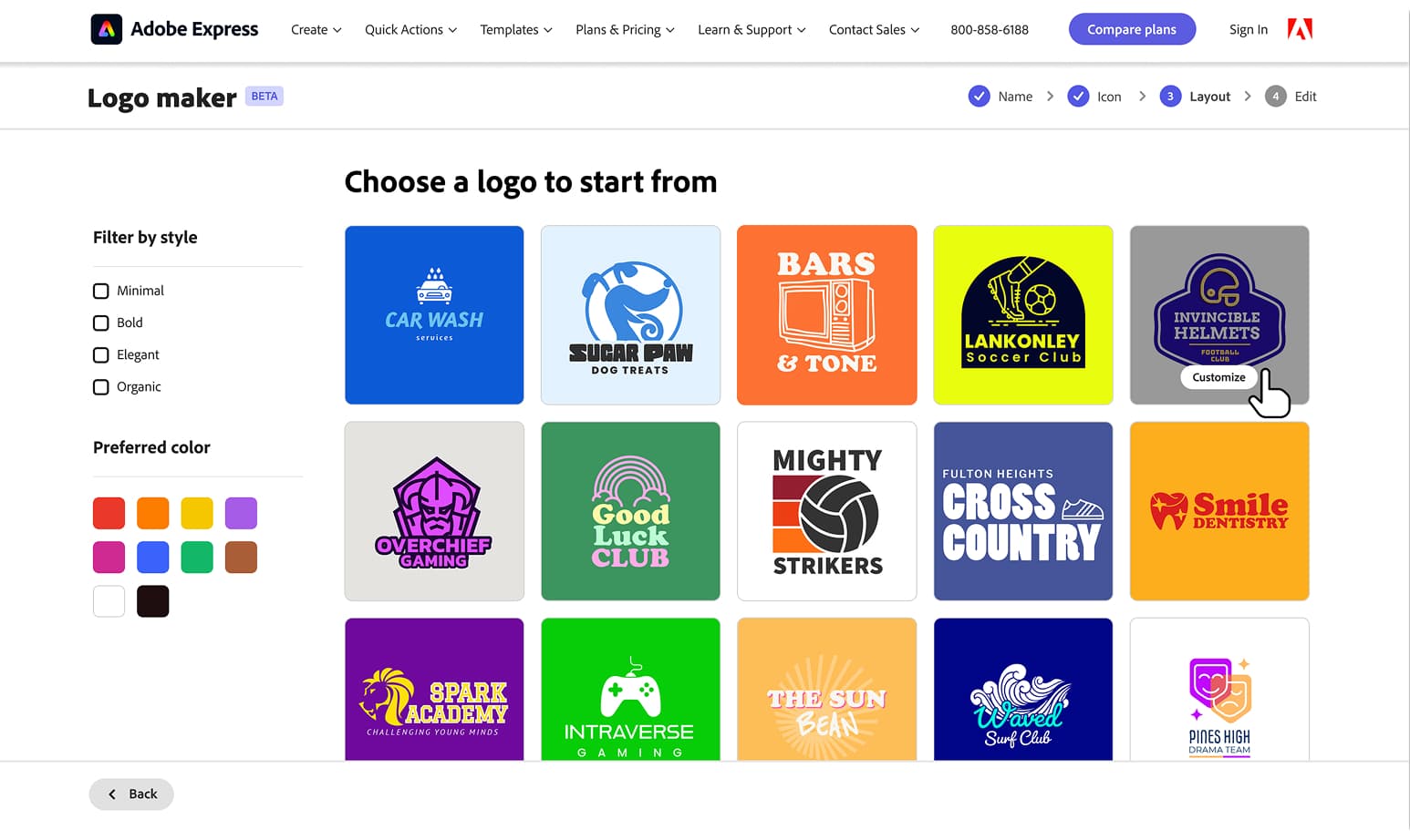
- Color was invisible until it was too late. Users couldn't filter by color on the listing page. The only way to change color was a random shuffle at the final step — after users had already formed an opinion about what they wanted.
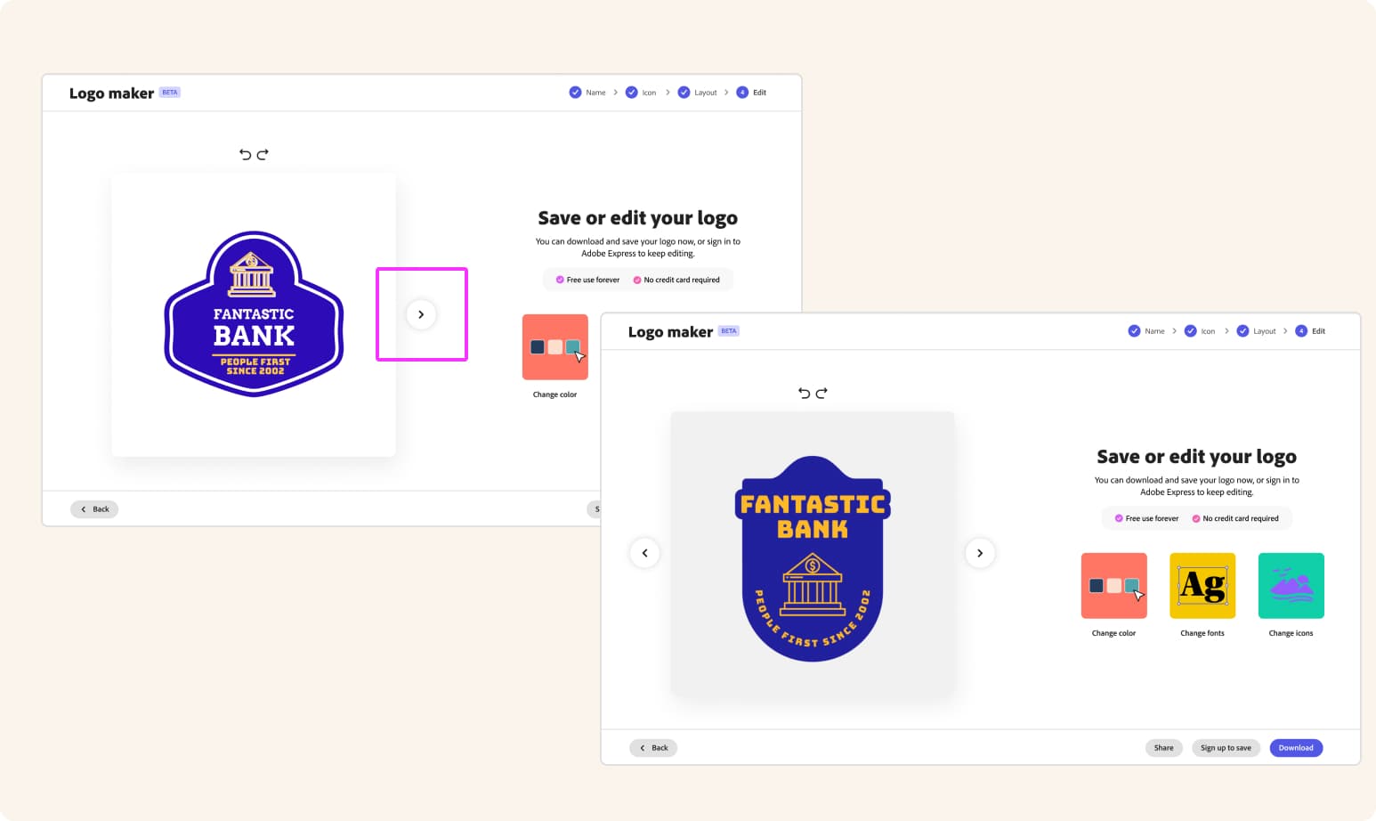
- The exit was a dead end. The final editing page gave users a binary choice: download or go into the full editor with no guidance. Users who wanted to tweak color or swap a font had no clear path forward. The bridge to the editor didn't tell them what they could do there.
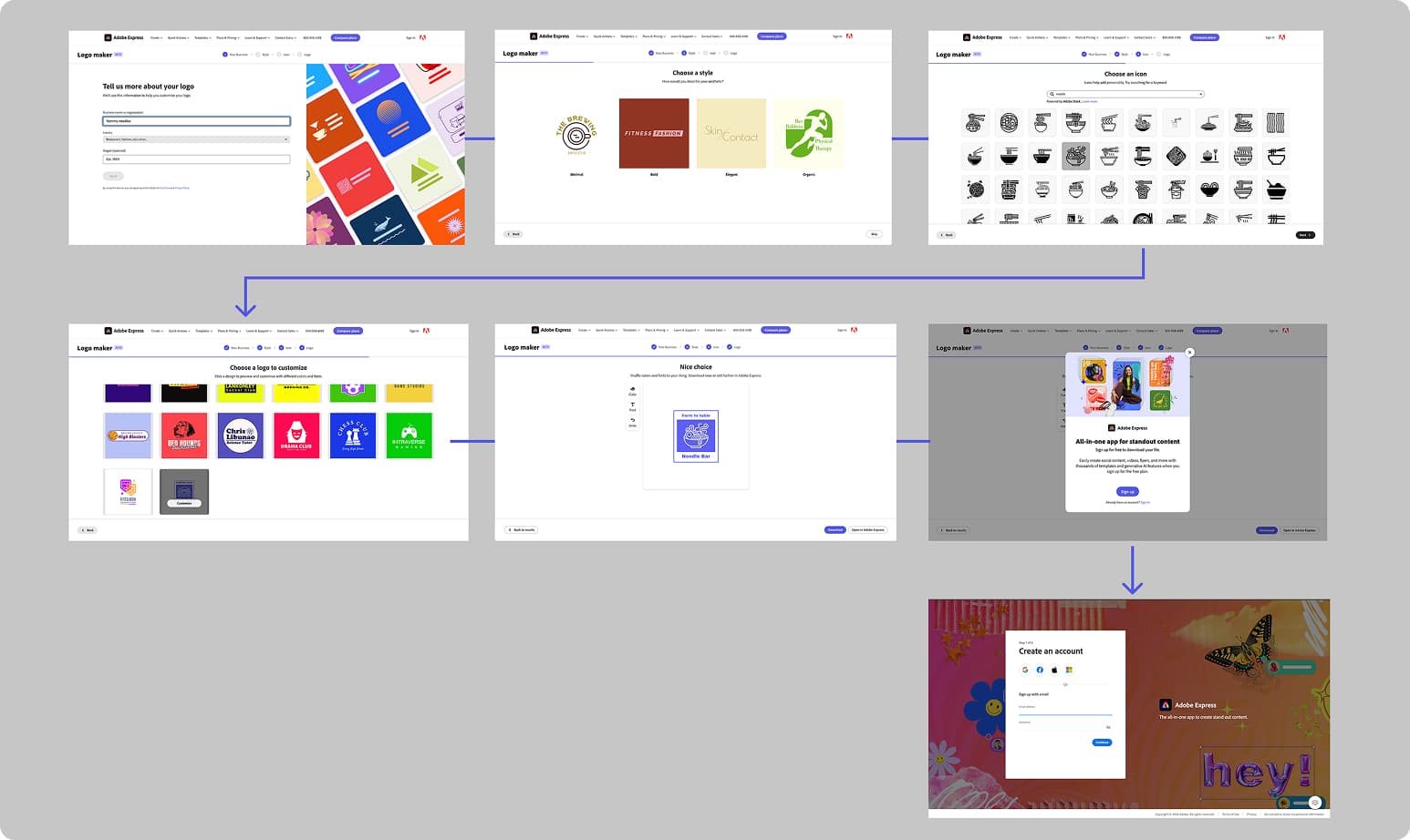
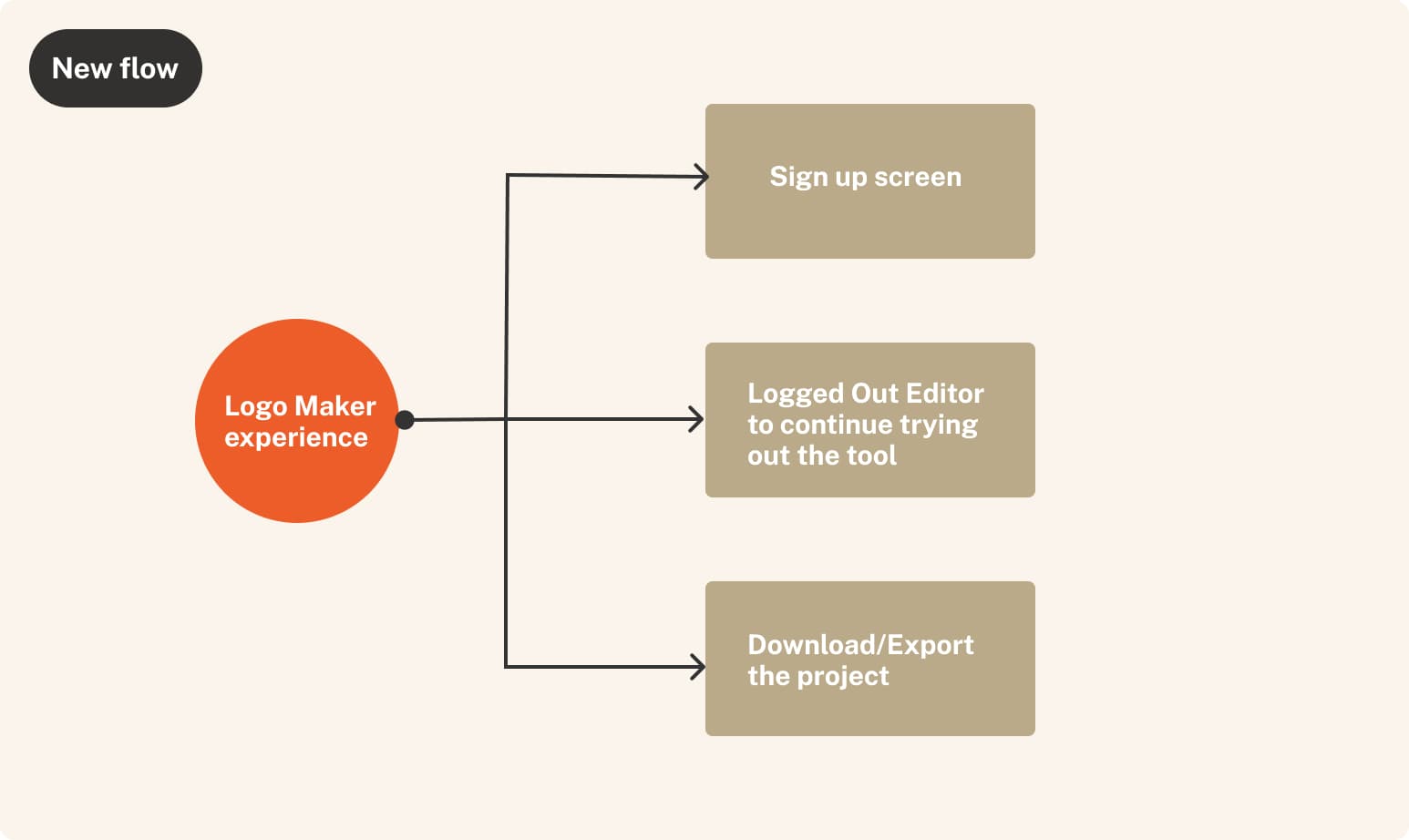
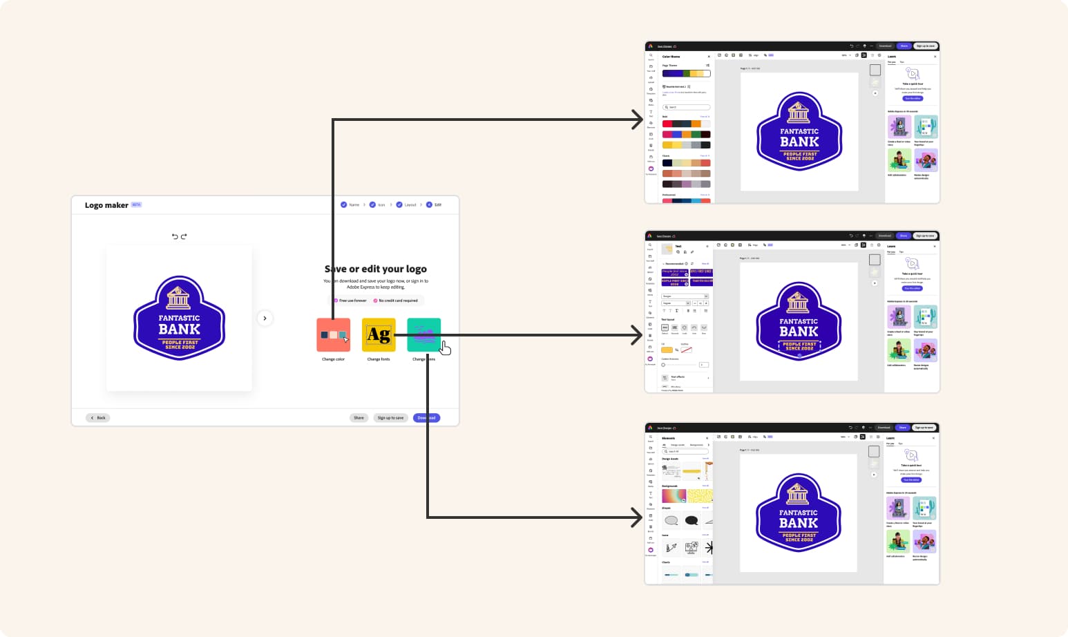
A strategic goal shaped the design: rather than optimizing purely for download completion within the SEO flow, we wanted to route users into the Logged Out Editor. A user who downloads a logo and leaves is a one-time visitor. A user who enters the editor — and experiences what Express can actually do — is a potential Express user. The jump points on the final screen weren't just UX convenience. They were a business strategy.
Six Design Decisions
1. Making the entry field optional
The required business name field was creating early abandonment — users who hadn't settled on a name, or who wanted to browse first, hit a wall before seeing any value. We made it optional, risking less personalized output. Instead, almost 95% of users filled it in voluntarily anyway, and drop-off from the entry page fell by 7%.
2. Color as a first-class discovery dimension
Users wanted to browse by color, but backend color detection wasn't on the roadmap. I designed a filter that queries Tempo (Adobe Express's template storage system) template filenames instead — the blue swatch surfaces results tagged "blue logo."
A workaround, not ideal architecture, but 23% of users engaged with it, and that cohort exported at a 30% rate. The pattern is also reusable across any maker (Card maker, Flyer maker, etc.) flow without backend color detection.
3. Auto-advance on selection
The flow required clicking "Next" after every selection — a wizard-form pattern, not how people actually browse visual options. Clicking a tile is the decision; confirming it again is friction without purpose. Auto-advance removed that friction across the entire flow.
4. Segment-aware CTAs at the final step
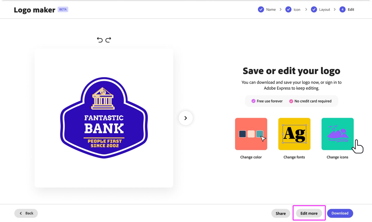
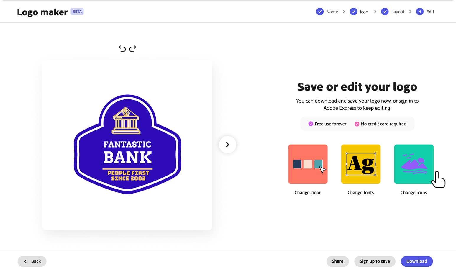
I split the old single generic final state into two: "Sign up to save" for unauth users (a clearer value prop than "Edit more"), and "Customize more" for authenticated users.
The data backed the split — authenticated users leaned into customization (Change color: 55.3% conversion; Edit more and Change font: 53.7% each), while unauth users prioritized Download (48.3%) but still engaged Change color 28% of the time before downloading.
5. Editing jump points with pre-opened panels
The old "Edit in Express" button dropped users into the full editor with no guidance. I replaced it with three action tiles — Change color, Change fonts, Change icons — each routing into the Logged Out Editor with the relevant panel already open, the core mechanism behind the LOE routing strategy. On the auth edit page, Change Color was the top action at 25% of users, converting to export at 55.3%.
6. Continuous template browsing from the final step
Previously, comparing alternatives meant navigating back to the listing page — and in the control experience, users did this repeatedly, bouncing back and forth and dropping off somewhere in the cycle. I introduced a carousel on the final step so users could browse alternatives without leaving, with business name carrying through automatically.
Results
This content is protected
Outcomes, metric tables, and what this unlocked beyond the test are behind the password — contact Lisa if you'd like access.
Up Next:
Looked, liked, loved it?
Let's talk.