
CJK Typography Taskforce:
Nobody filed a ticket, so I built the case myself
- Status
- Shipped
- Timeframe
- 2024–2025
- Role
- Design Lead
- Company
- Adobe
The problem nobody owned
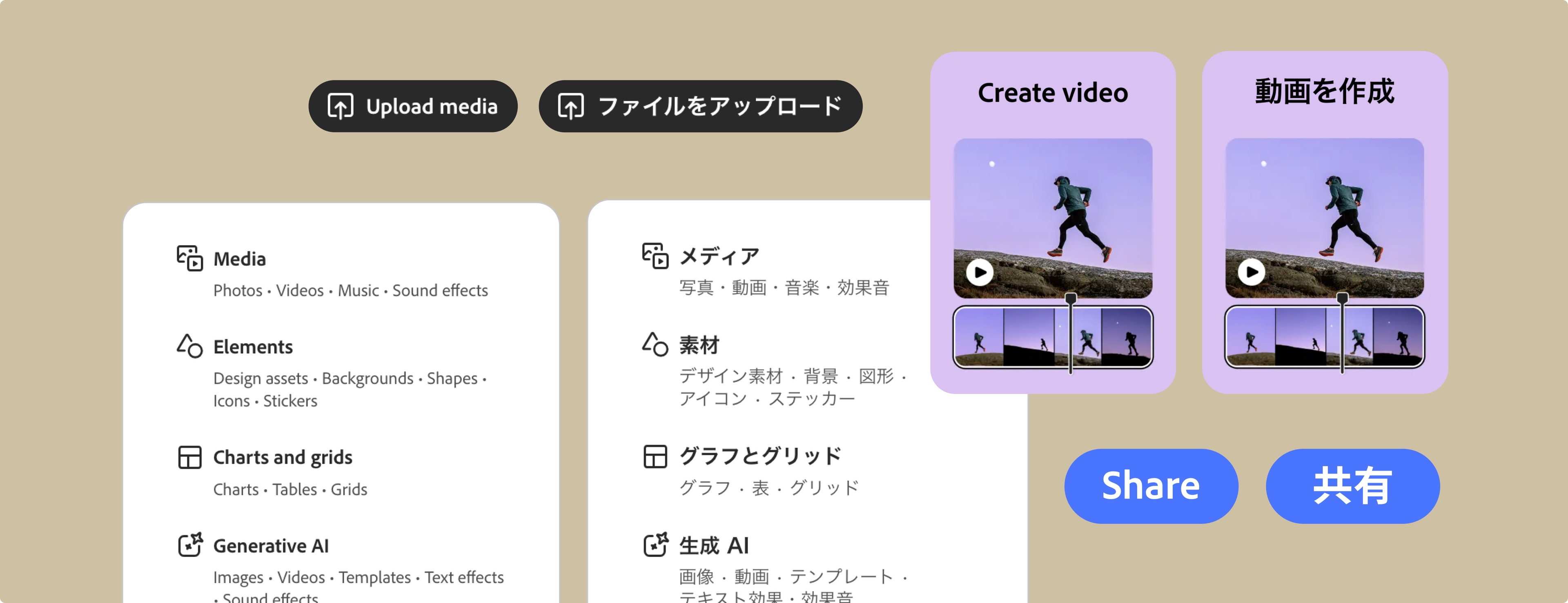
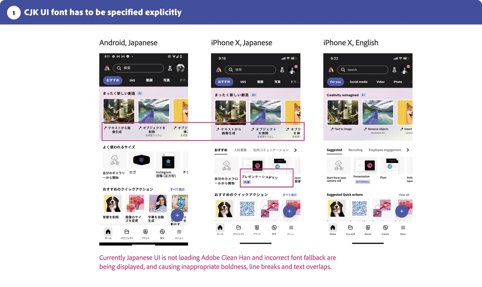
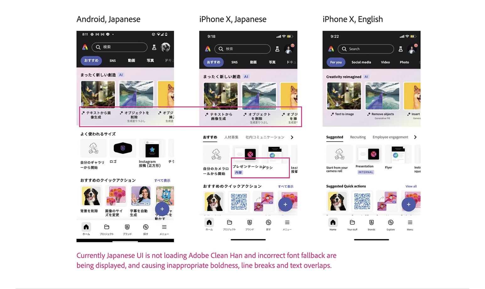
Chinese, Japanese, and Korean type on a global product is not a translation pass. It's a cross-functional problem that touches fonts, layout, and content ops — and it doesn't have a single owner. On Adobe Express, localized strings were shipping — but the product was not consistently loading Adobe Clean Han, the dedicated CJK UI font. Fallback system fonts made Japanese UI look heavier, break layouts, and truncate the labels users needed to read.
Nobody owned the rendering bug end to end. Engineering saw a font embedding constraint. Design saw broken screens. Content saw strings that looked fine in the CMS and wrong in product. This taskforce gave that work a seat at the table and an actual path to ship.
The communication challenge
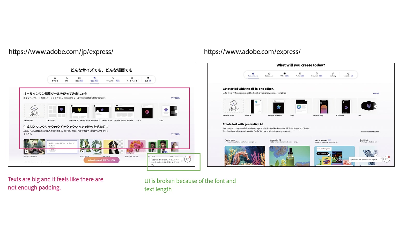
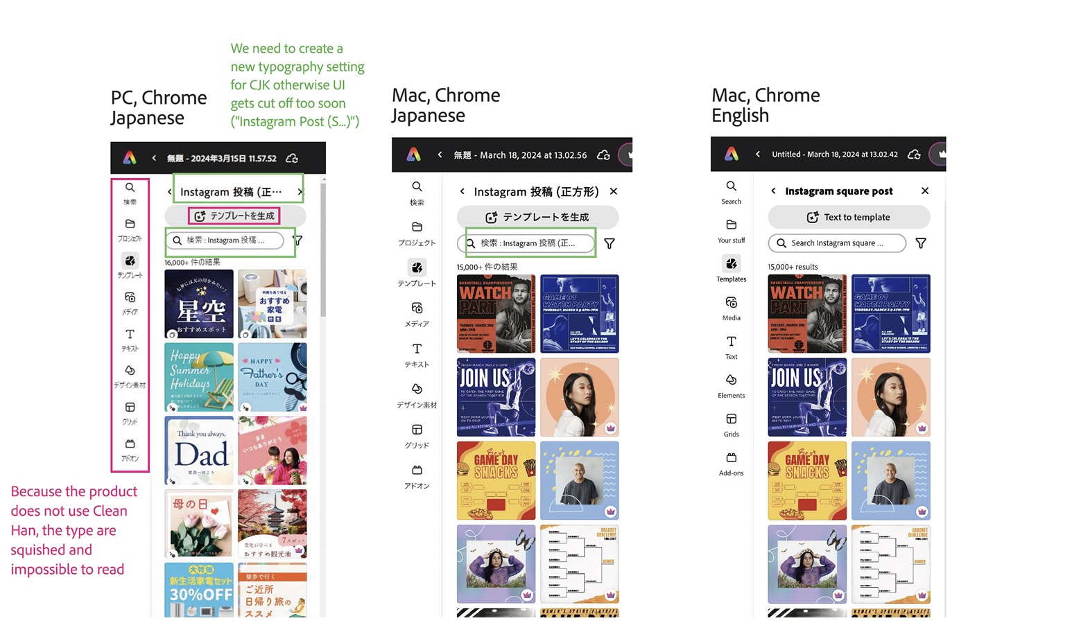
The hardest part wasn't finding the issues — it was making people who don't read Japanese feel a problem they couldn't see. To me, a font that's too bold or a label truncated mid-character is immediately, viscerally wrong. To a teammate who doesn't read Japanese, none of that registers as broken.
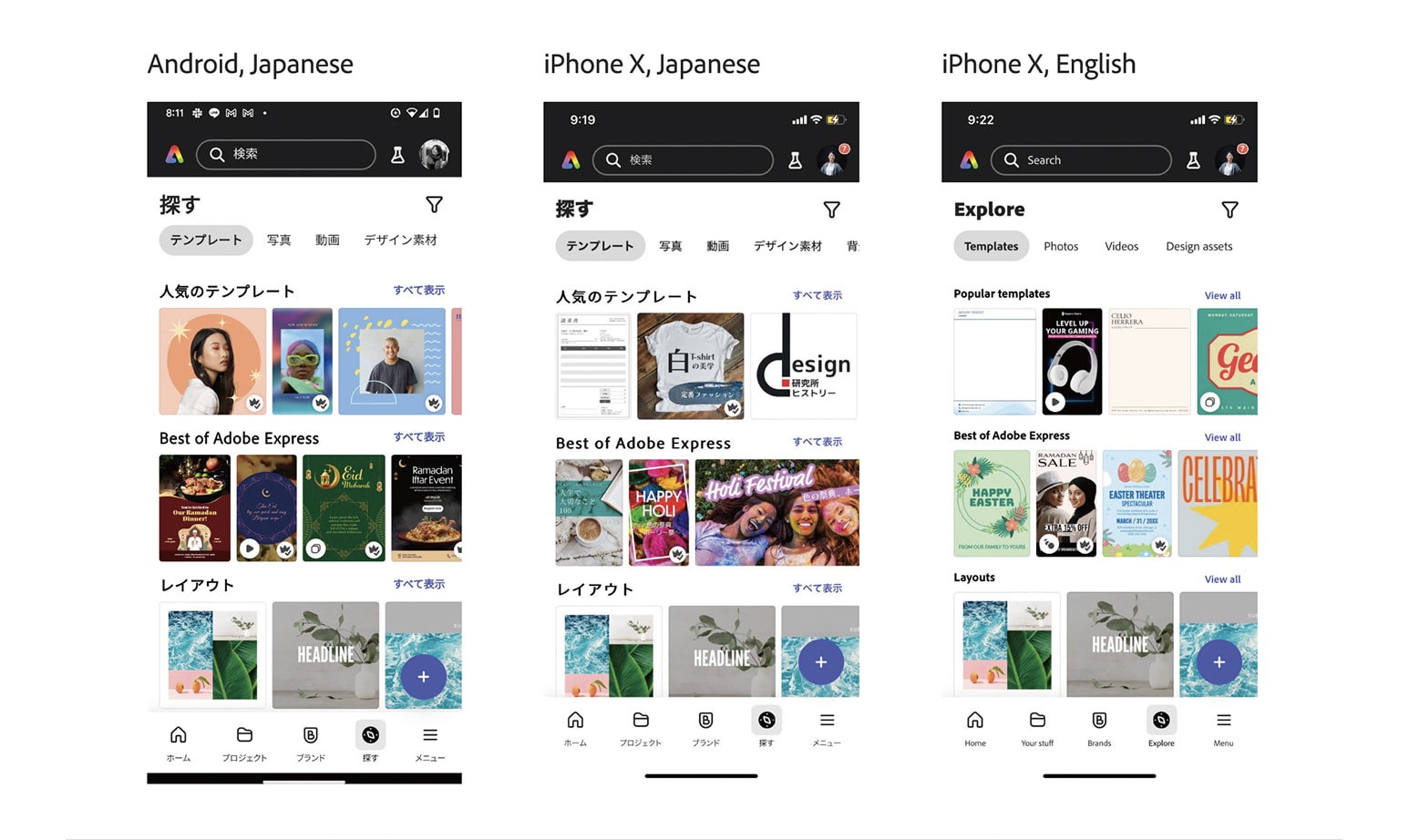
So I built the case around comparison, not description. I mocked up equivalent breakage in English — the same kind of mid-word cutoff or heavy-handed weight — so people could feel what a Japanese reader felt without reading a character of Japanese. I put Japanese and English UI side by side to make the gap visible. And I pulled screens from well-designed Japanese products, so the team had a concrete target for "correct," not just a list of what was wrong.
Phase 1: building the case
I documented the issues across surfaces and organized them into three categories, using annotated screenshots and browser inspection data to make each one actionable.
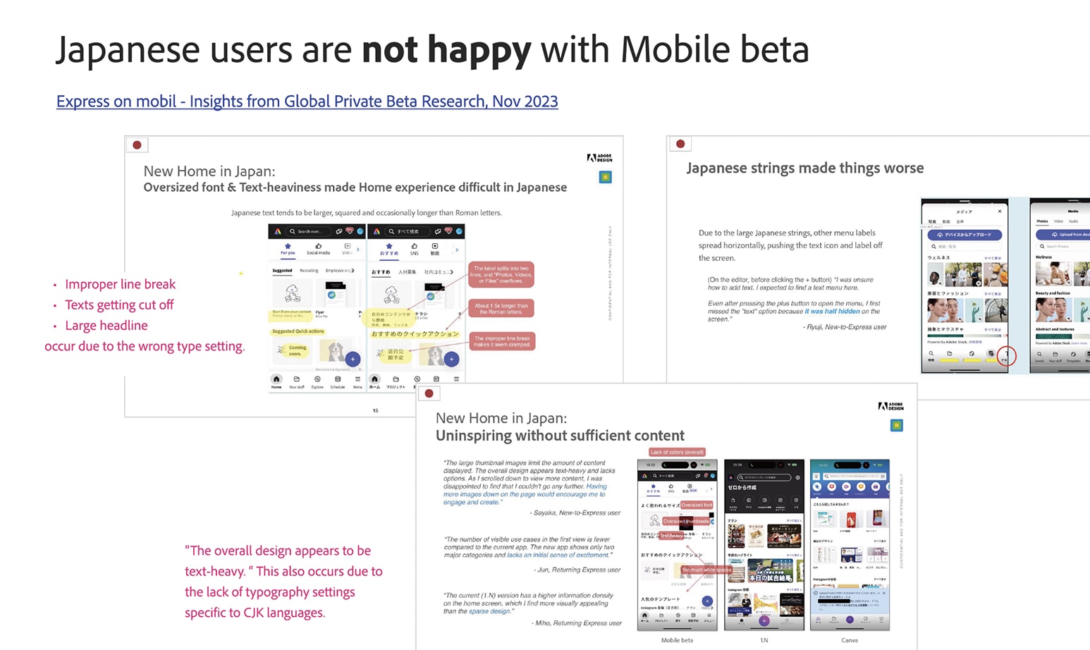
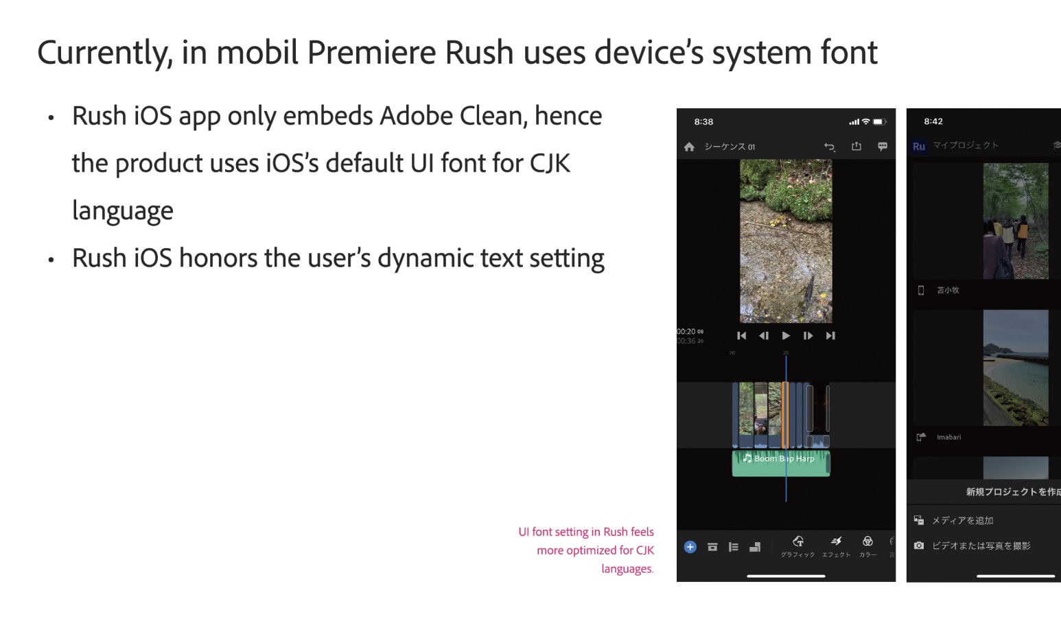
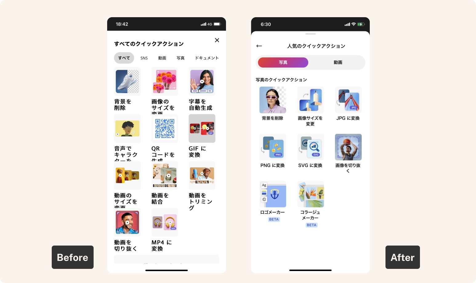
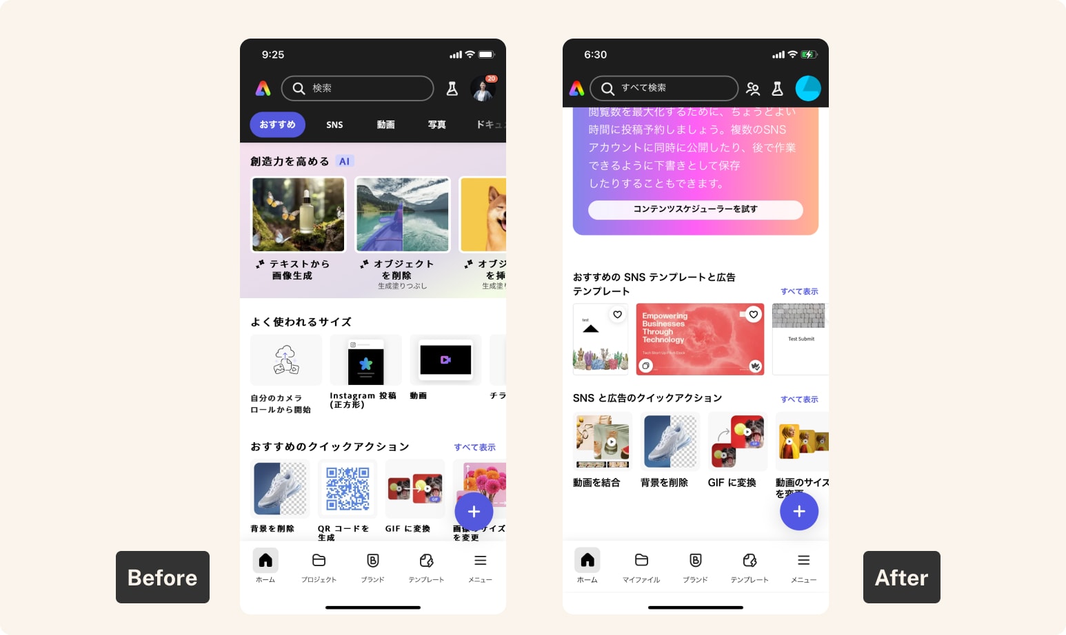
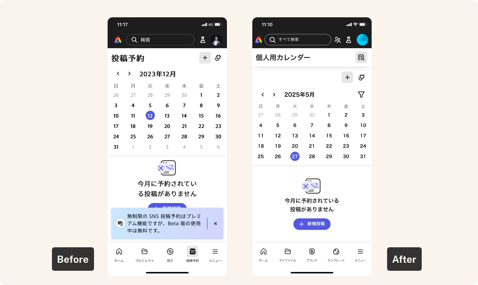
The mobile font wasn't rendering correctly
My initial read was that our branded CJK typeface, Adobe Clean Han, wasn't loading at all on iOS — the type looked nothing like it should. That visual evidence was what opened the conversation. The actual root cause turned out to be more specific, and surfaced later.
CJK needs its own type spec
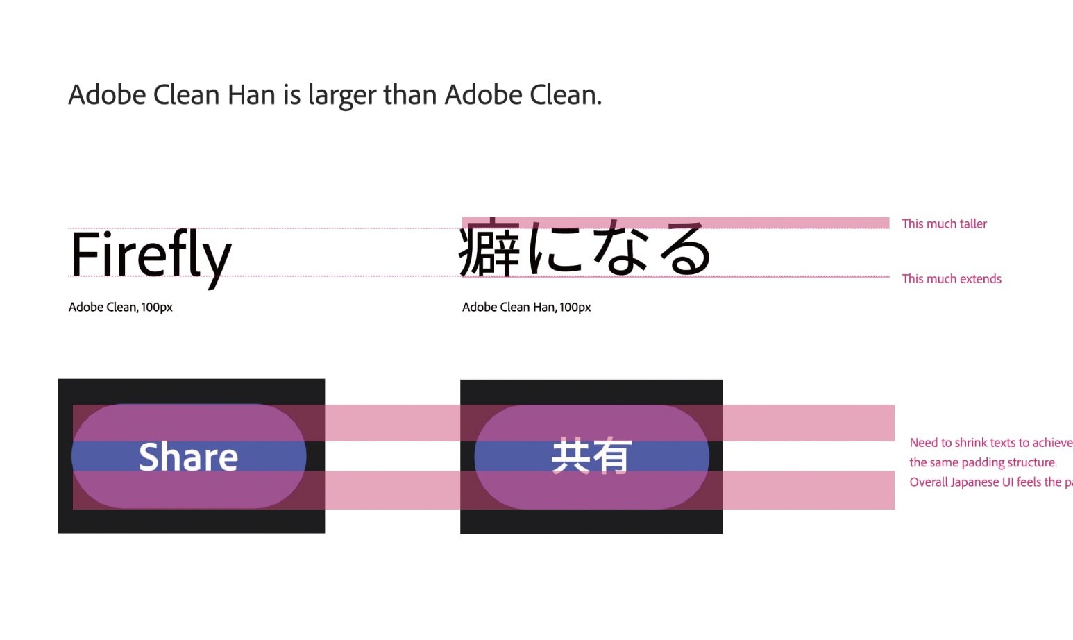
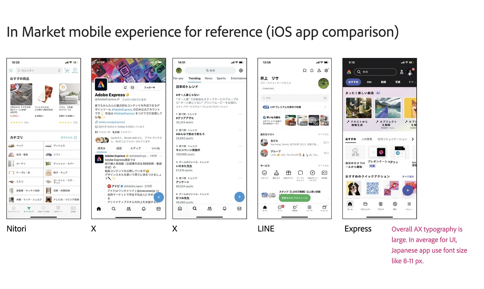
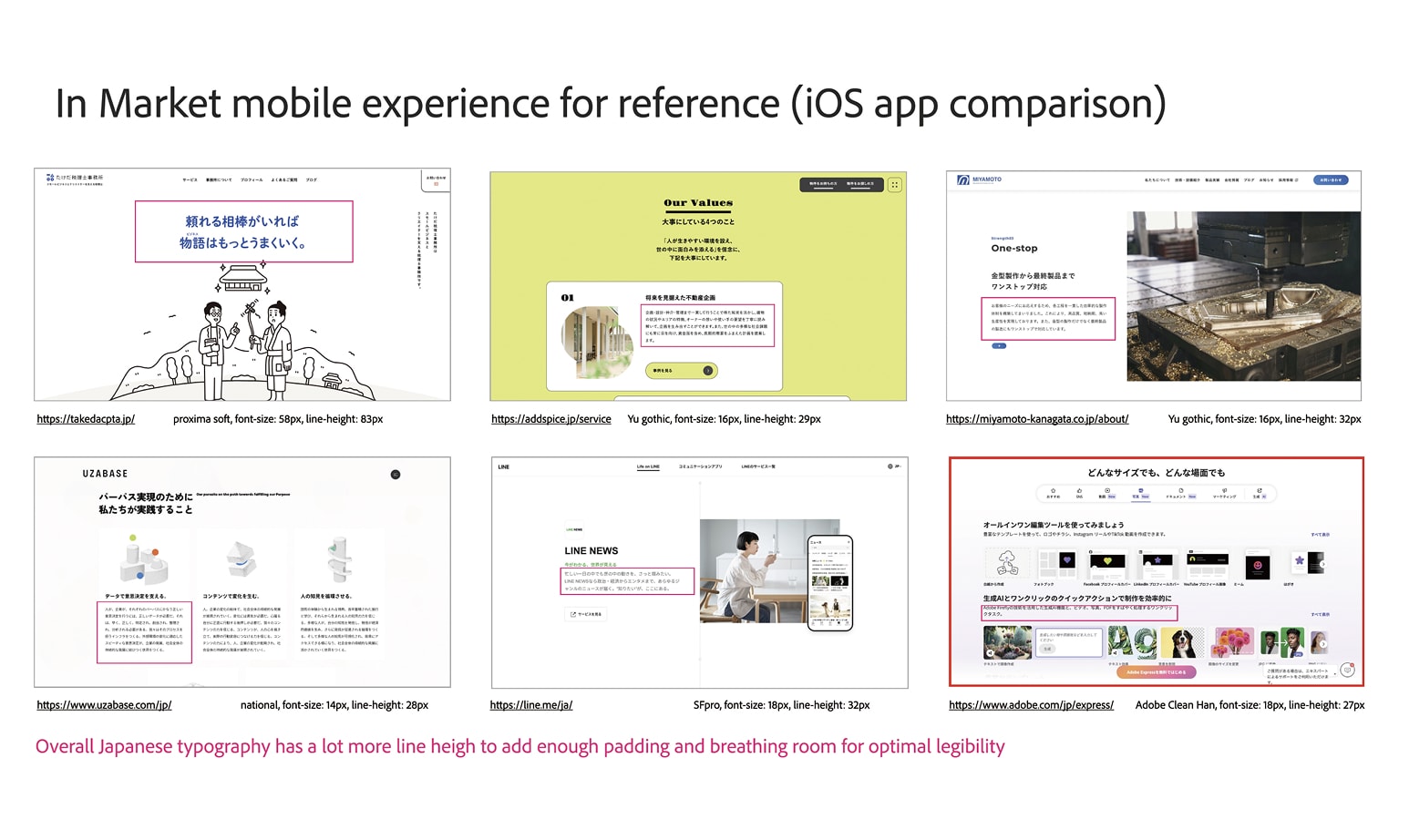
Adobe Clean Han glyphs are physically larger than Latin glyphs at the same point size — not a font flaw, but a legibility requirement of the script. When I first raised this, the instinct was to ask the font team to shrink the typeface. I knew that wasn't right, but I'm not a type specialist, so I set up a meeting with Adobe's senior type designers to make the technical and historical case. Having them in the room changed the conversation.
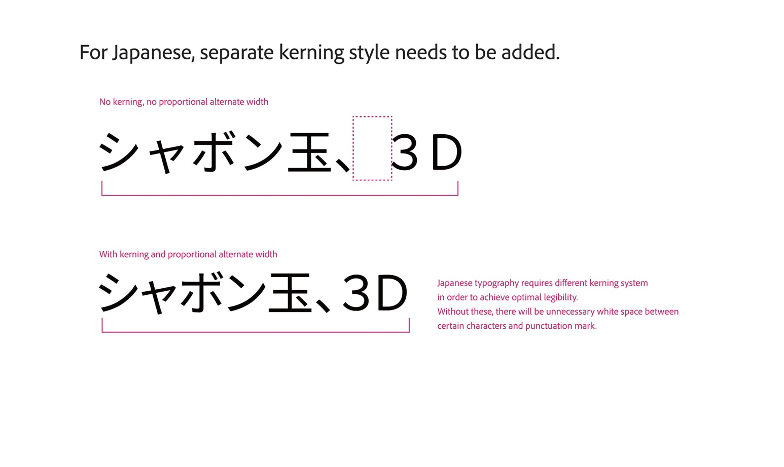
Through that process I also learned Japanese typography needs PALT (proportional alternate width) to handle kerning — without it, punctuation creates the kind of awkward white space Japanese readers feel but can't always name.
I built the case visually: side-by-side comparisons of Express against well-designed Japanese products like LINE, Nitori, and UZABASE, to make the gap legible to non-Japanese-reading teammates.
Components weren't consistently using Adobe Clean Han
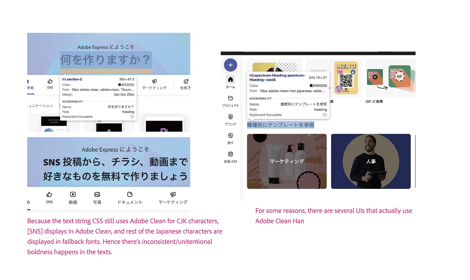
As Express scaled, individual engineering teams sometimes overwrote Spectrum's base styles, specifying the Latin font directly instead of the correct token. The result: Japanese characters in those components fell back to a mismatched default font — sometimes two typefaces co-mingling inside a single label. I documented these instances with browser inspection screenshots, tied to the specific teams that owned each affected component.
How the taskforce moved
Once the evidence was organized, I brought in the right people from Foundation and Spectrum — engineers who recognized the faux bold the moment they saw it. What they needed was someone to organize the evidence and make the case for prioritization. That was my job.
The Spectrum engineer audited the component library and found the real root cause of the faux bold: Express stylesheets were specifying font-weight 800 — a weight that exists in Adobe Clean but not in Adobe Clean Han. The browser was synthesizing the weight it couldn't find, producing text that looked heavier and blurrier than our brand intent. The fix was straightforward once we knew what we were looking for: remap the weight token to 700.
For the size issue, we mapped every type size in the design system and tested adjustments that would correct CJK proportion without requiring component-level padding changes. Reducing everything by 1px held layout integrity while fixing the visual weight.
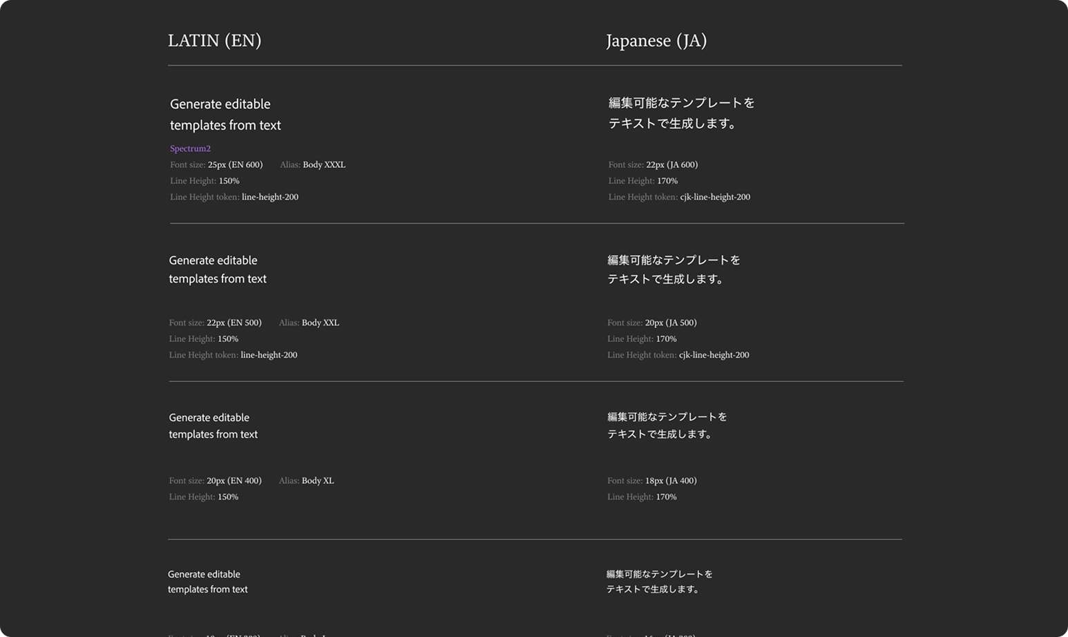
For components owned by individual feature teams, I worked with the International Program Manager to file remediation tickets across every affected area, while the Spectrum lead produced a guide for engineers on handling CJK typography correctly when overriding styles. Phase 1 closed. The product looked significantly better, and the system had documentation it hadn't had before.
Phase 2: the crash nobody connected to typography
Six months after Phase 1 closed, the International Program Manager flagged something in our taskforce Slack channel: the Express mobile team was seeing unusually high crash rates for users with CJK UI on iOS. The suspected culprit was font loading.
This is where the earlier groundwork mattered. During Phase 1, I'd already talked to the mobile teams at Lightroom and Premiere Rush about how they handle CJK — both apps use Adobe Clean for Latin and system fonts for everything else. Express was doing something different. Because it was built as a WebView app rather than a native one, it was fetching whatever fonts desktop web used, including Adobe Clean Han — a Pan-CJK font file over 20MB. That was creating enough memory pressure to crash the app.
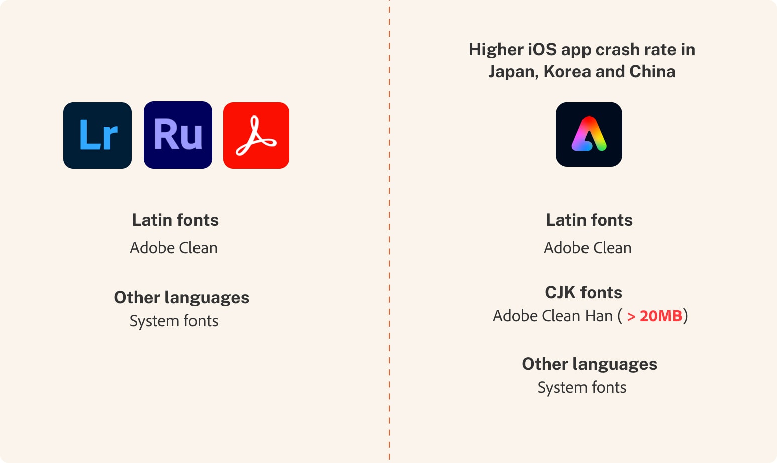
The fix shipped in two stages. Short-term, we reduced the font to just two weights — Regular and Bold — while still using Adobe Clean Han, to get something out fast and start monitoring crash rates. I weighed in on which weights to keep: desktop Express had been running Regular, Bold, and Extrabold, but Extrabold reads too heavy for Japanese UI regardless of the crash issue — that observation helped the team land on consolidating to Regular and Bold only. Crash rates barely moved.
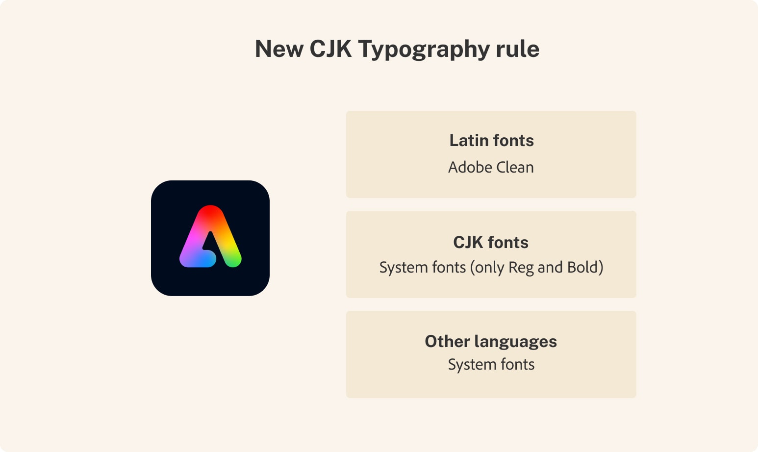
In parallel, I raised a bigger question with the Spectrum team: could CJK UI drop Adobe Clean Han entirely, on both desktop and mobile? Because Express was a WebView product, dropping the font on mobile meant dropping it from desktop too — there was no version where mobile used system fonts and desktop kept the branded typeface.
That meant auditing every surface first. A few places needed to keep the Adobe Clean family regardless — the product name "Adobe Express" had to stay in the branded font, and short brand-mention strings like "Powered by Adobe Photoshop" kept Adobe Clean (Latin), which is a lighter file than Adobe Clean Han. Everywhere else, we prioritized performance over branding and dropped Adobe Clean Han from CJK UI completely.
The results came in within a day of deployment:
| Market | Before | After |
|---|---|---|
| Japan | 85.1% crash-free | 89.8% crash-free |
| Korea | 62.6% crash-free | 79.4% crash-free |
| China | 59.7% crash-free | 75.7% crash-free |
What it opened up
The crash data was an outcome nobody expected from a design quality initiative. But the bigger conversation it unlocked may matter more long-term: what happens to other complex writing systems — Arabic, Thai, Devanagari — in a product built and QA'd almost entirely by teams who only see Latin characters? The CJK taskforce made that question impossible to ignore inside Adobe Express.
My role
- Independently identified, documented, and categorized CJK typography issues across mobile and desktop surfaces
- Built the business case and organized evidence to bring Foundation, Spectrum, and font specialist teams into the problem
- Brought in Adobe's senior type designers to explain CJK typographic standards and prevent the team from pursuing the wrong solution
- Coordinated multi-team diagnosis across design, engineering, and font systems
- Worked with the International PM to create remediation tickets across feature teams
- Consulted on font weight consolidation strategy for the Phase 2 mobile fix
- Contributed institutional knowledge about other Adobe apps' font handling that shaped the long-term architecture direction
Up Next:
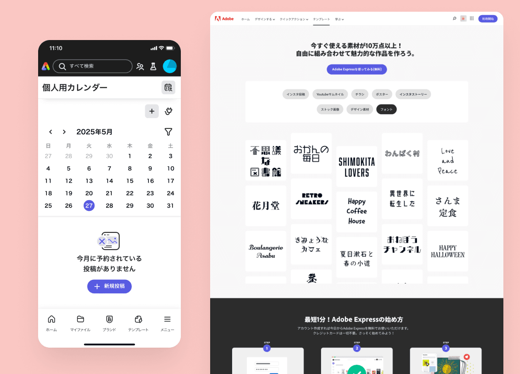
Looked, liked, loved it?
Let's talk.