
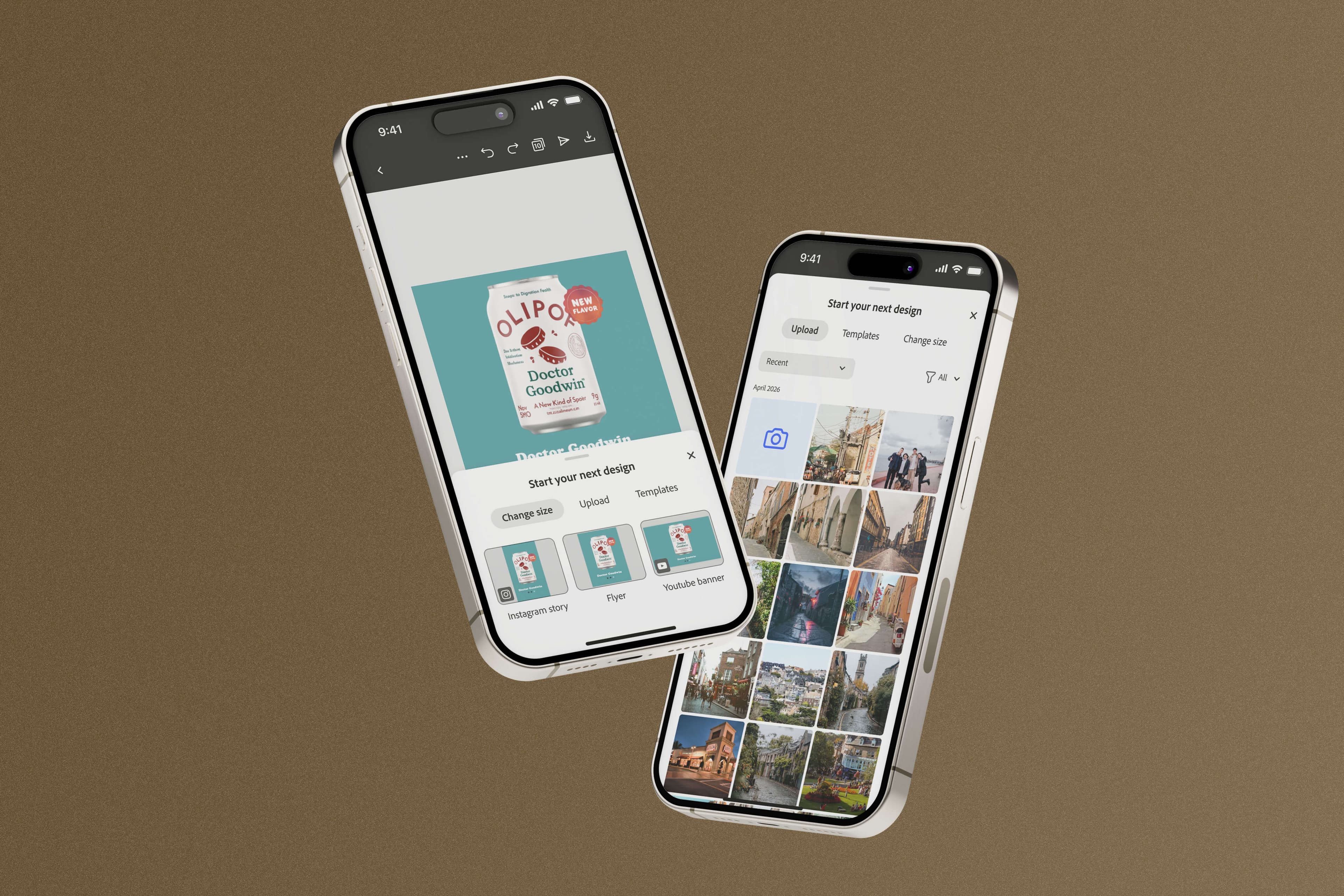
Next Best Action Multi CTA: Lower click rate, deeper engagement — and the largest rMAU driver PLG shipped
- Status
- Shipped · Winner
- Timeframe
- Feb–Mar 2026
- Role
- Design Lead
- Company
- Adobe
Context
The post-export moment is one of the highest-leverage touchpoints in the PLG loop — a user just finished something, and what happens next either deepens the relationship or lets it drop. This test ran Feb 25 – Mar 17, 2026 on Desktop Web, worldwide English, and came back a winner for returning and opted-out users. New users told a different story — more on that below.
Problem
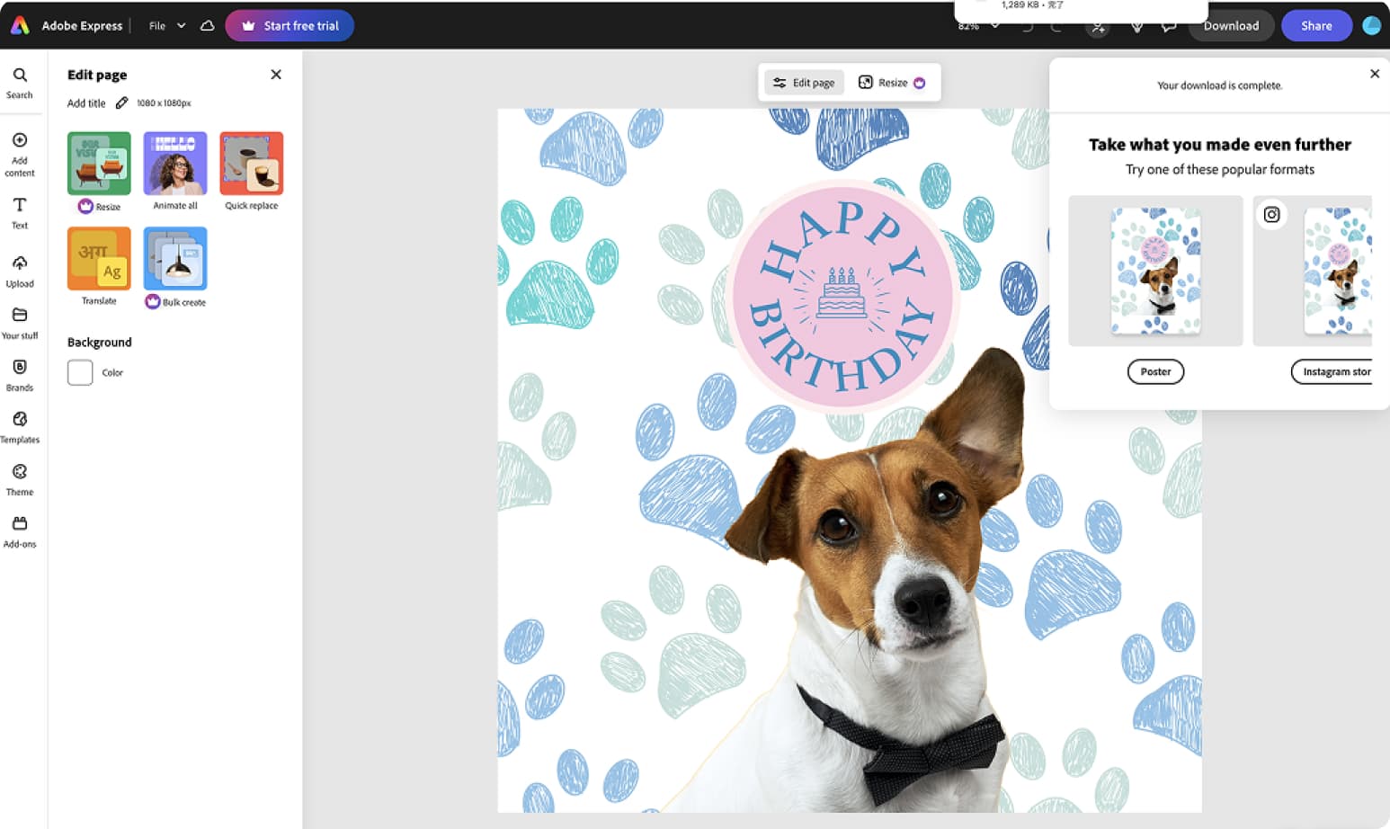
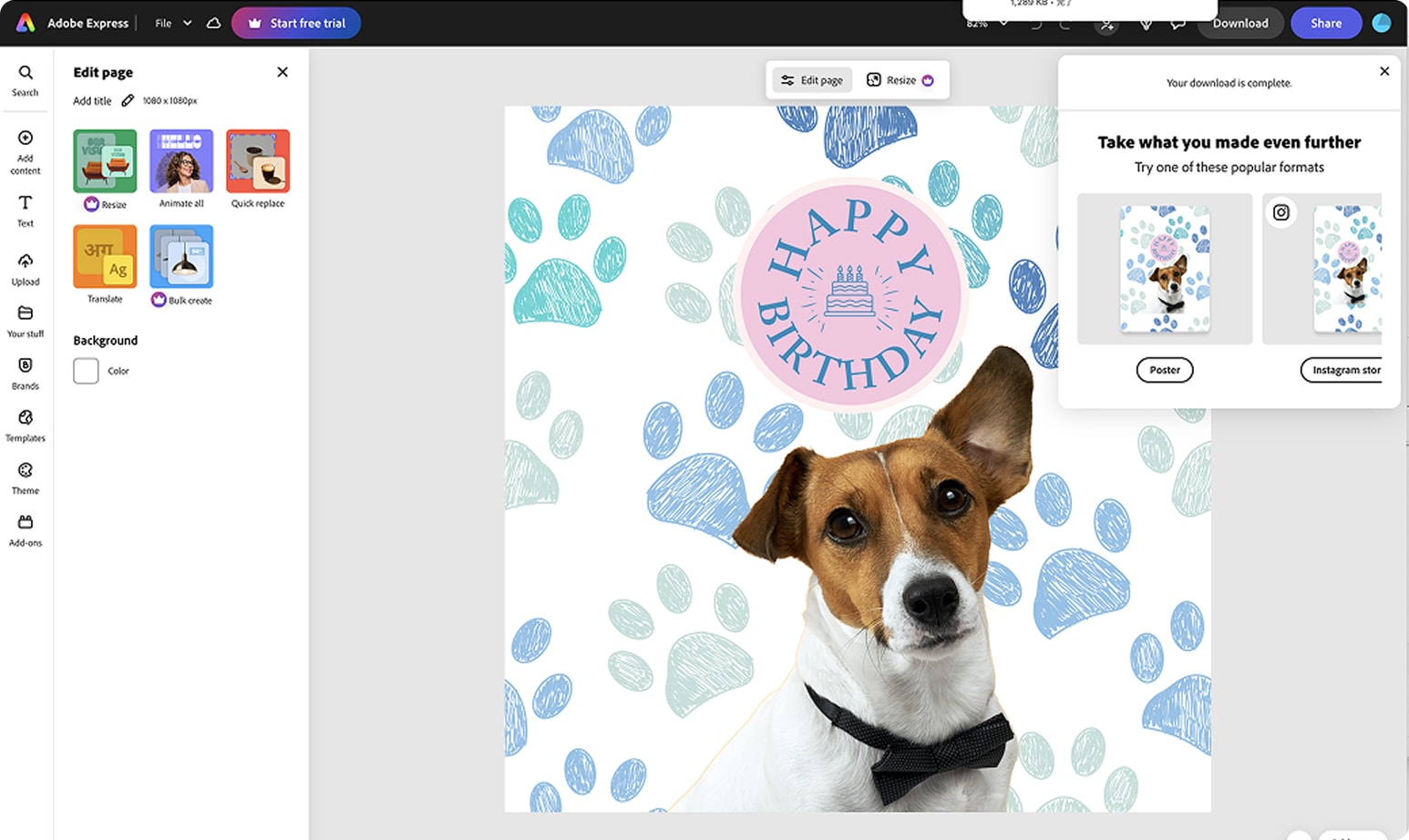
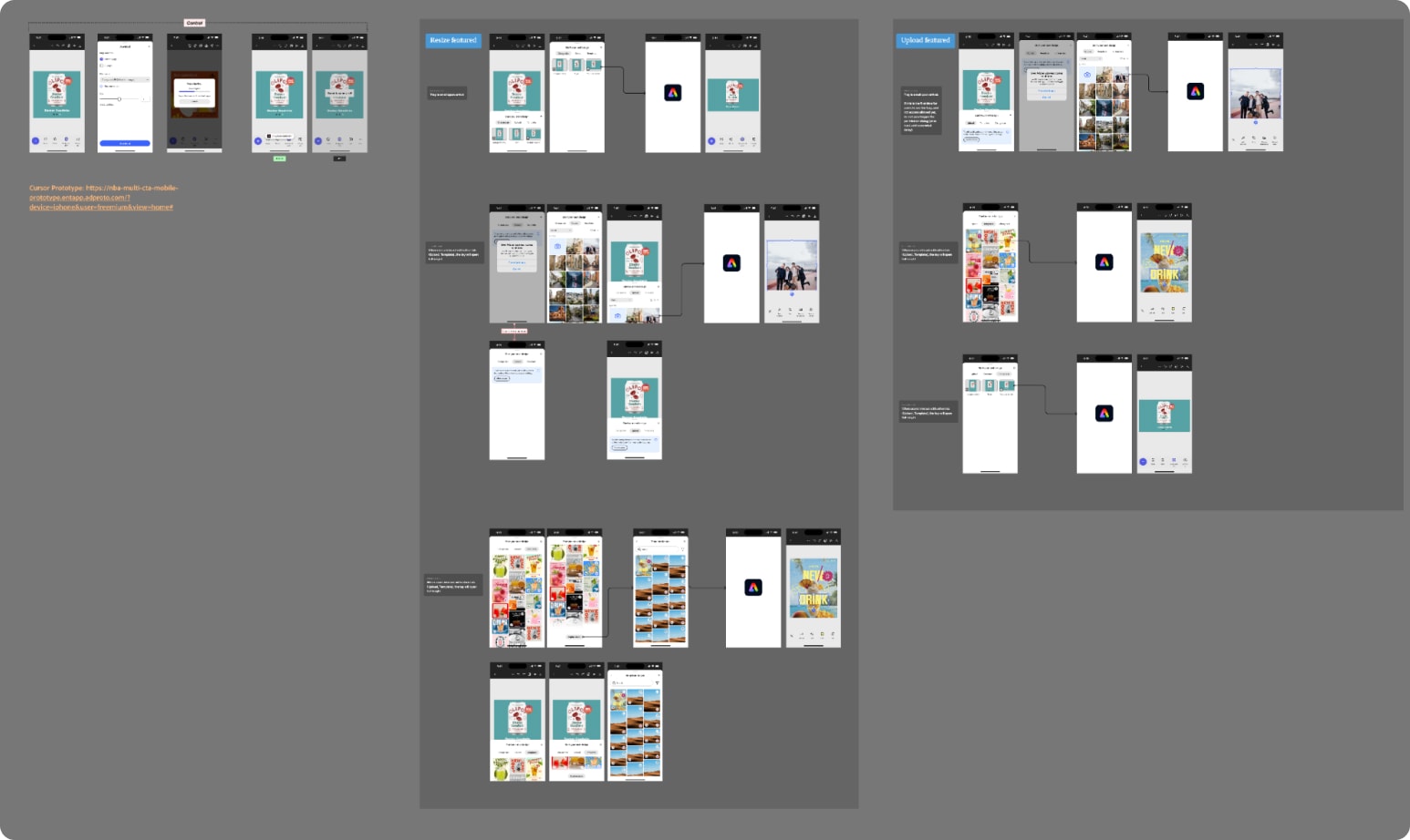
The existing post-export experience was built around one specific action: the Commonly Built Together modal, which showed users a live preview of their current design resized into other canvas formats — a user working on an Instagram Square Post might see the same design previewed as a Poster, an Instagram Story, and a Facebook Post, with logic determining which sizes to surface based on what they'd built.
That worked well when resizing matched what the user was actually trying to do. It broke down when it didn't. Users retouching an image, building a logo, or doing any task outside the resize use case still saw the same resize-preview modal — an experience with no relevance to their intent, and no path to a next action that made sense. The moment didn't fail because the modal was poorly designed. It failed because it only ever offered one kind of next step, regardless of what the user had actually come to Express to do.
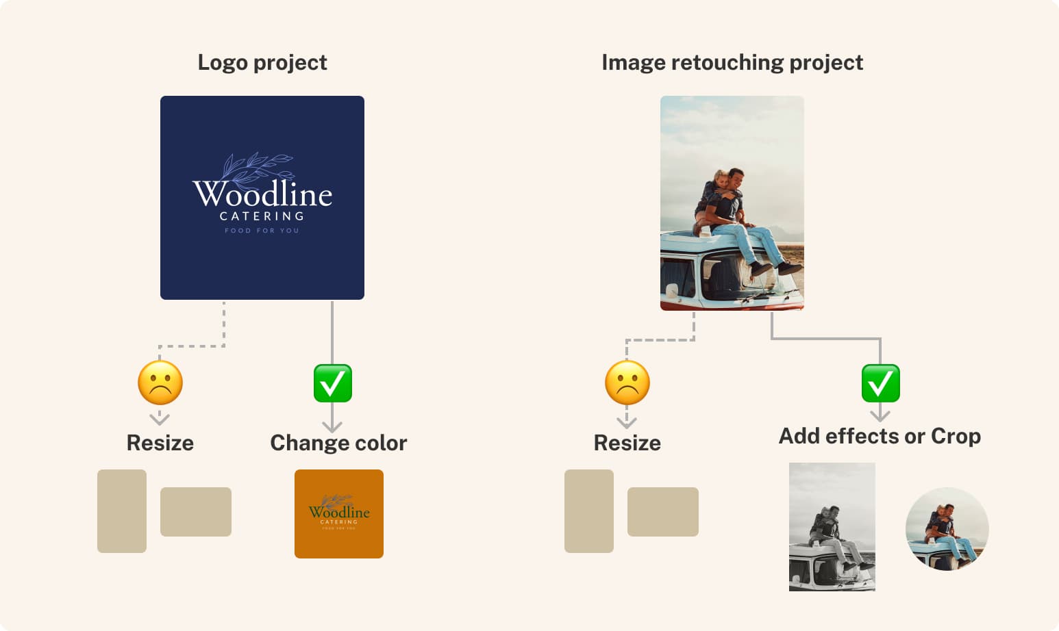
The gap was already visible in the data, and it pointed to exactly the right fix. Resize was already working as a next-best-action: when a user started a project by uploading a photo and then cropped or resized the image, suggesting Resize post-export nudged them to repeat that same action on a different image. Add Captions was working the same way — when a project included voice audio, suggesting Add Captions after export helped users add subtitles to that video. Both worked because the suggestion matched what the user had actually just been doing.
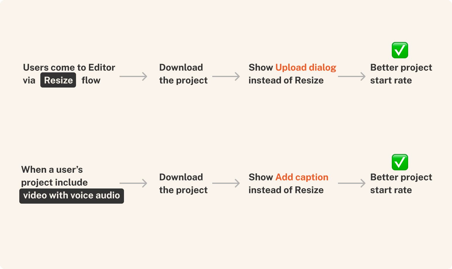
The single-CTA structure wasn't failing for lack of good options — it was failing by only ever showing one, chosen for the wrong kind of task. Resize and Add Captions proved the model worked when the suggestion matched intent. The next step was obvious: stop guessing at one action for everyone, and build a system that could surface the right one for each user.
The Decisions
1. From one path to a menu
The fix wasn't a better single suggestion. It was a different question entirely: what if, instead of prescribing one path, we showed users a menu and let them find their own way in?
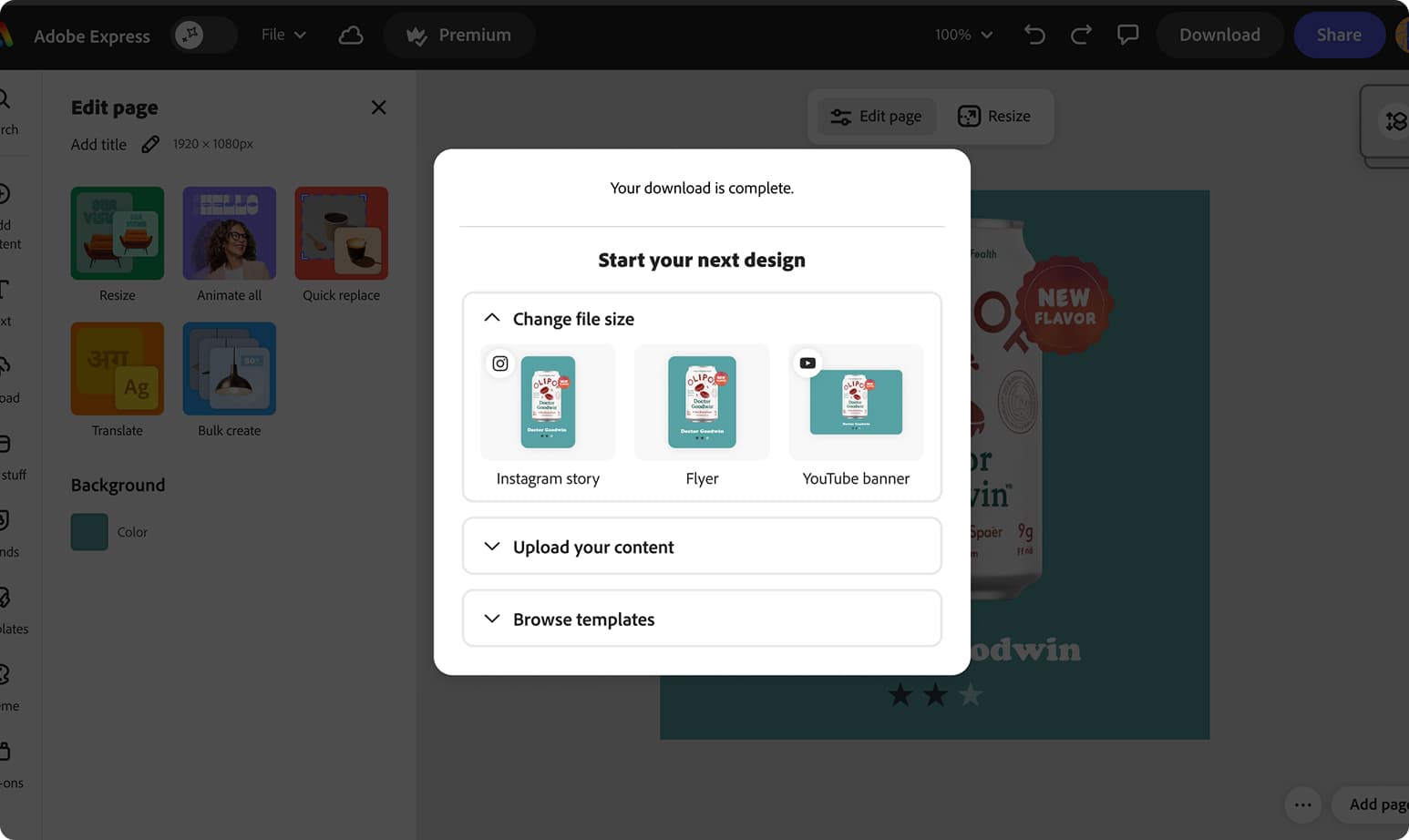
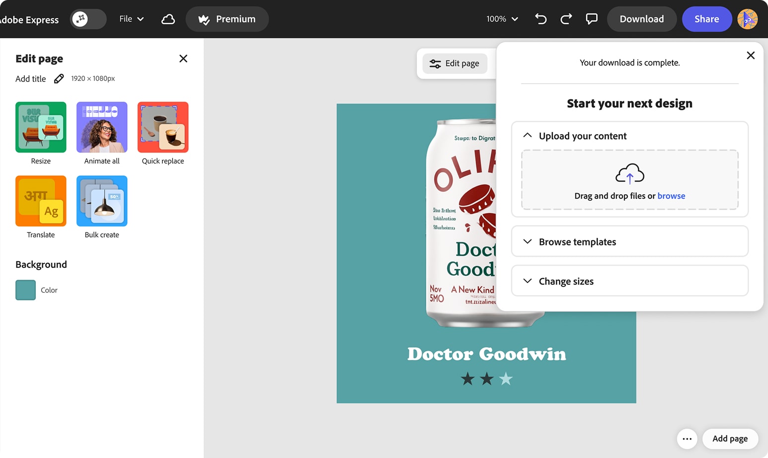
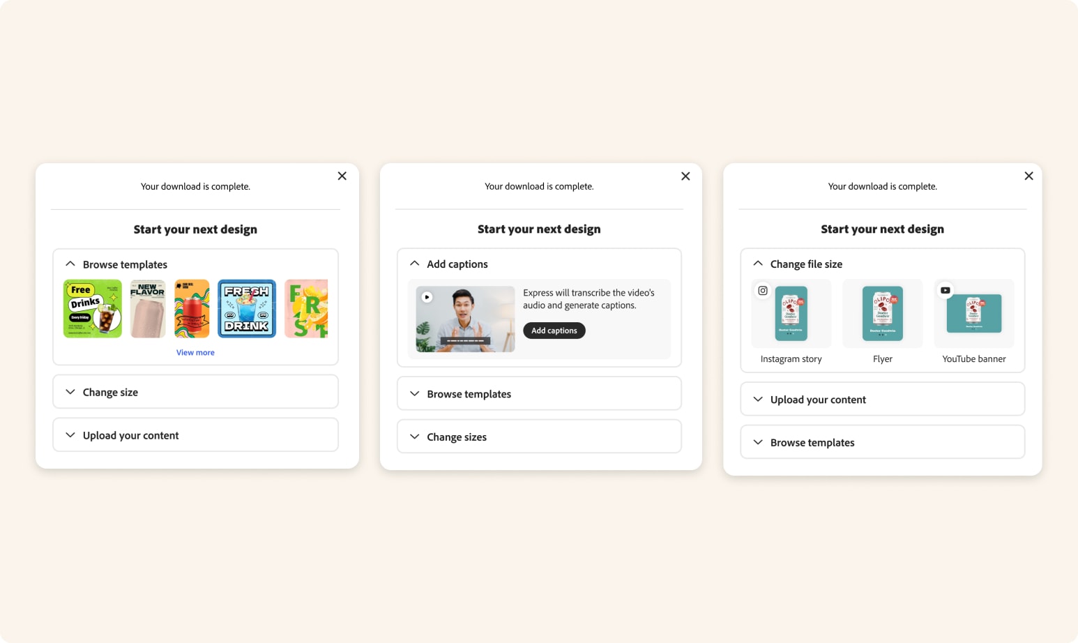
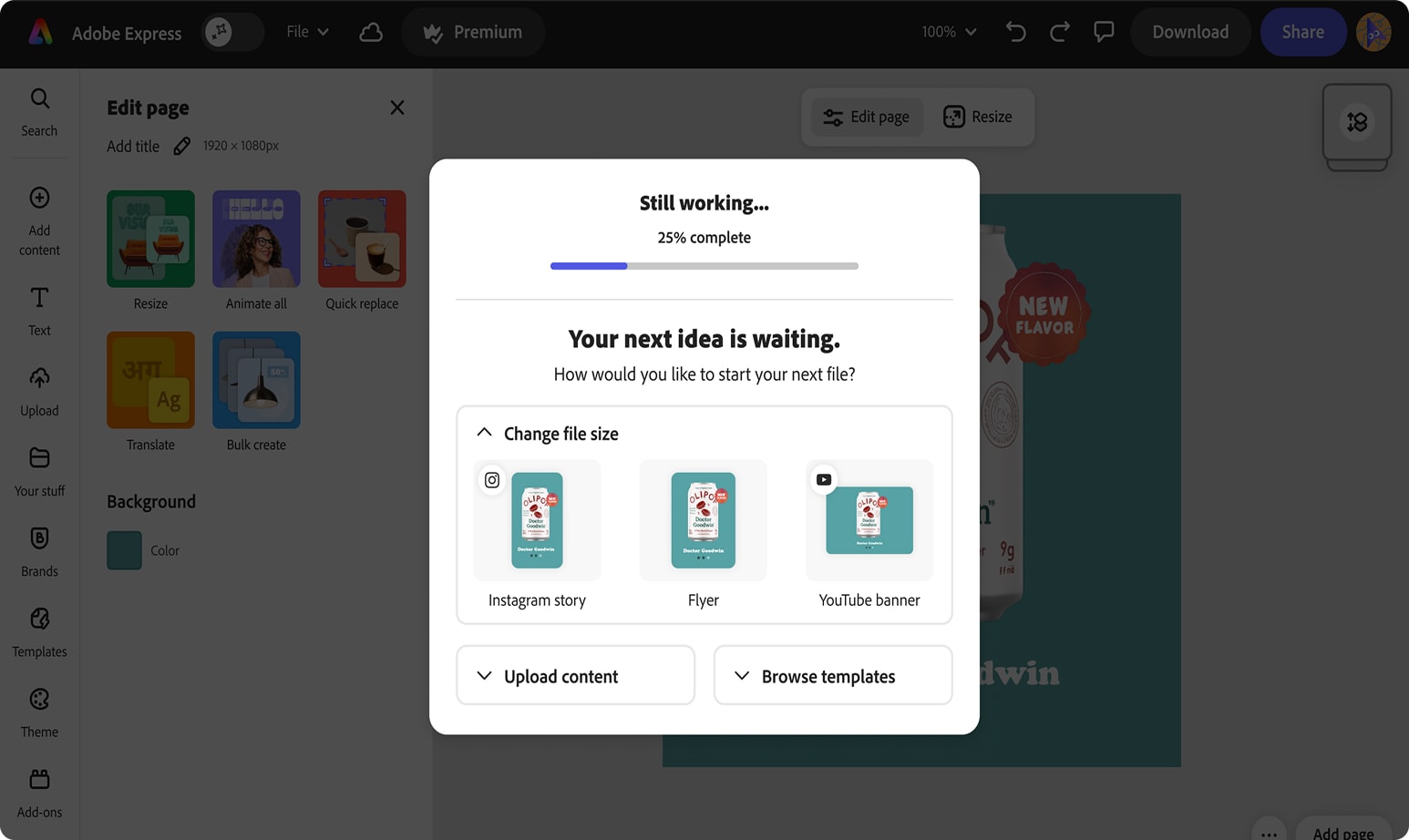
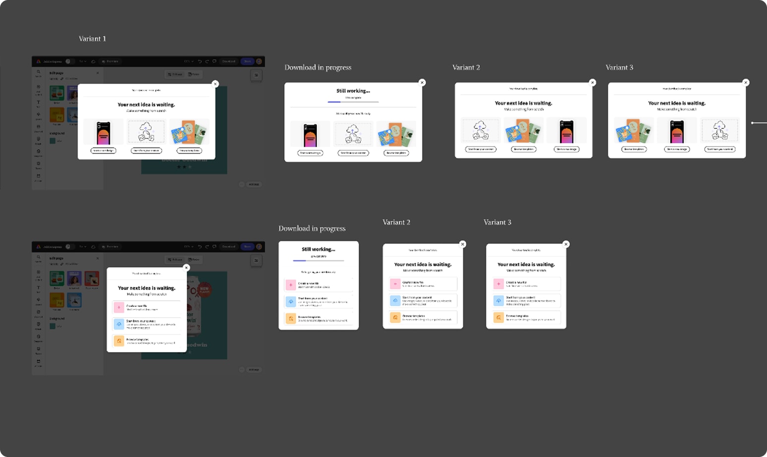
That shift shows up in the framing itself — "Take what you made further" became "Start your next design," moving the entire moment from iteration to expansion. The result was a dynamic multi-CTA accordion modal surfacing three personalized next actions — Resize, Browse Templates, Upload Content, Add Captions — with the top action expanded by default. Ranking was driven by how the user started their project, what features they'd used while editing, and the type of file they exported.
2. Accordion over slider
The accordion format wasn't the only option on the table. A slider was considered, but past experience showed hidden slider content tends to go undiscovered — users don't scroll to find what they can't see. The accordion solved that by keeping every option's heading visible up front, giving users more chance to notice an alternative even before opening it.
The deeper reasoning went further than layout mechanics. Express's whole reason for existing is to be the simpler alternative to tools like Photoshop — qualitative research consistently showed that too many visible options overwhelm users, the same failure mode that keeps people from ever adopting more complex tools in the first place. Showing all four next-actions expanded at once would have recreated that exact problem inside the moment meant to bring users back. The accordion let the modal offer range without demanding it be processed all at once — one action expanded by default, the rest present but not overwhelming.
3. Three cohorts, three reads
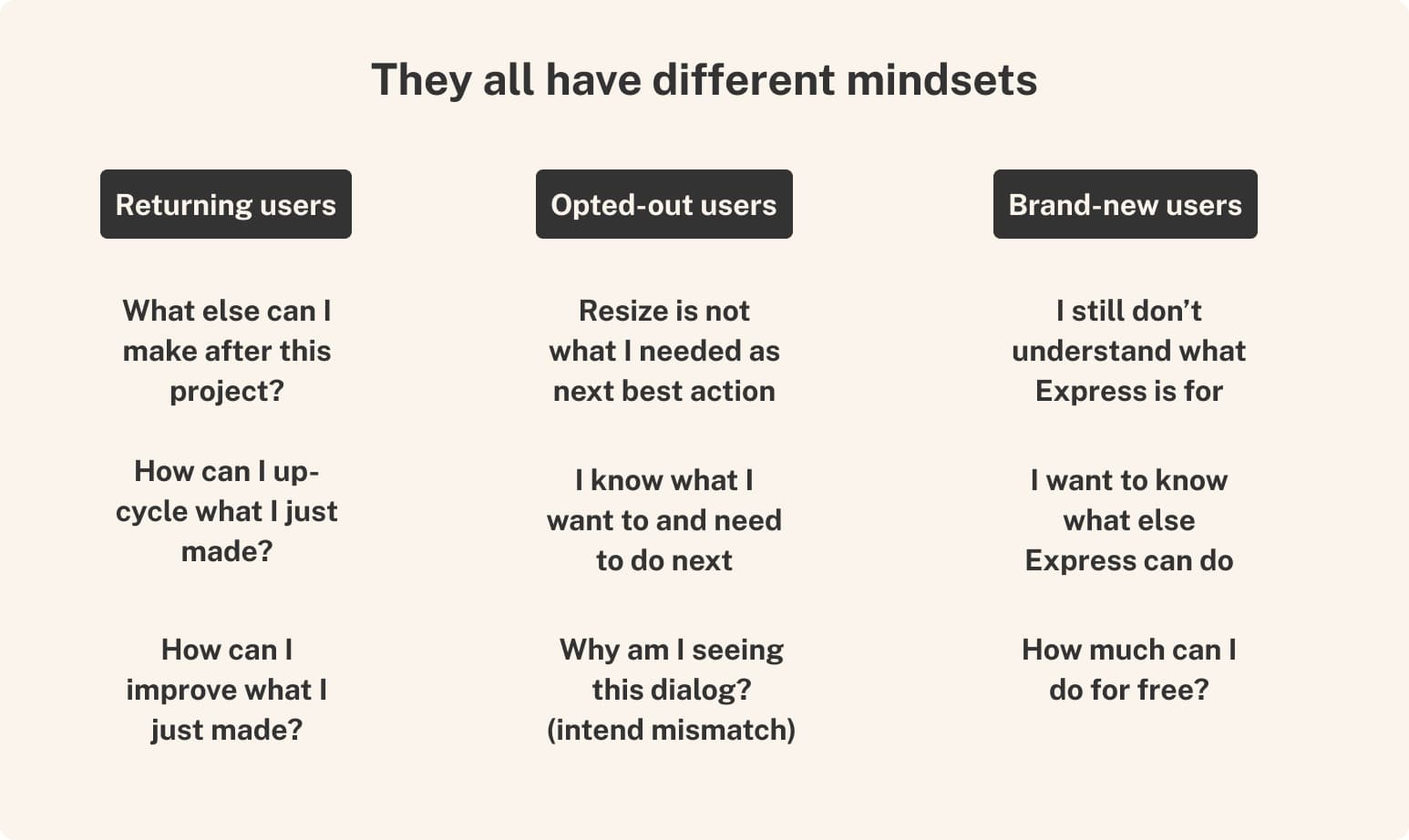
The other decision that shaped everything downstream: treating this as three different problems, not one. Returning users, opted-out users, and brand-new users don't come into this moment with the same context, so reading one blended number would have hidden more than it revealed. Breaking results out by cohort from the start was what made the real story visible.
4. Validate before automating
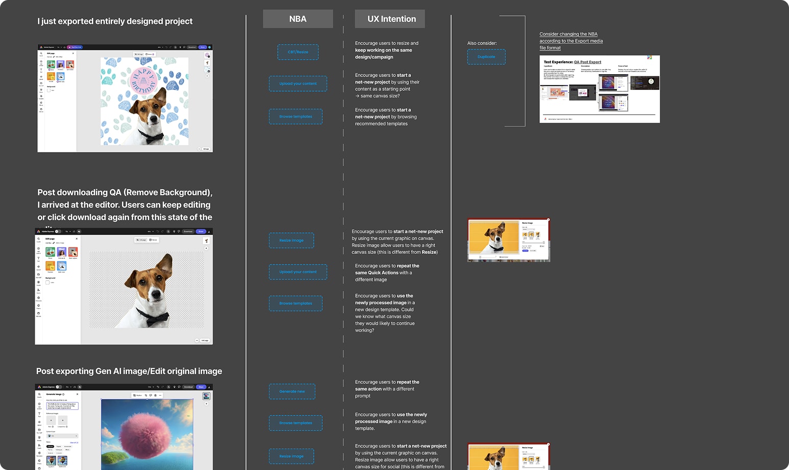
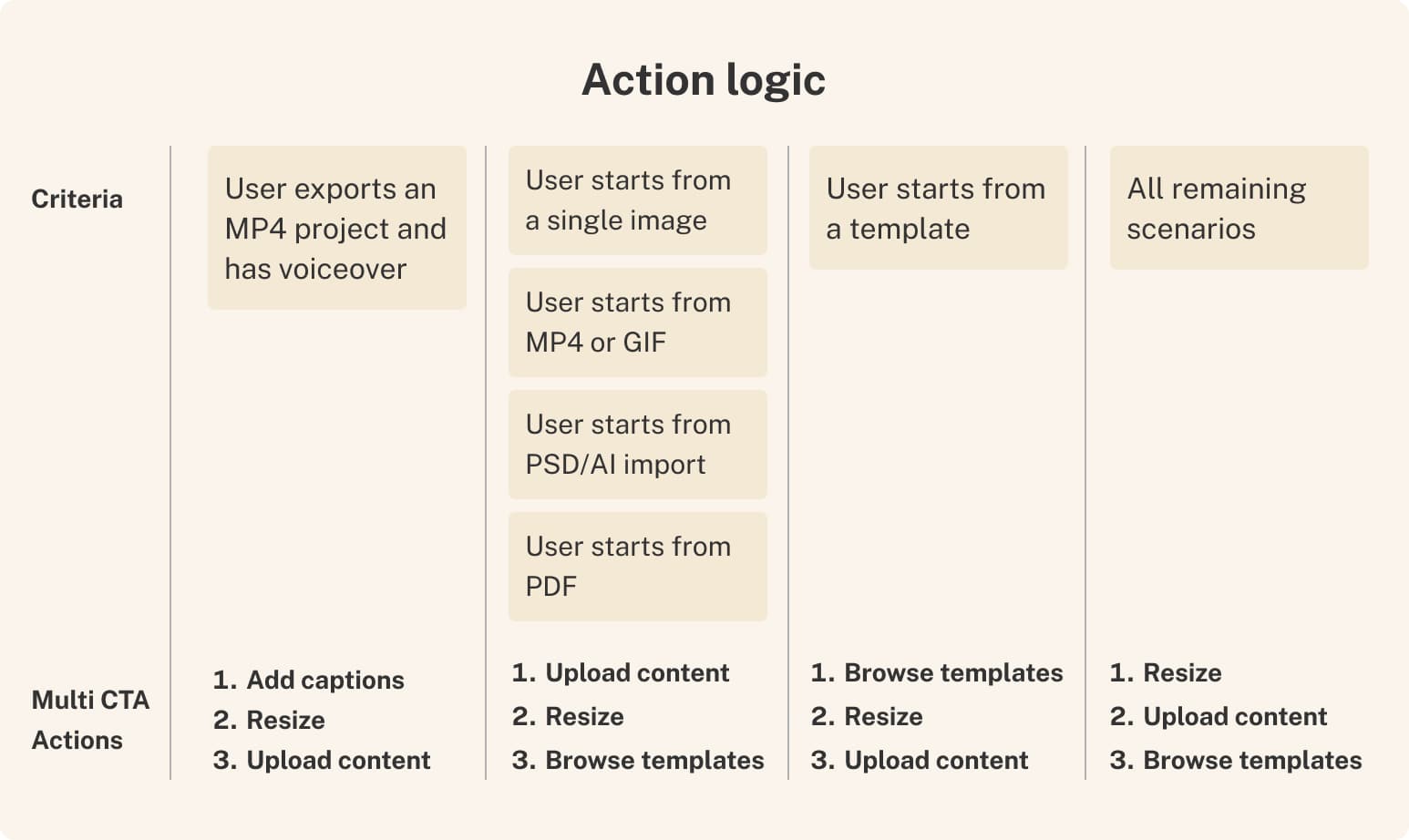
The ranking logic itself — which action to prioritize based on how a user started their project and what they'd done with it — was led by the PM and data scientist on the project, based on four priority tiers: MP4 exports with voiceover surfaced Add Captions first; single-image or PSD/AI imports surfaced Upload Content first; template-started projects surfaced Browse Templates first; and everything else defaulted to a Resize-first order. I reviewed the logic against the interaction design — checking that the criteria held up against what users would actually be seeing and doing in the modal.
The manual, rule-based version was intentional. Before investing in an automated recommendation system, the team needed to validate that the underlying concept — surfacing the right next action based on user intent — actually moved behavior. This static logic was the test. Automating the ranking was always the intended next step, contingent on the concept proving out first.
Results
This content is protected
Outcomes, metric tables, and what this unlocked beyond the test are behind the password — contact Lisa if you'd like access.
Up Next:

Looked, liked, loved it?
Let's talk.